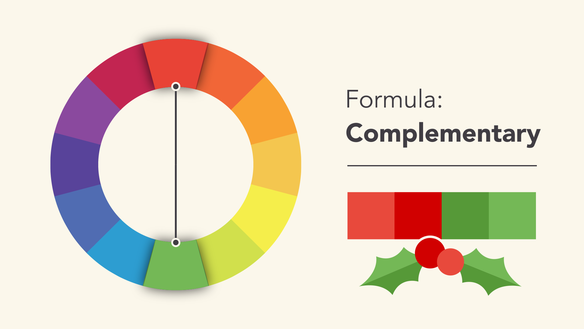
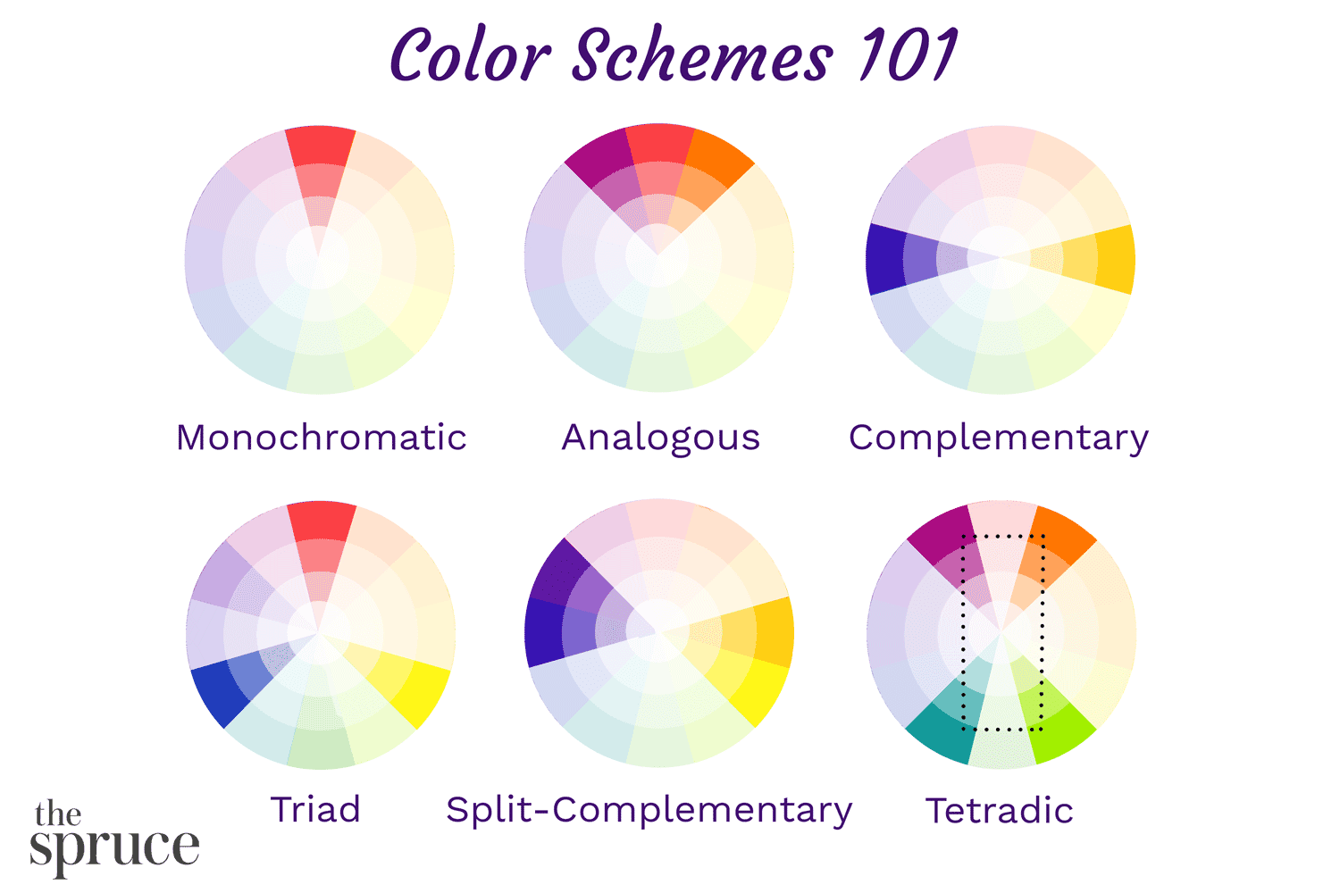
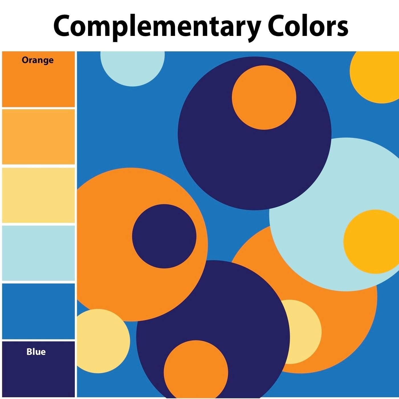
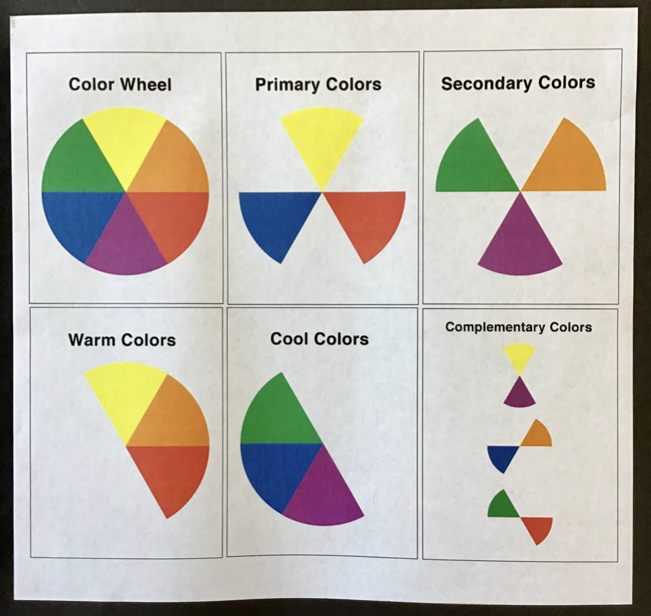
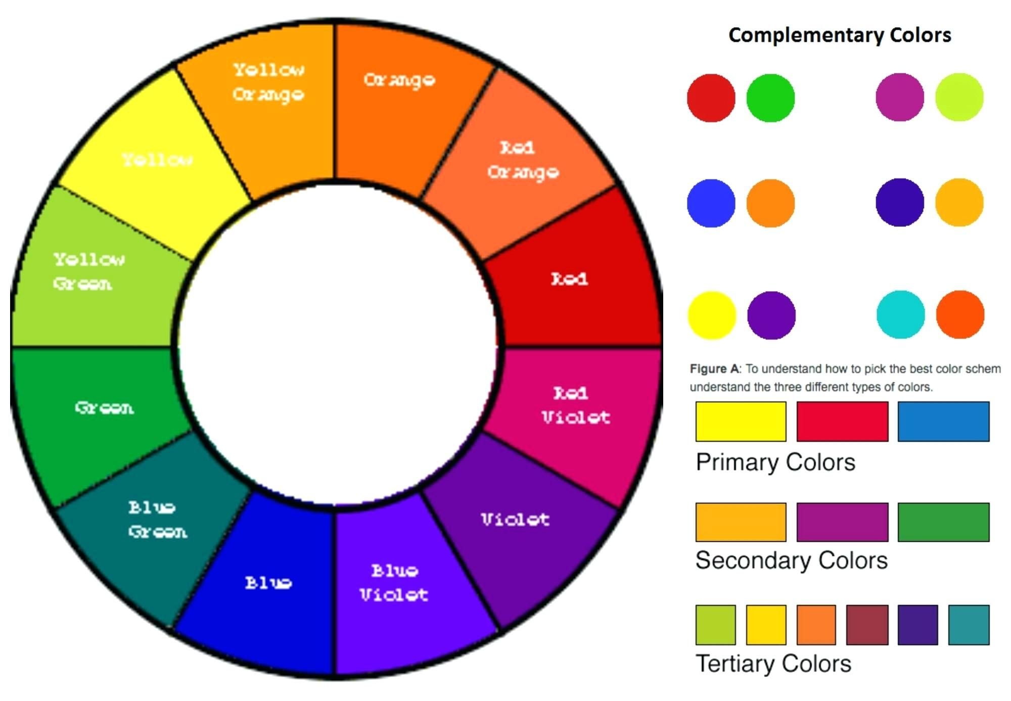
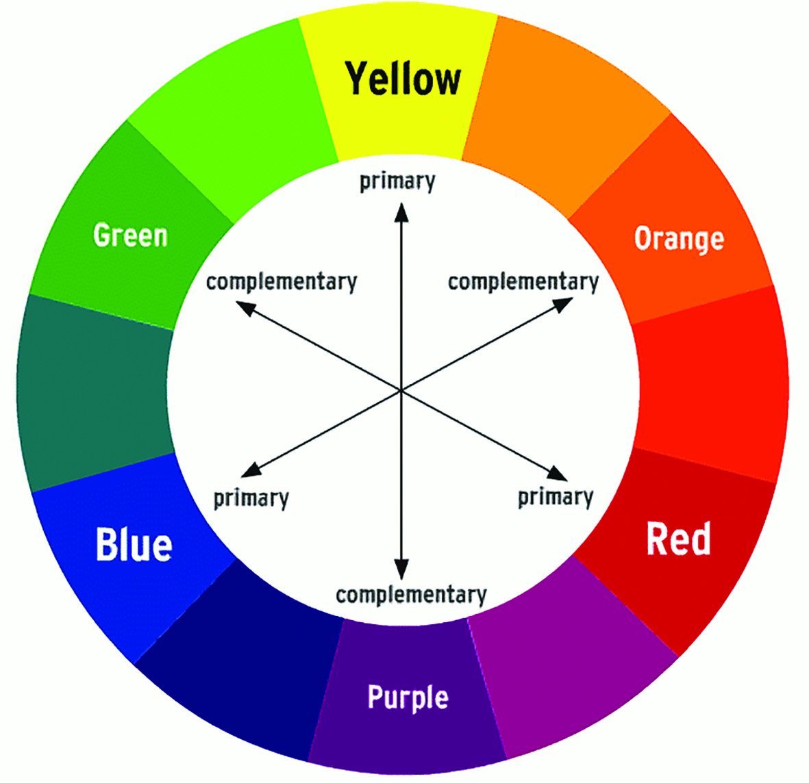
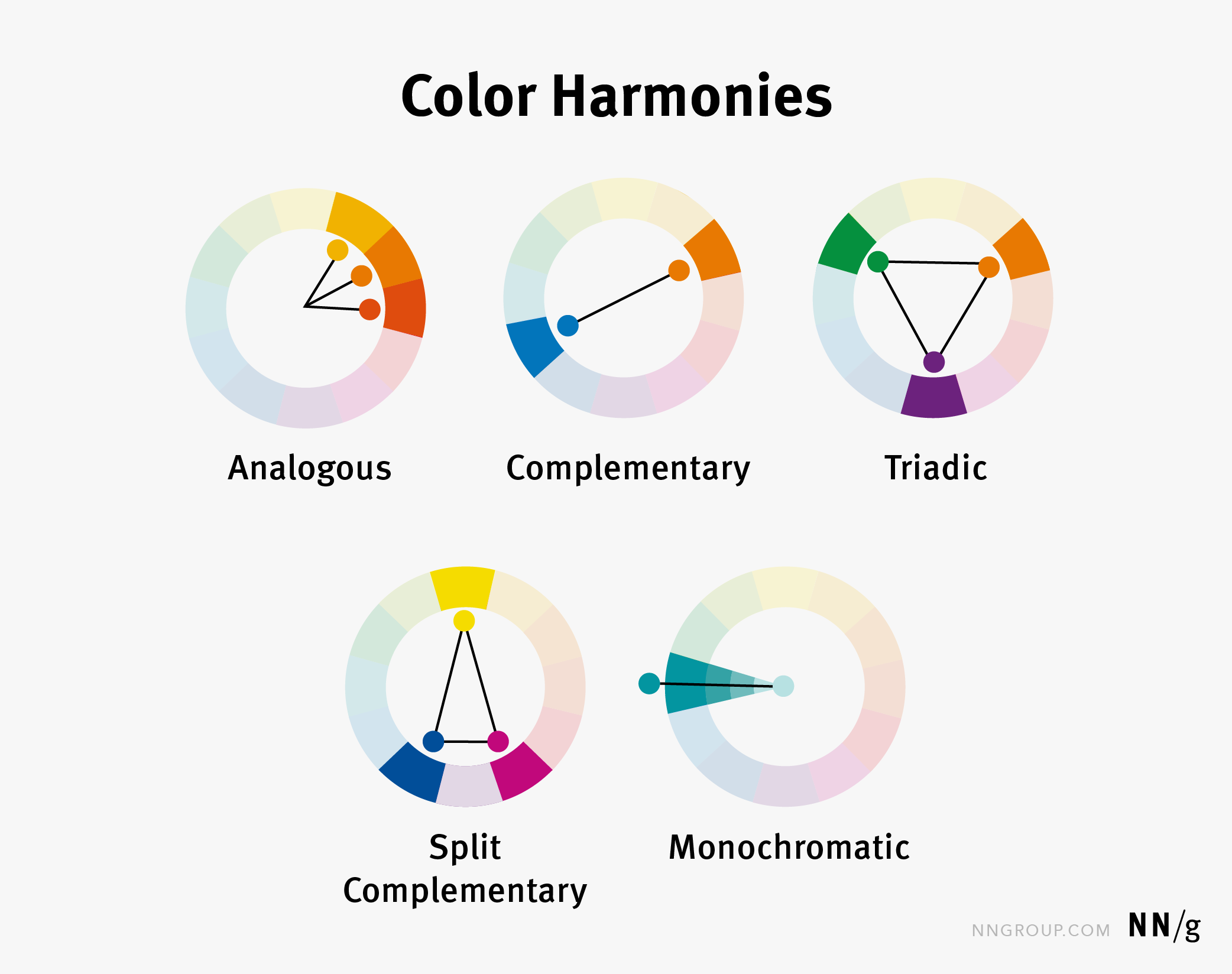
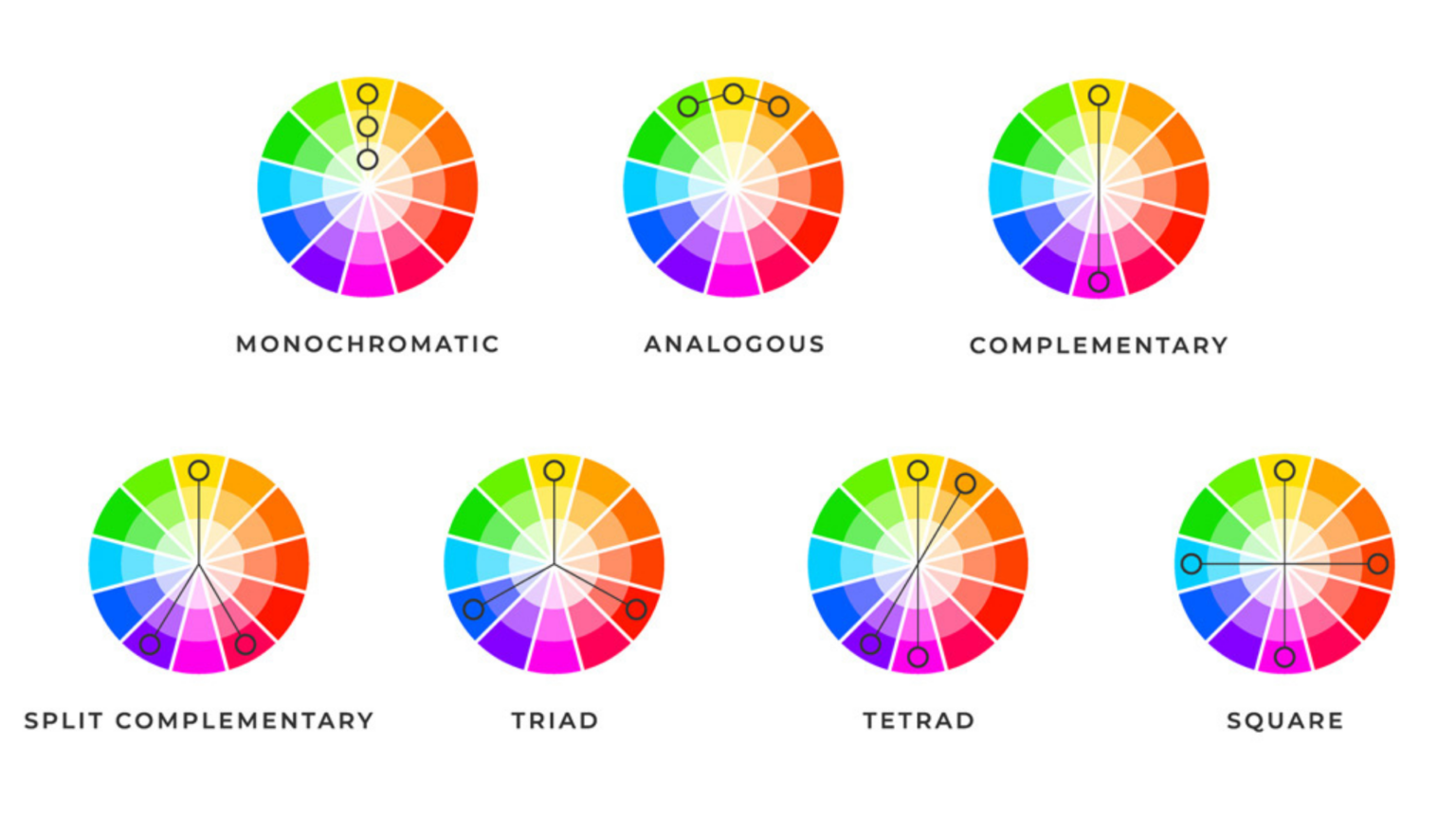
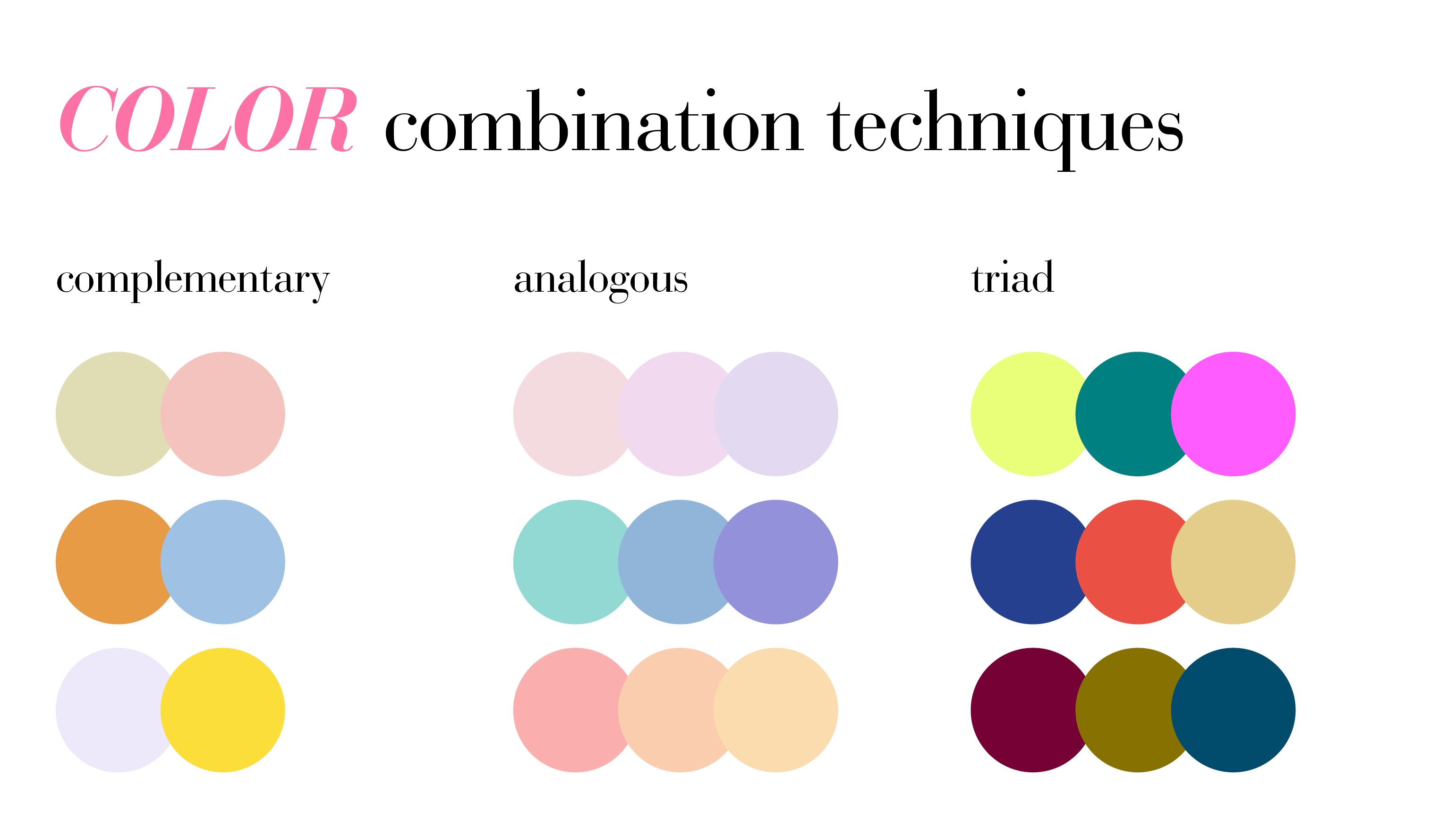
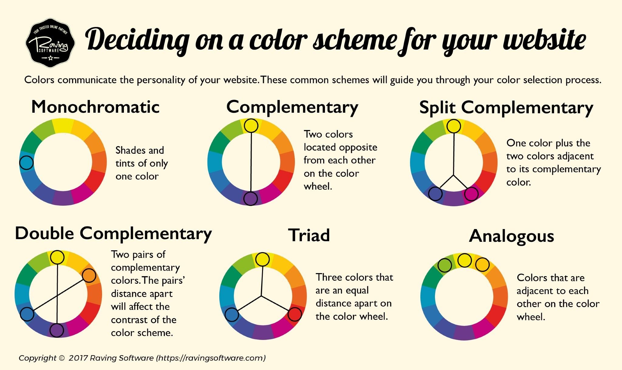
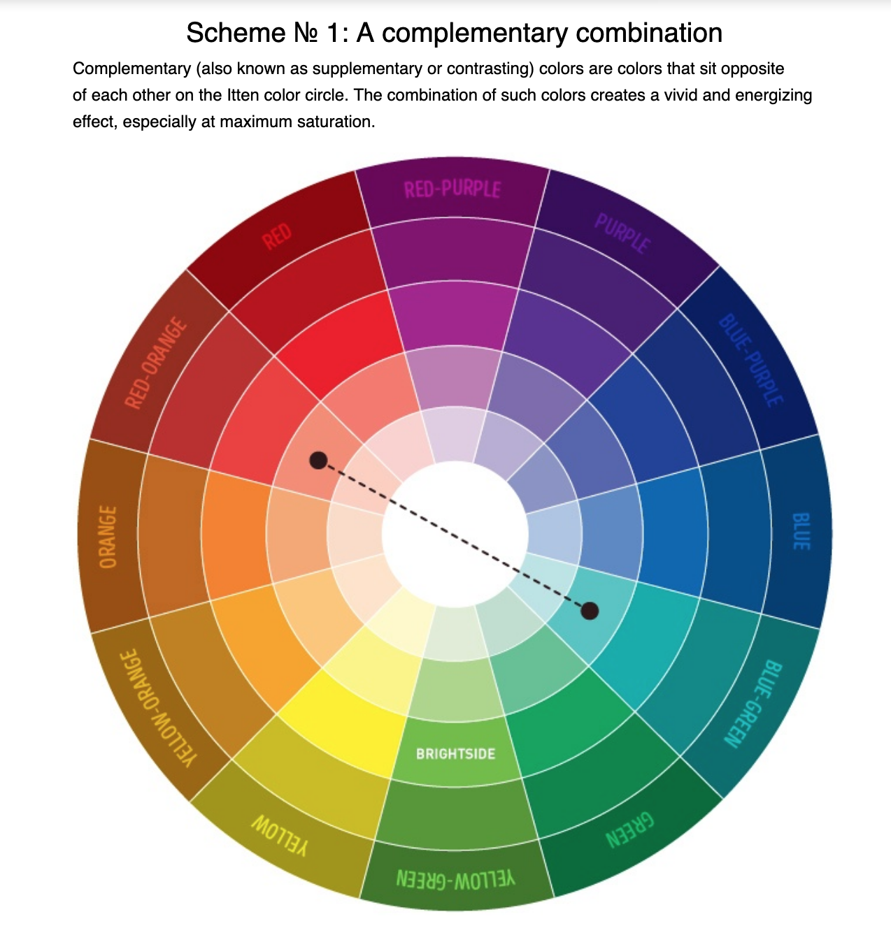
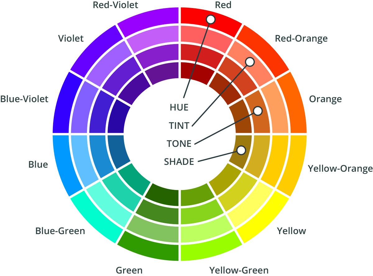
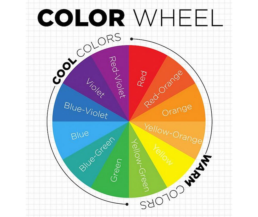
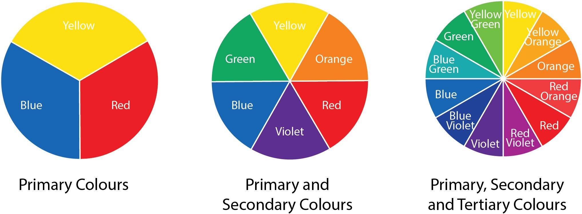
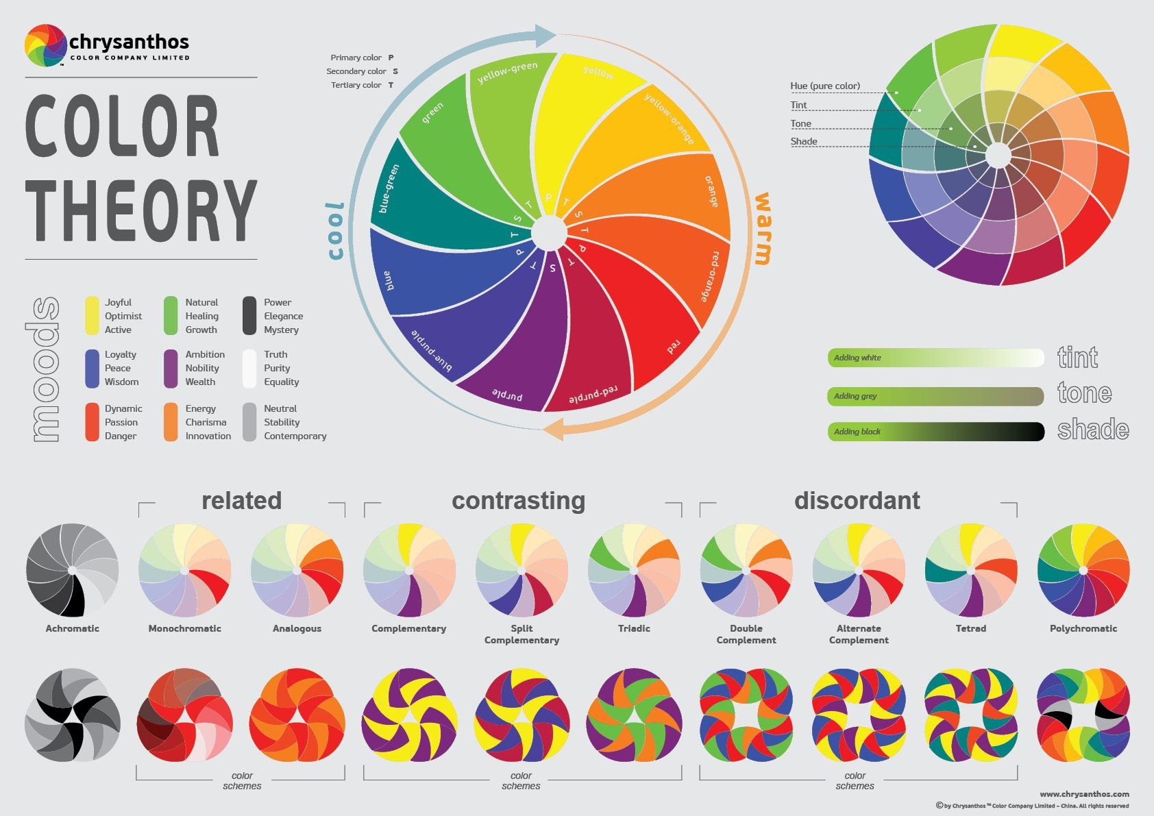
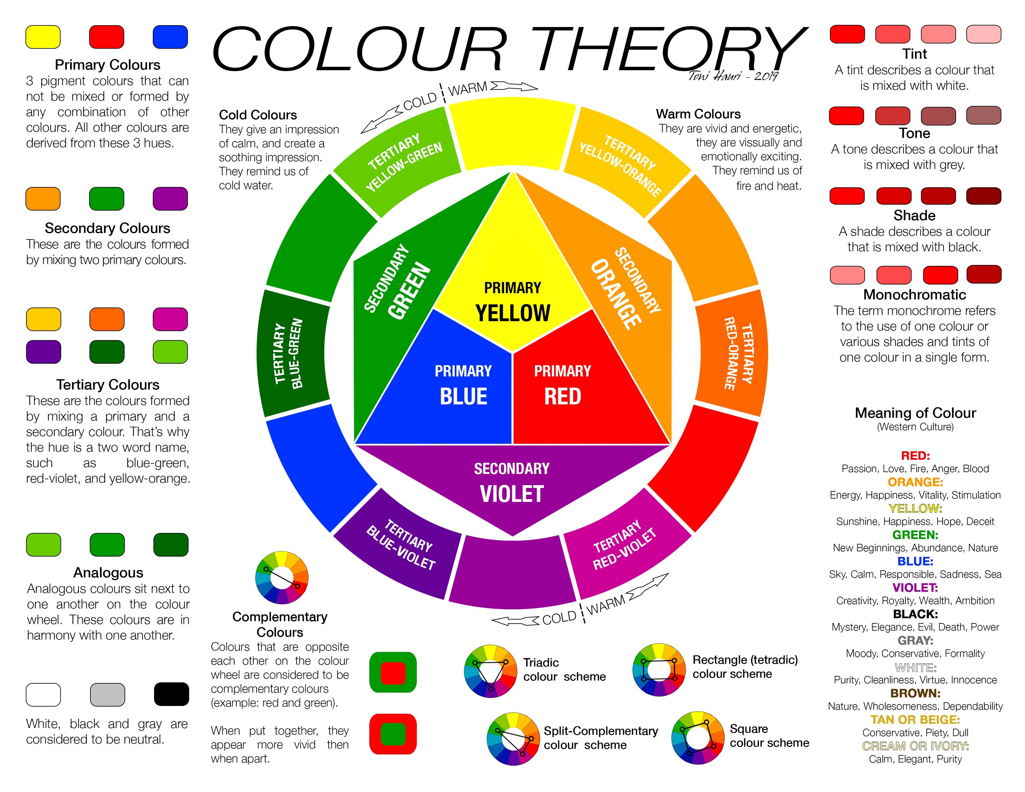
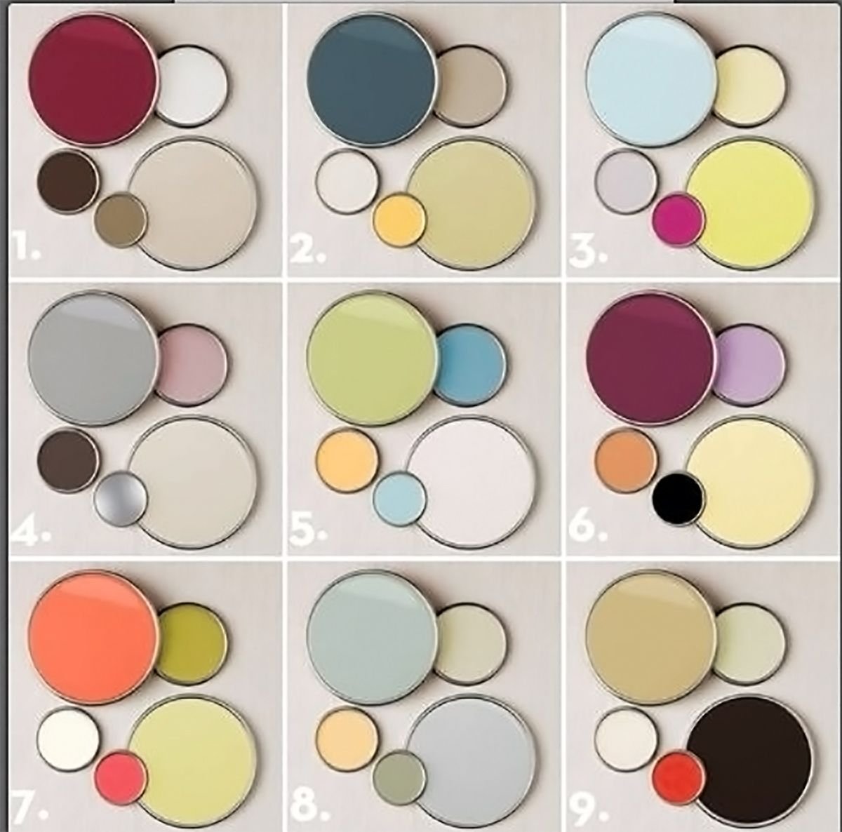
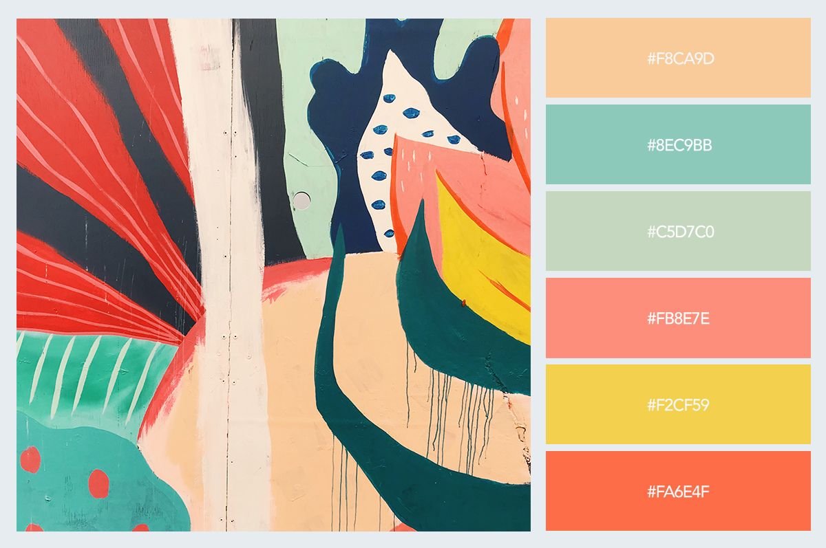
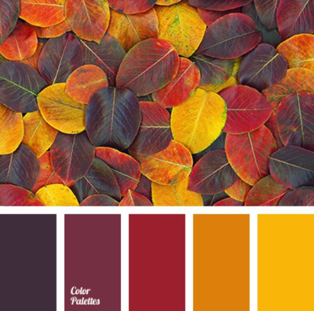
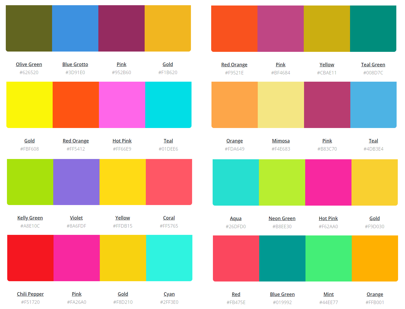
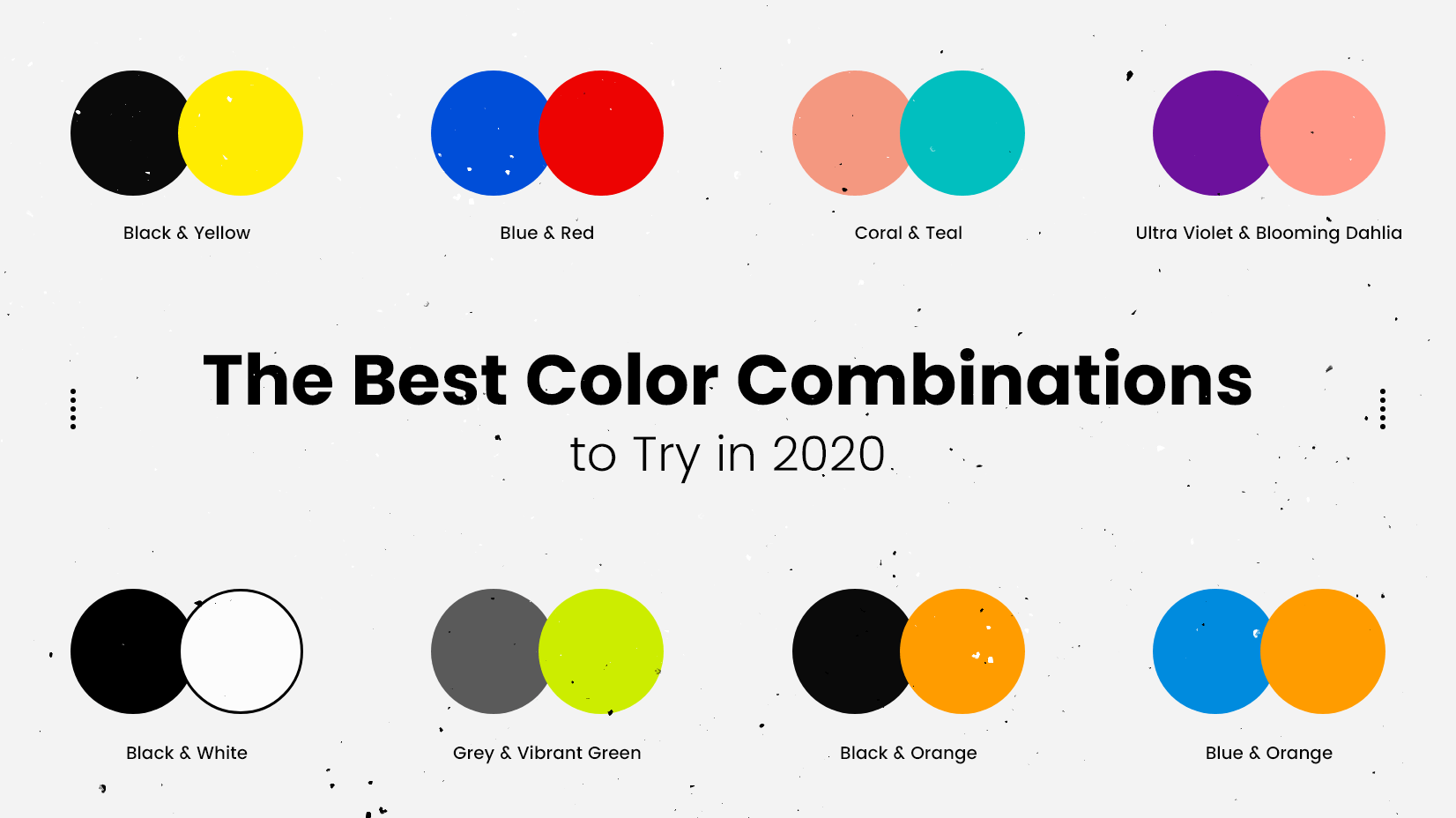
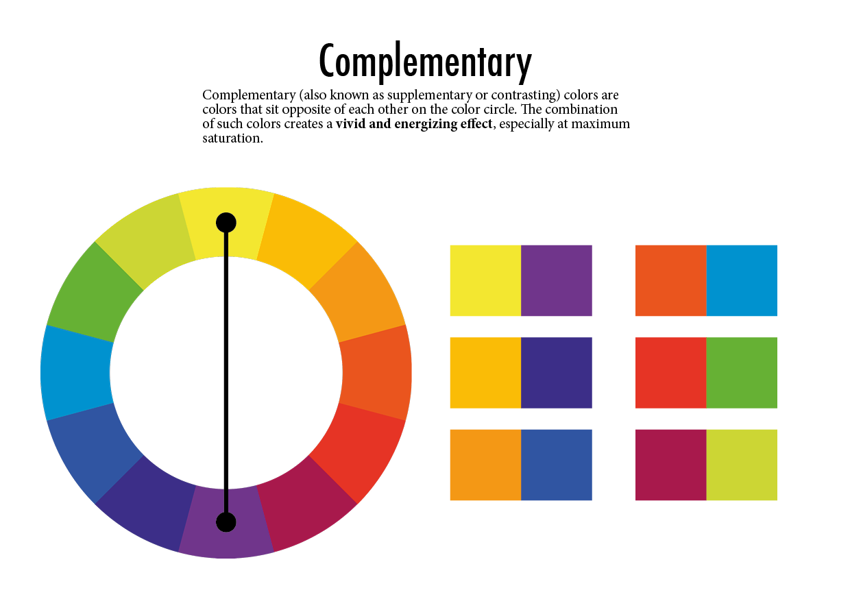
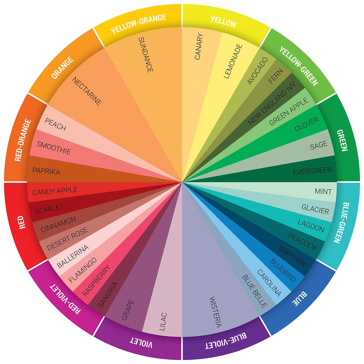
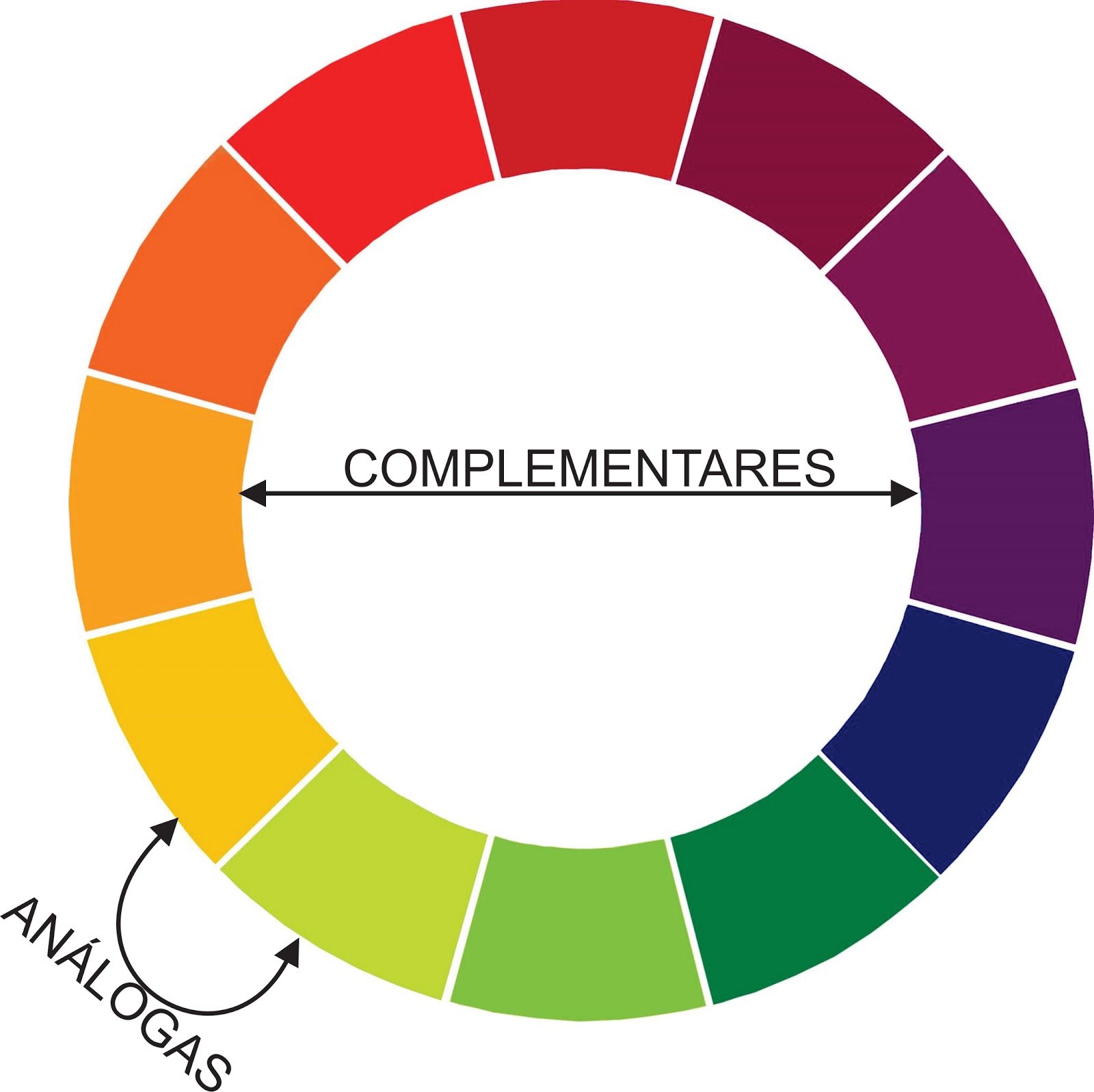
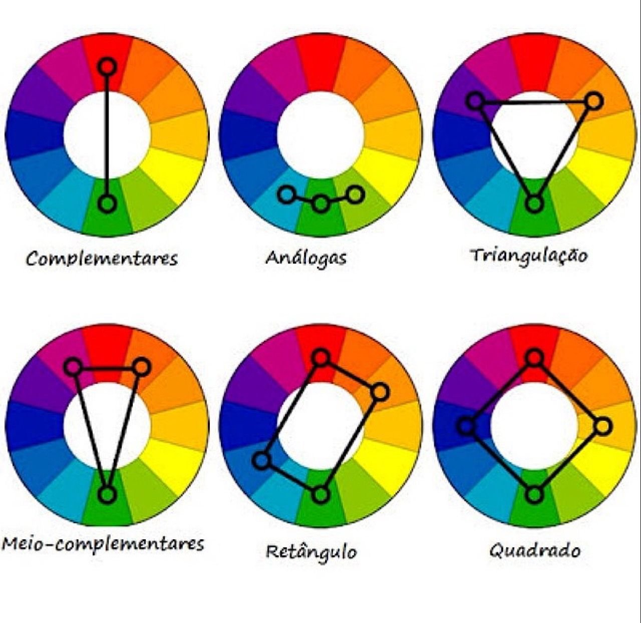
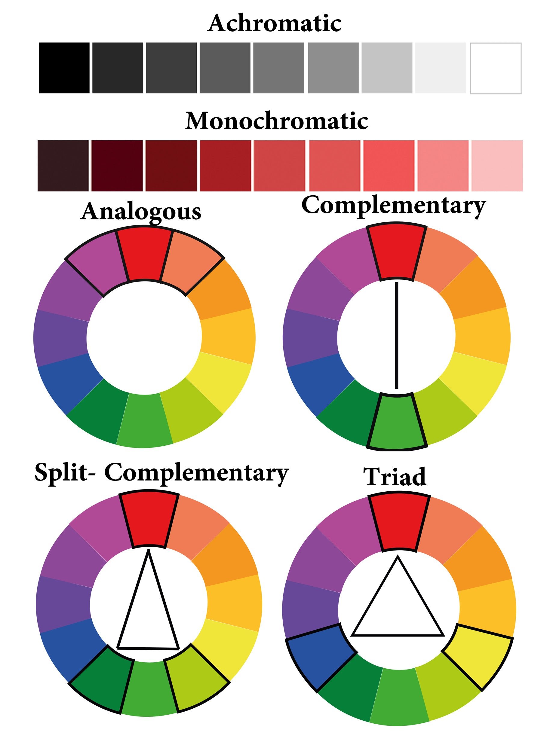
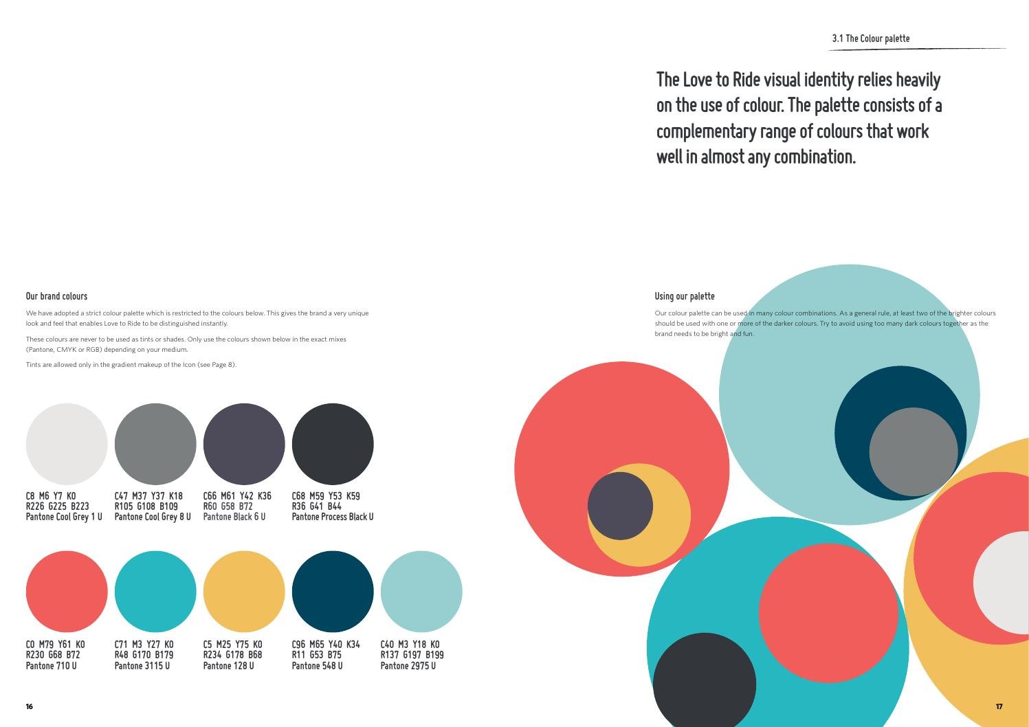
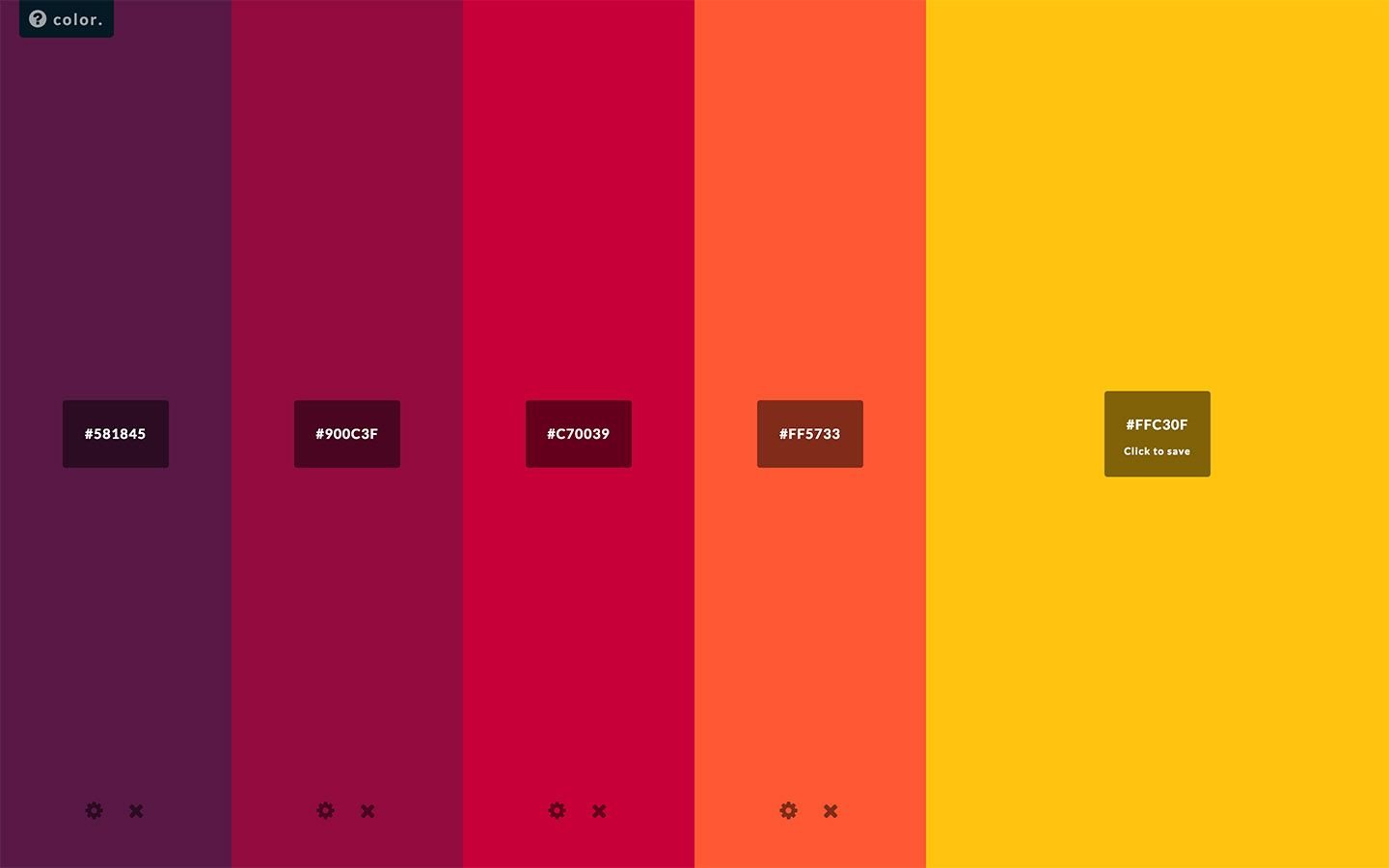
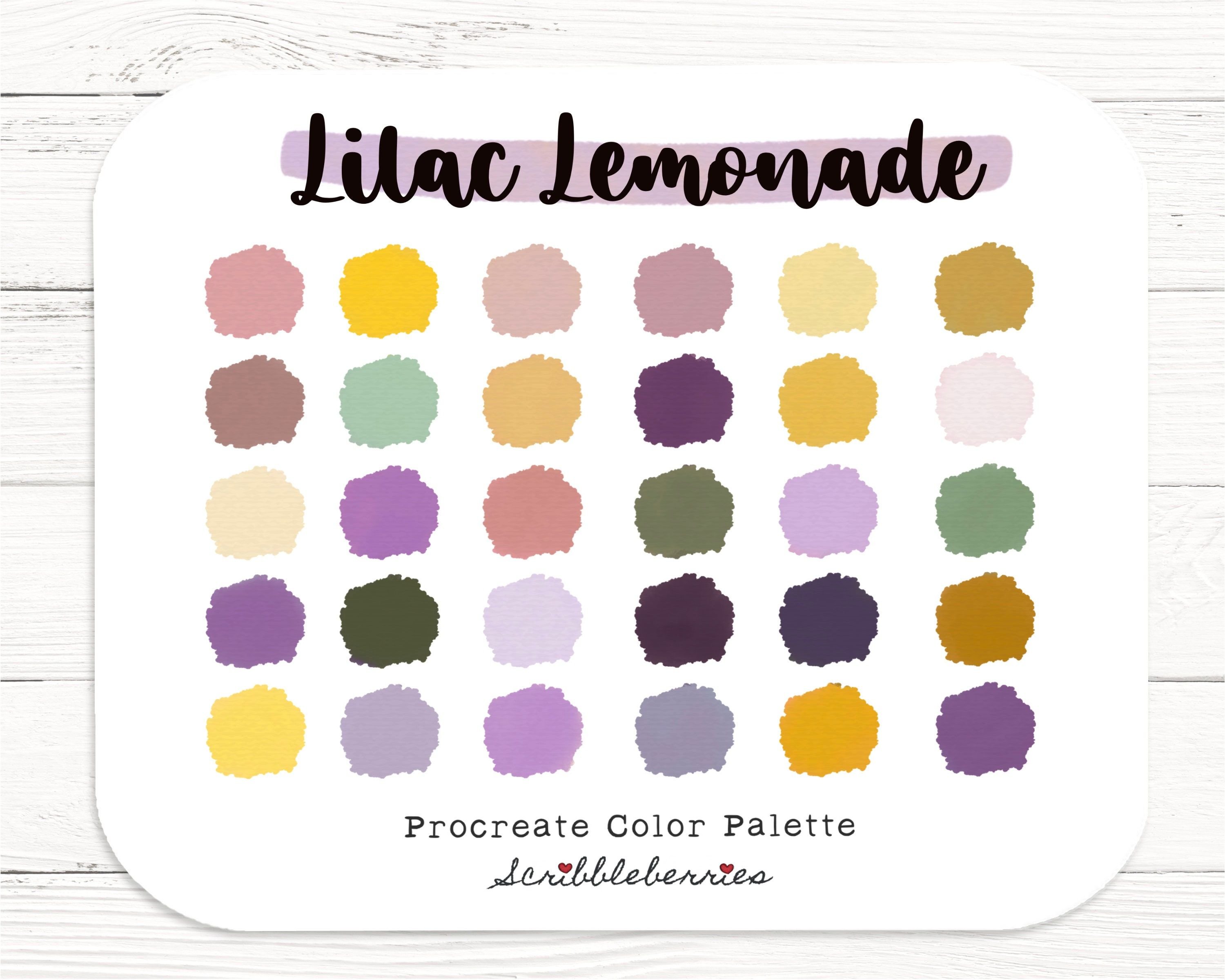
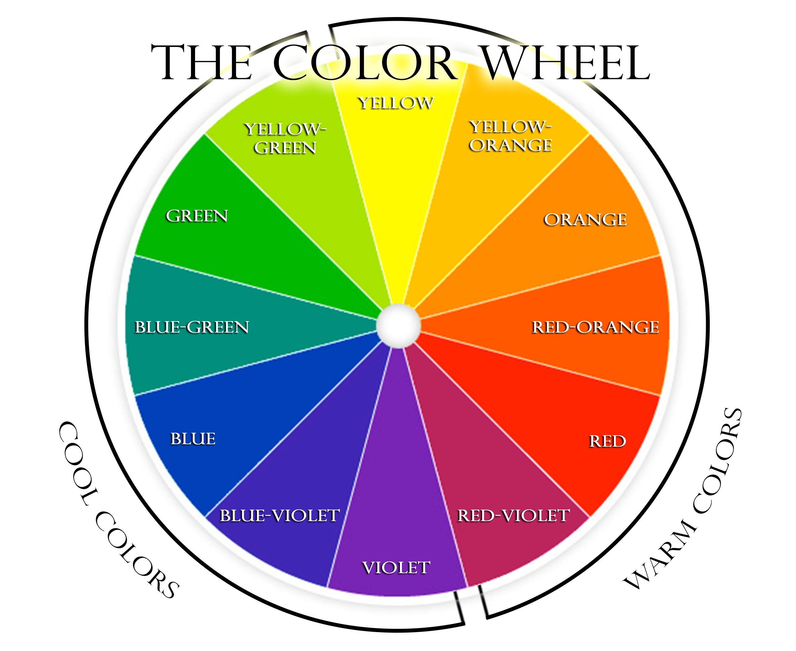
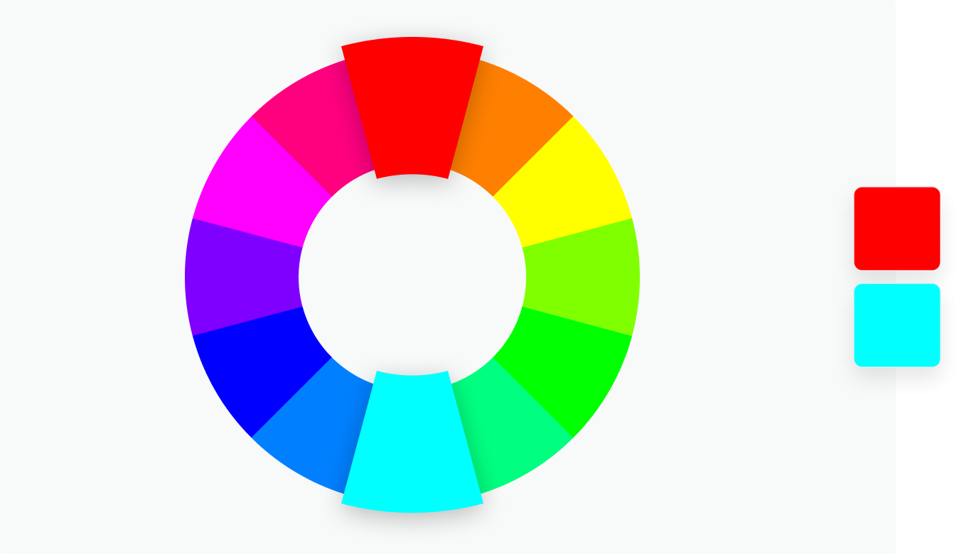
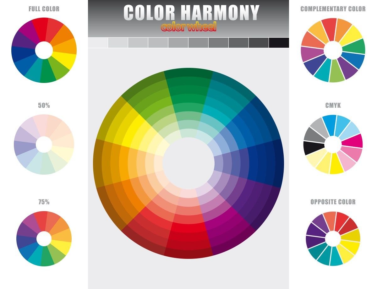
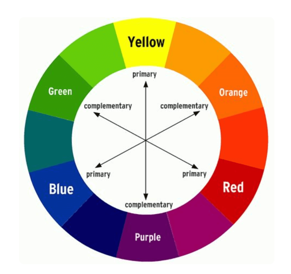
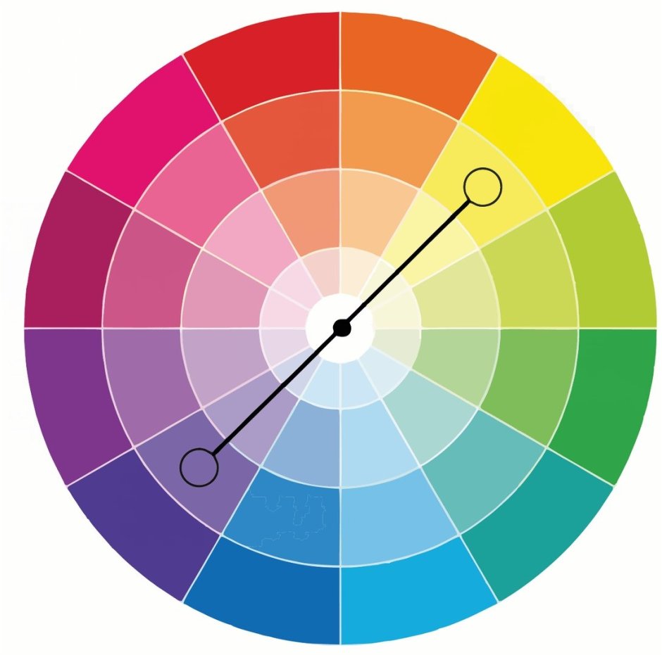
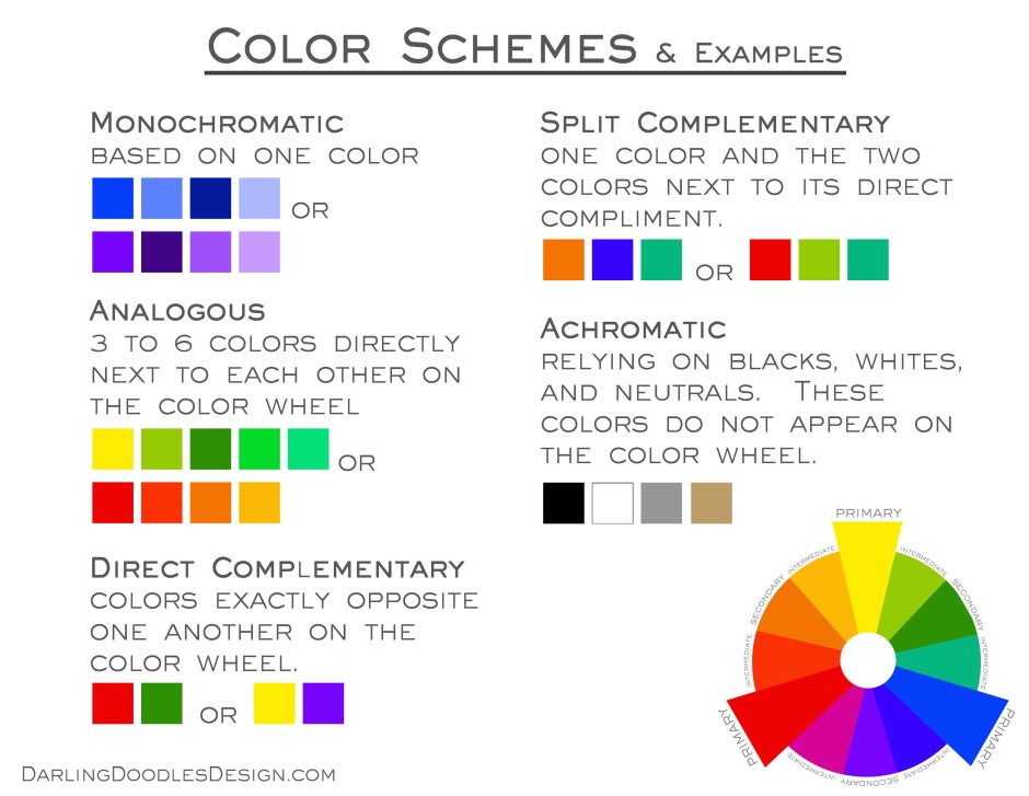
Complementary colours
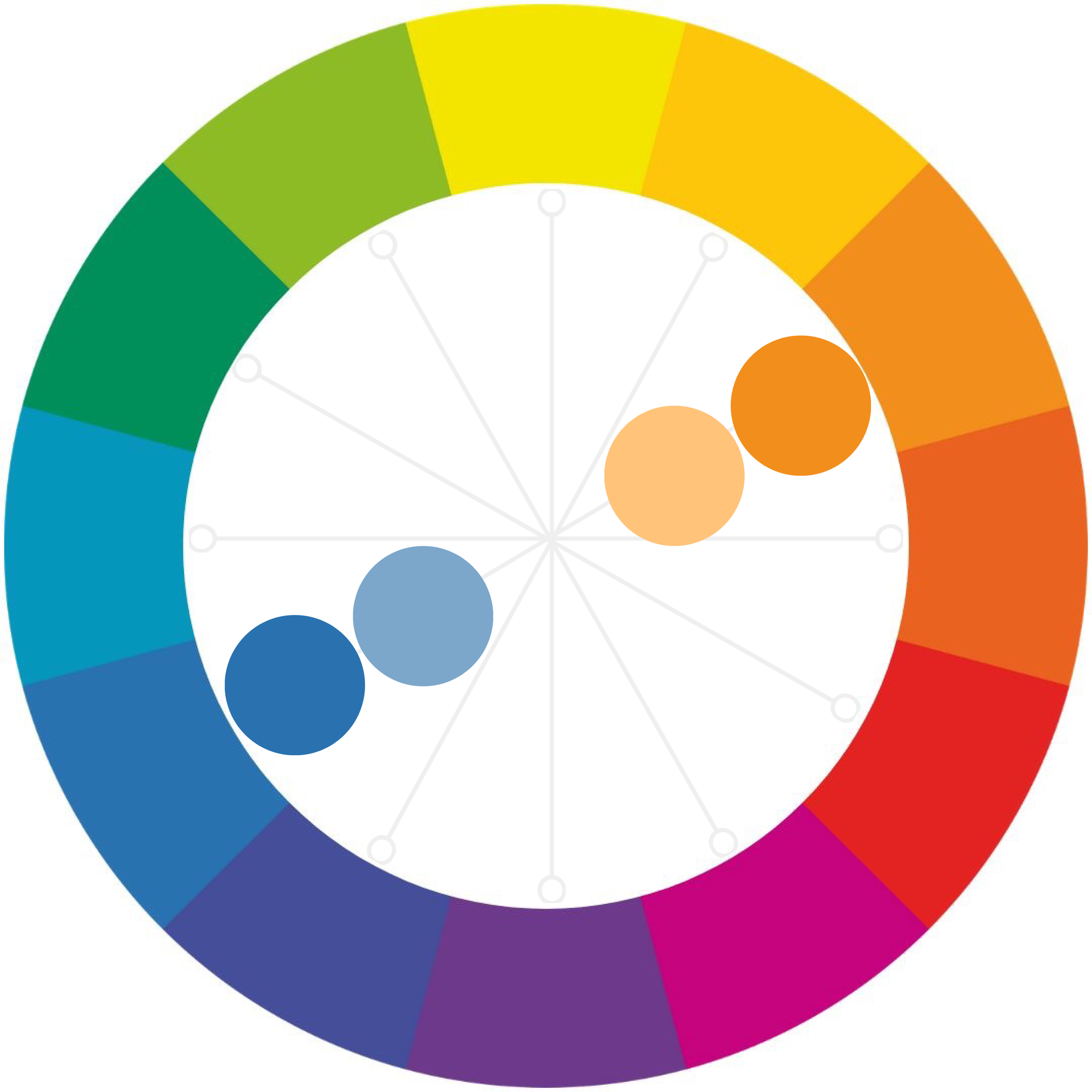
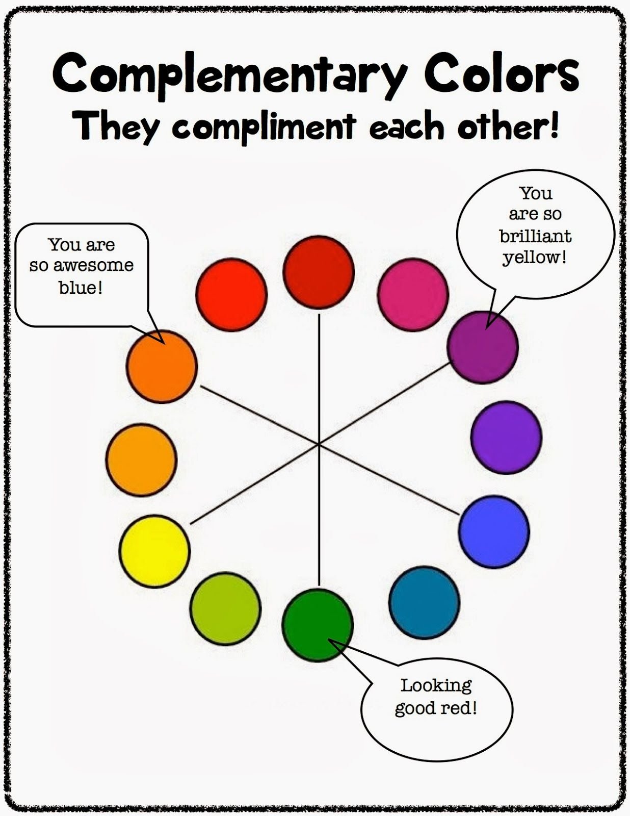
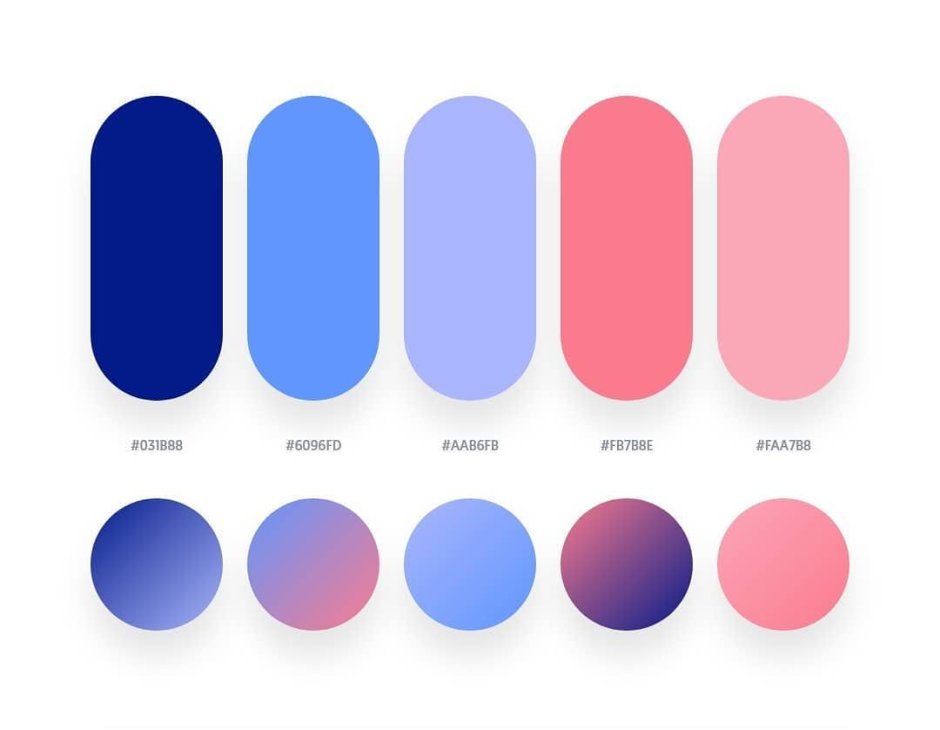
Complementary colors are pairs of colors that, when placed next to each other, create a striking visual contrast. These color combinations are known for their ability to create a harmonious and balanced effect in various design and artistic endeavors.
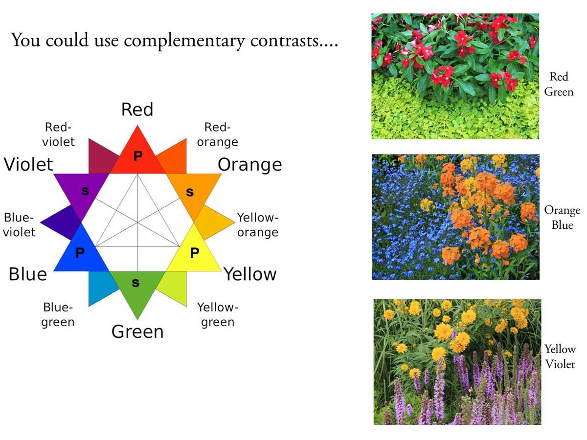
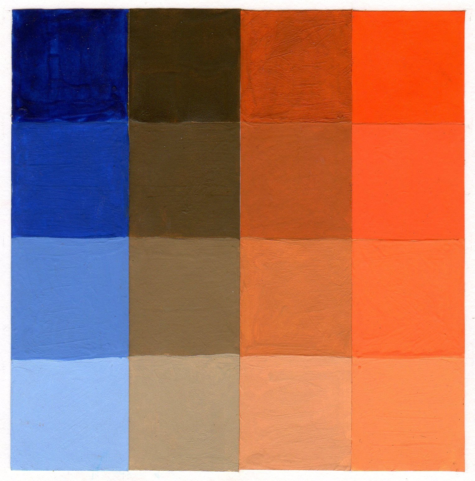
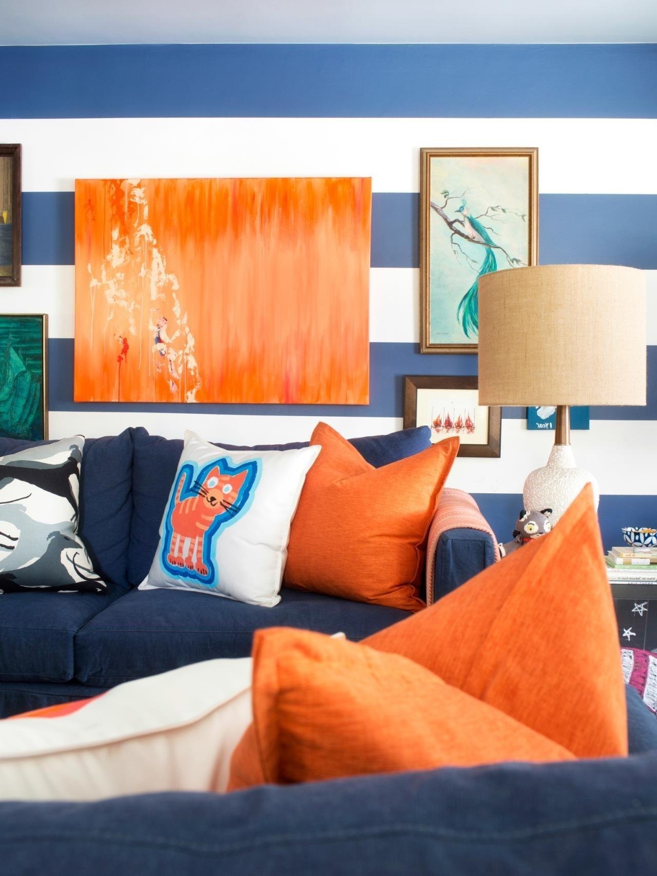
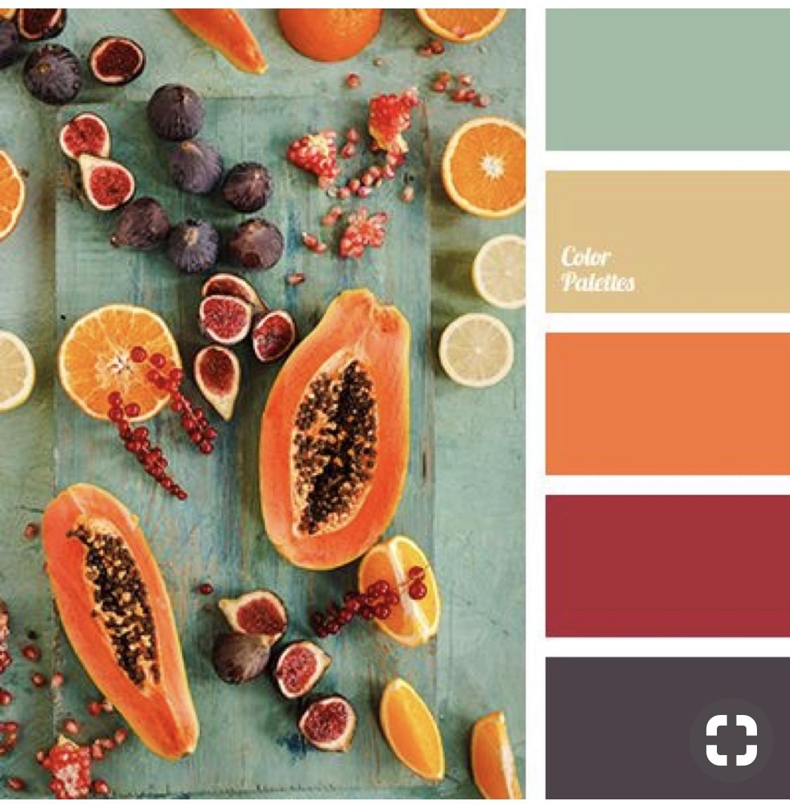
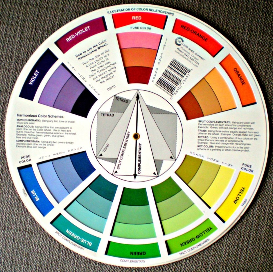
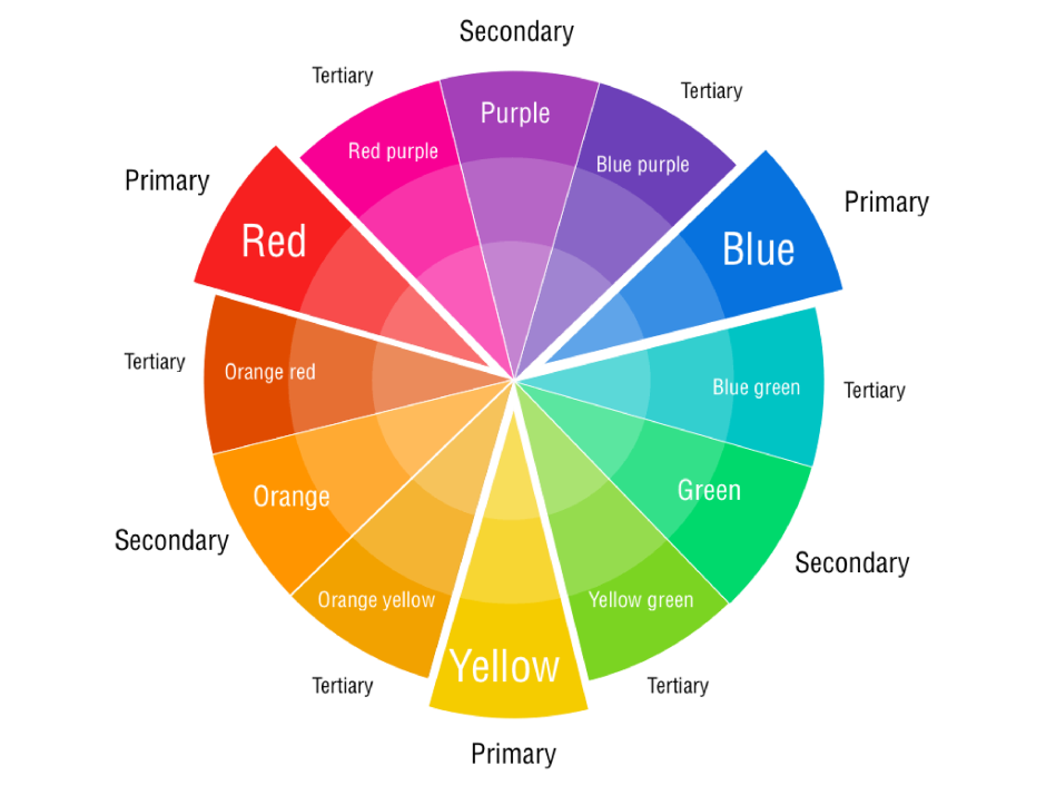
One classic example of complementary colors is red and green. These two colors sit opposite each other on the color wheel and when used together, they create a vibrant and eye-catching contrast. Another popular combination is blue and orange, which also creates an appealing visual impact.
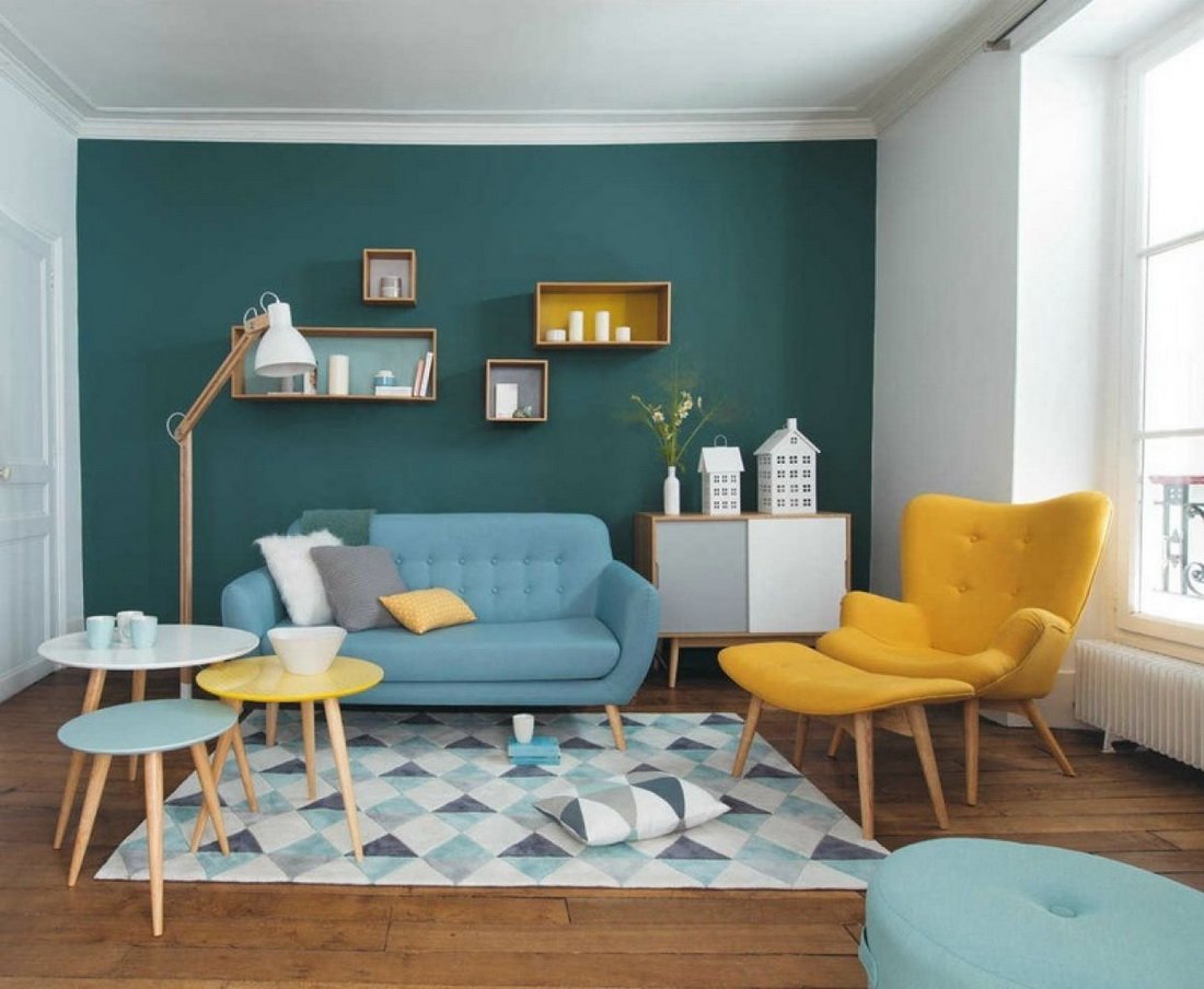
The concept of complementary colors is widely used in various fields such as interior design, fashion, graphic design, and even photography. By understanding how these colors work together, designers can effectively create visual interest and balance within their compositions.
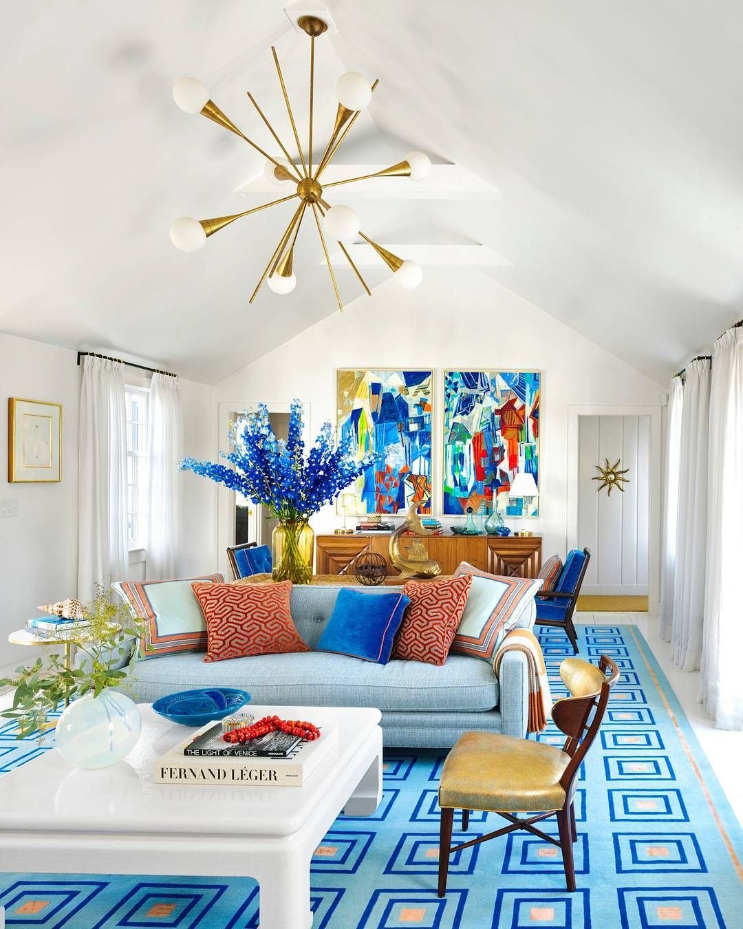
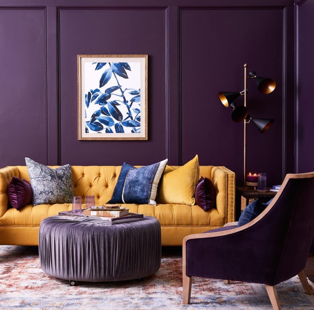
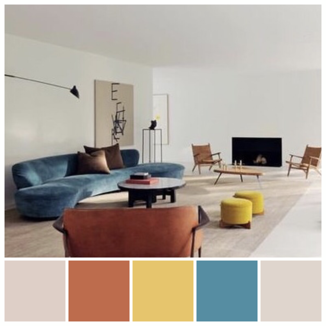
When it comes to interior design, complementary colors can be used to create a dynamic and energetic atmosphere. For instance, a room with predominantly blue elements can be complemented by orange accents, creating a sense of vibrancy and warmth.
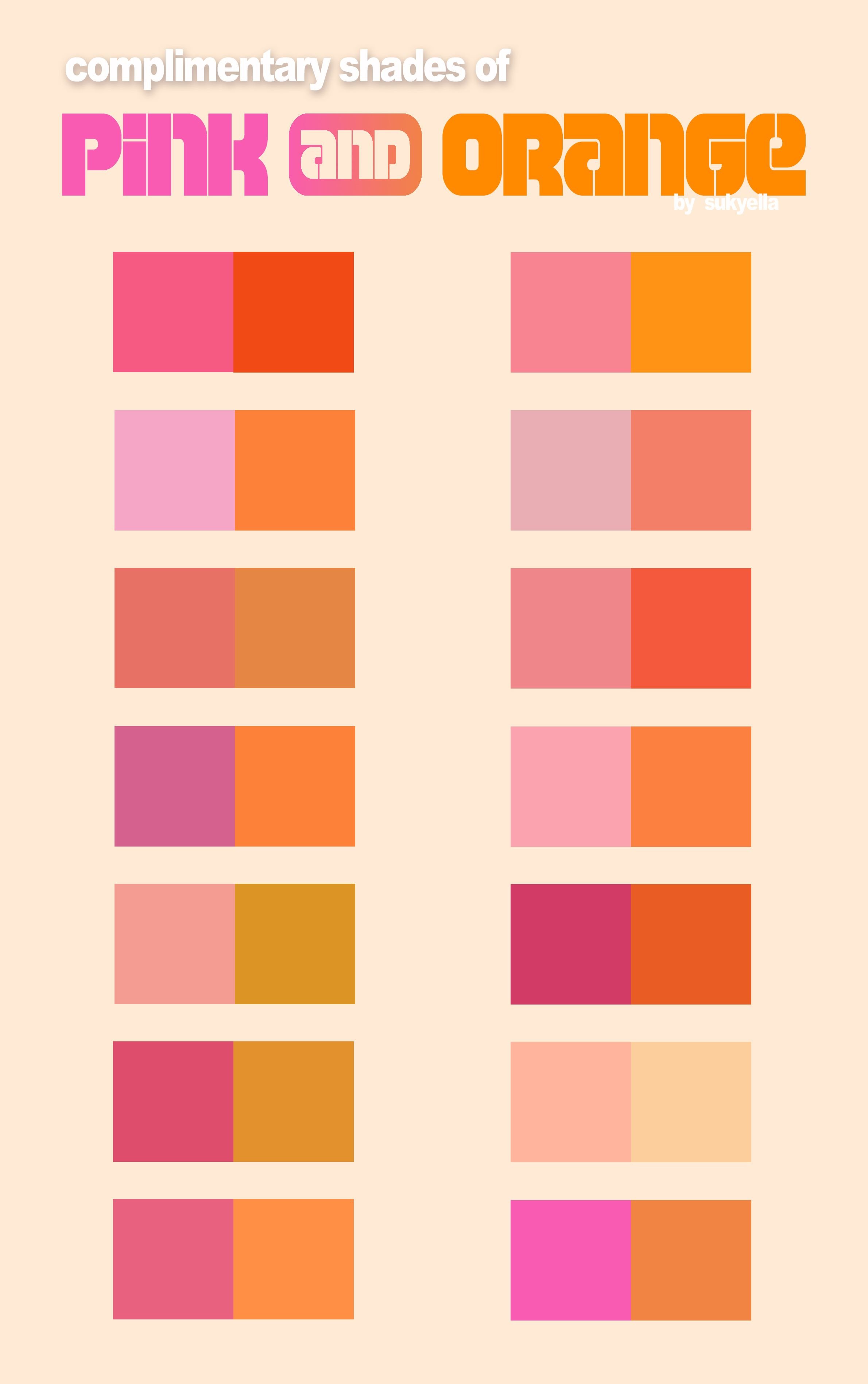
In fashion, complementary colors are often used to create bold and eye-catching outfits. Pairing a garment in one primary color with accessories or details in its complementary color can make a powerful and visually striking statement.
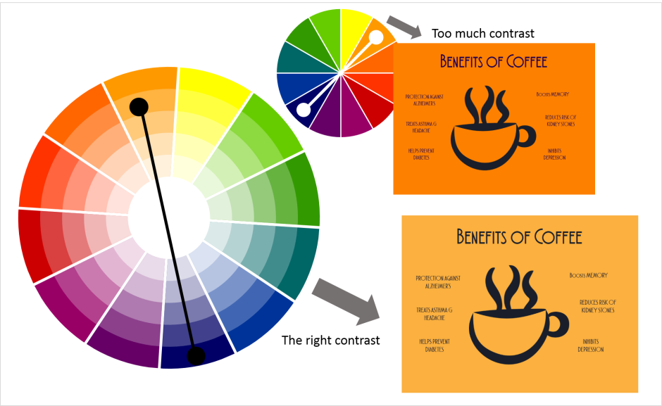
Graphic designers frequently employ complementary colors in their work to create visually appealing compositions. The contrasting nature of these colors helps to draw attention to specific elements or create a sense of depth and balance in the overall design.
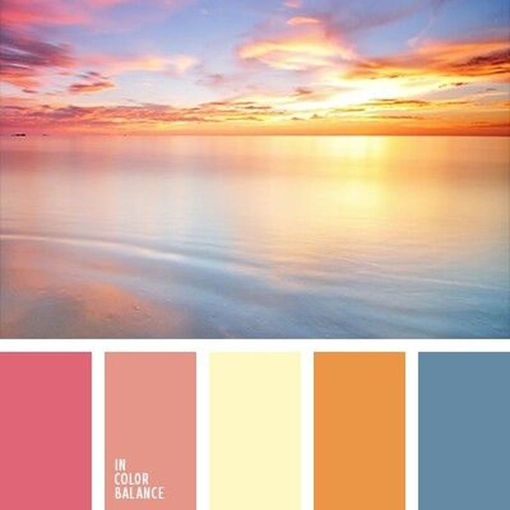
Photographers also take advantage of complementary colors to enhance their images. By placing subjects against backgrounds or environments with complementary hues, they can create captivating and visually pleasing photographs that effortlessly catch the viewer's eye.
Overall, complementary colors offer a versatile tool for designers and artists to create visually stunning and impactful compositions. Whether it's in interior design, fashion, graphic design, or photography, understanding how these colors work together can truly elevate the visual experience. So, consider incorporating complementary colors into your next creative project and watch as the colors come alive!