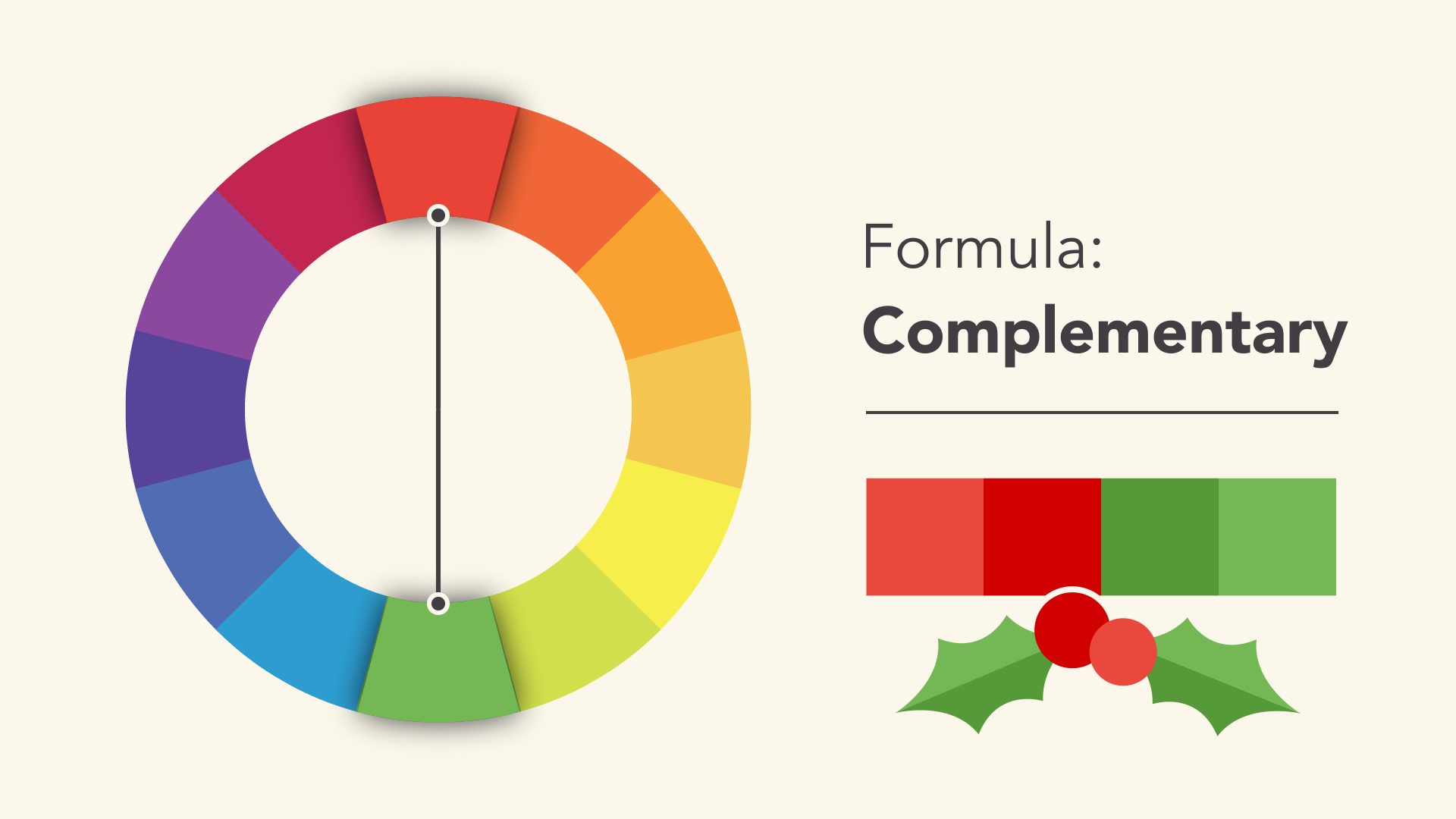
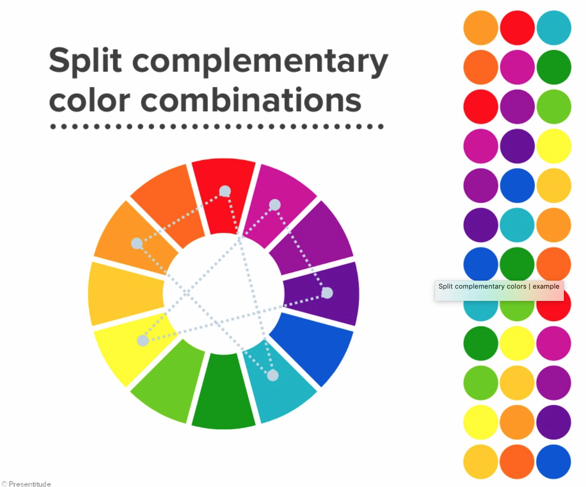
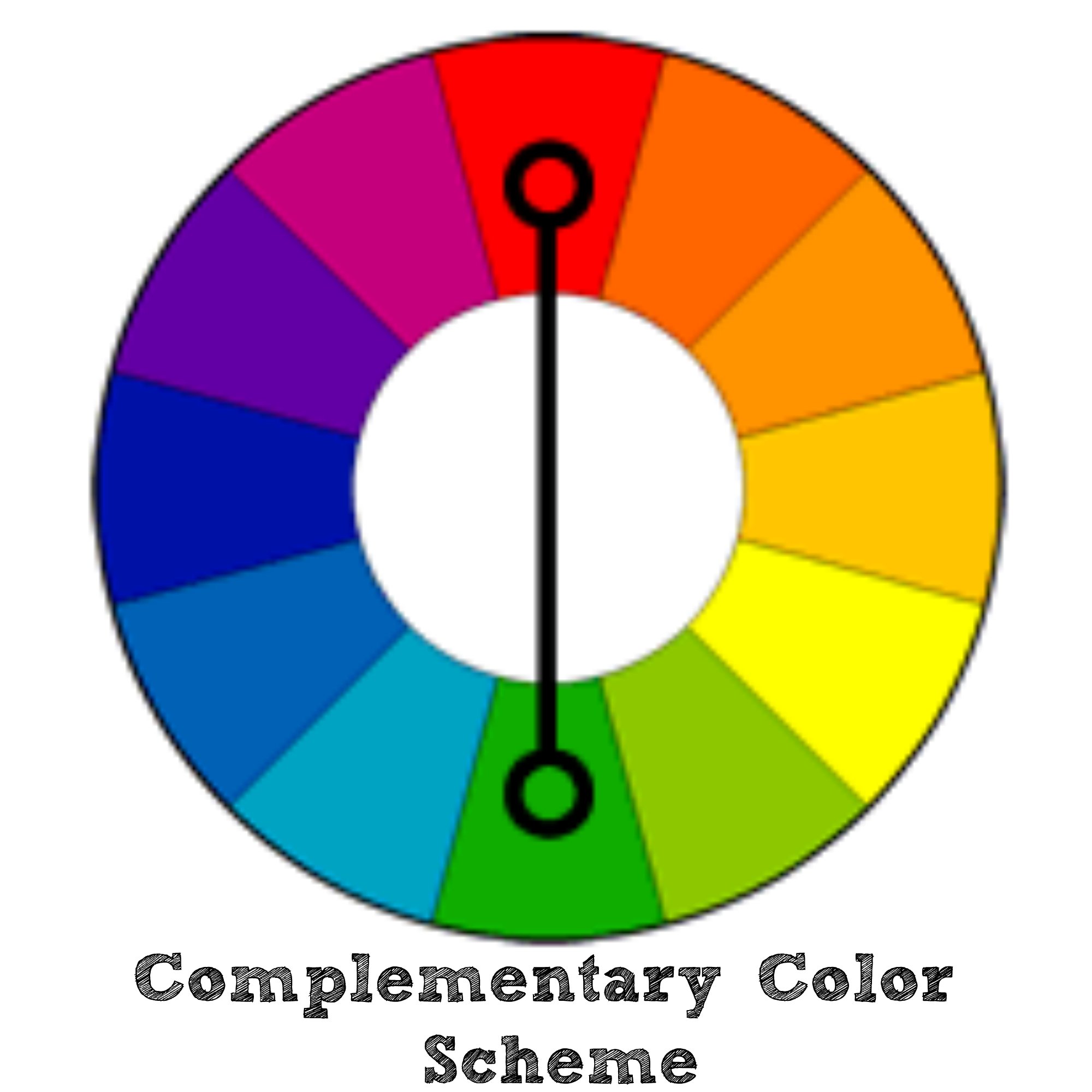
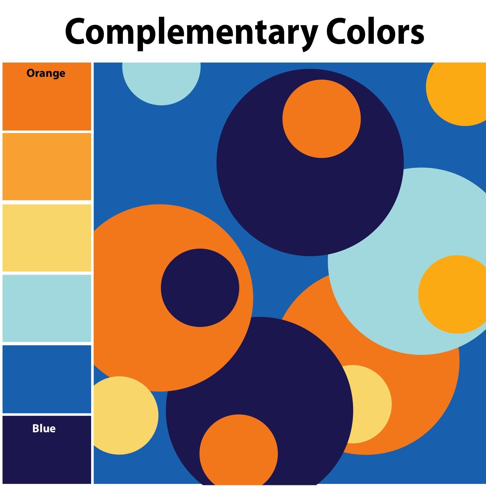
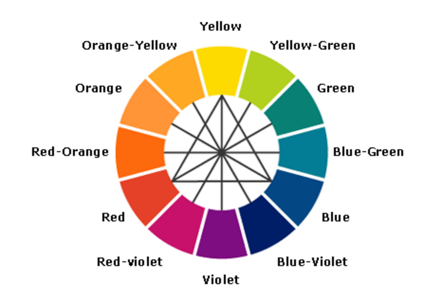
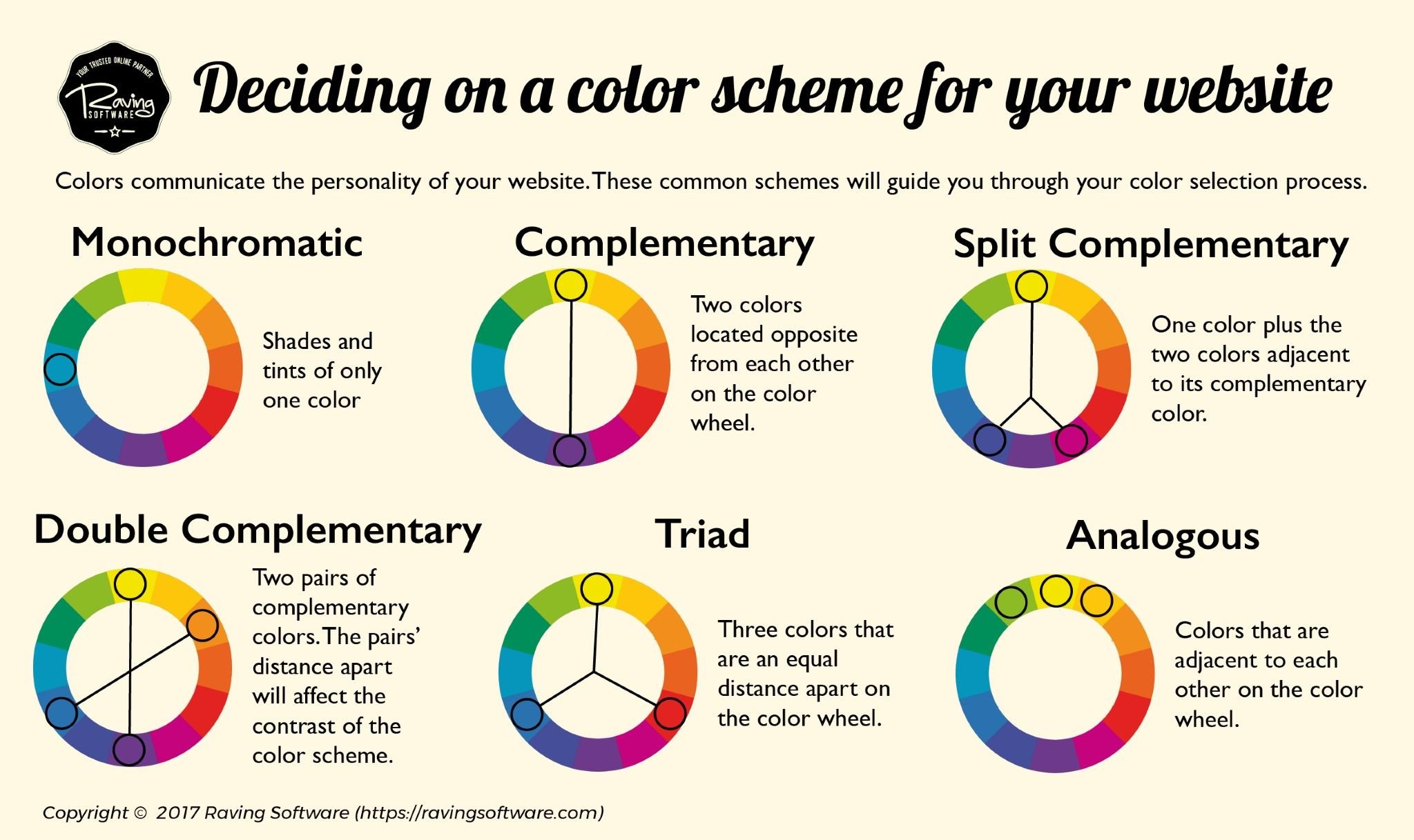
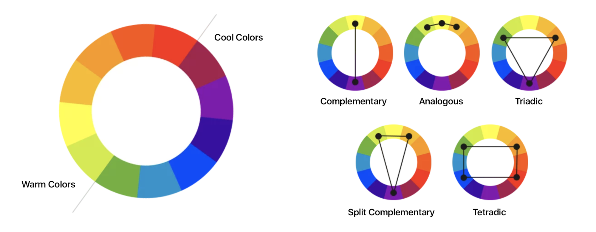
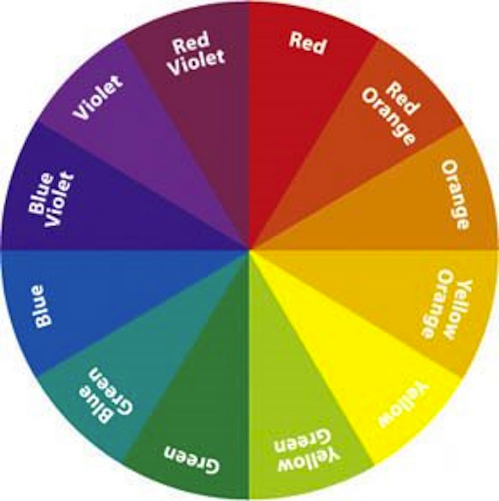
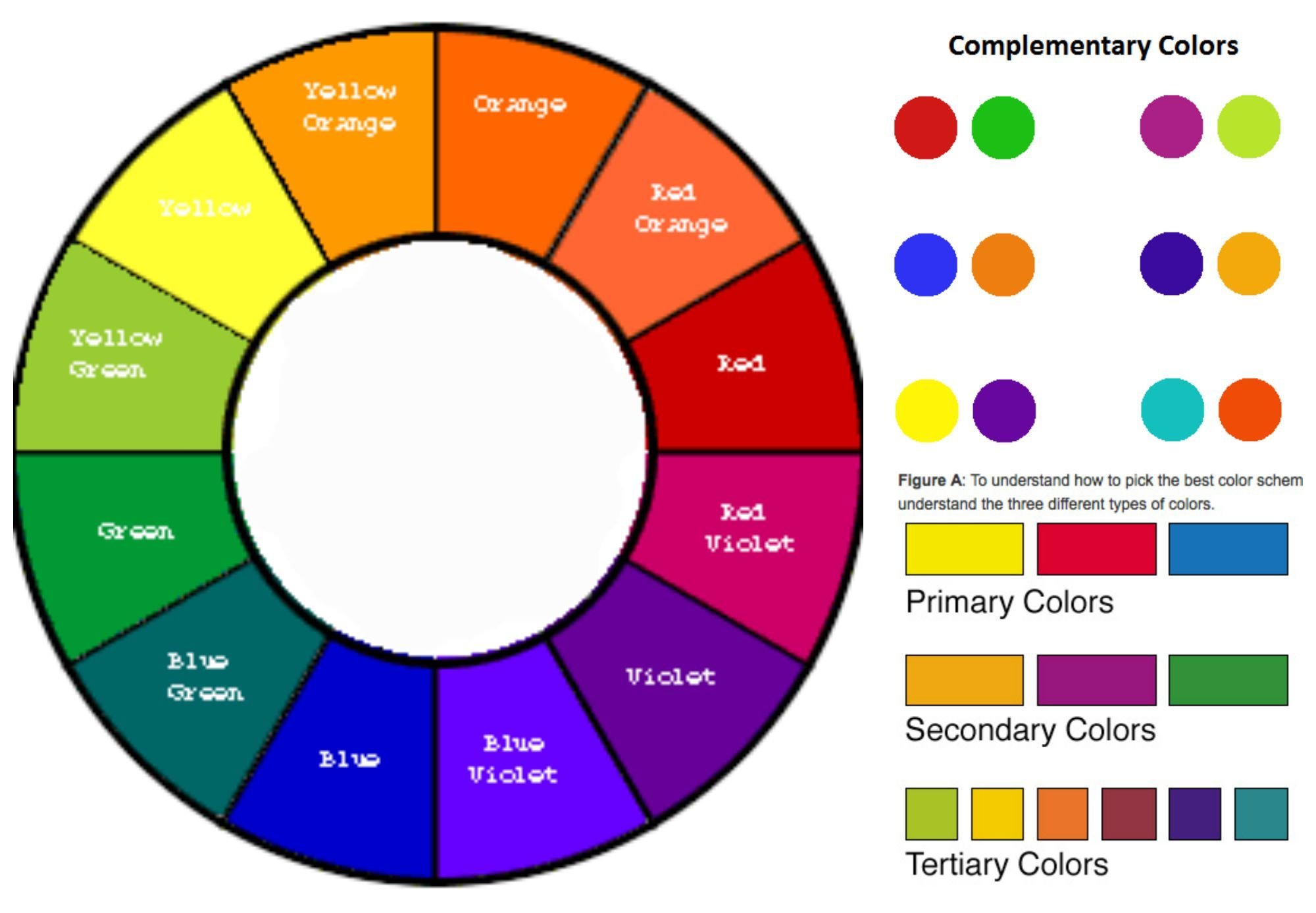
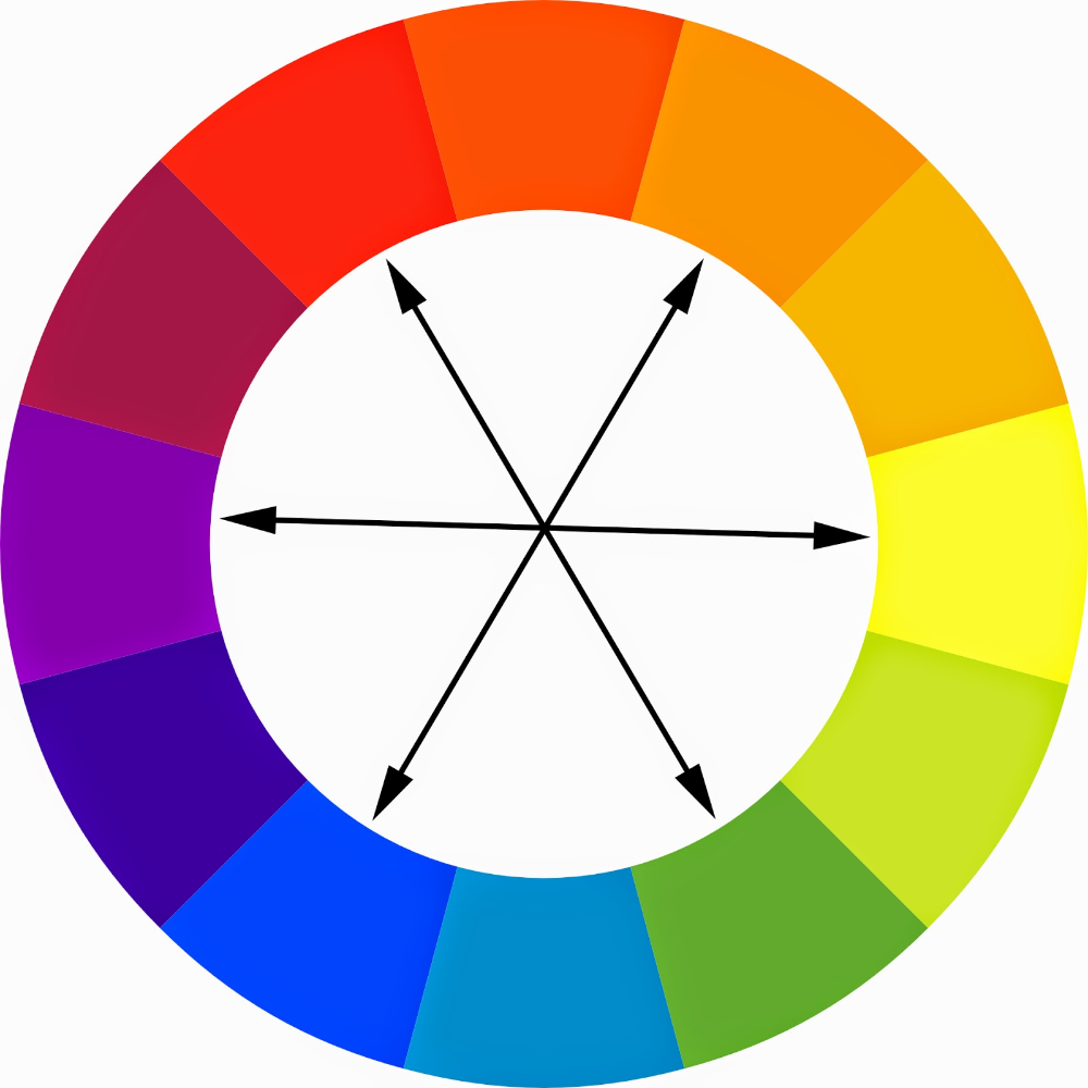
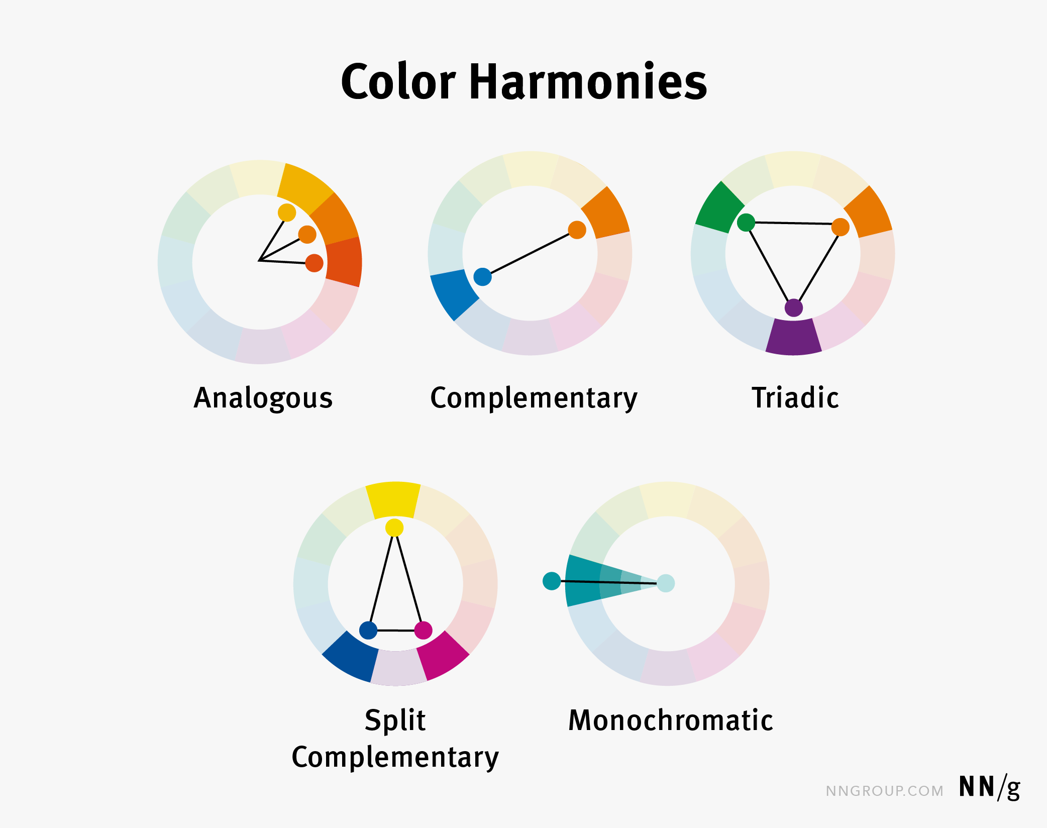
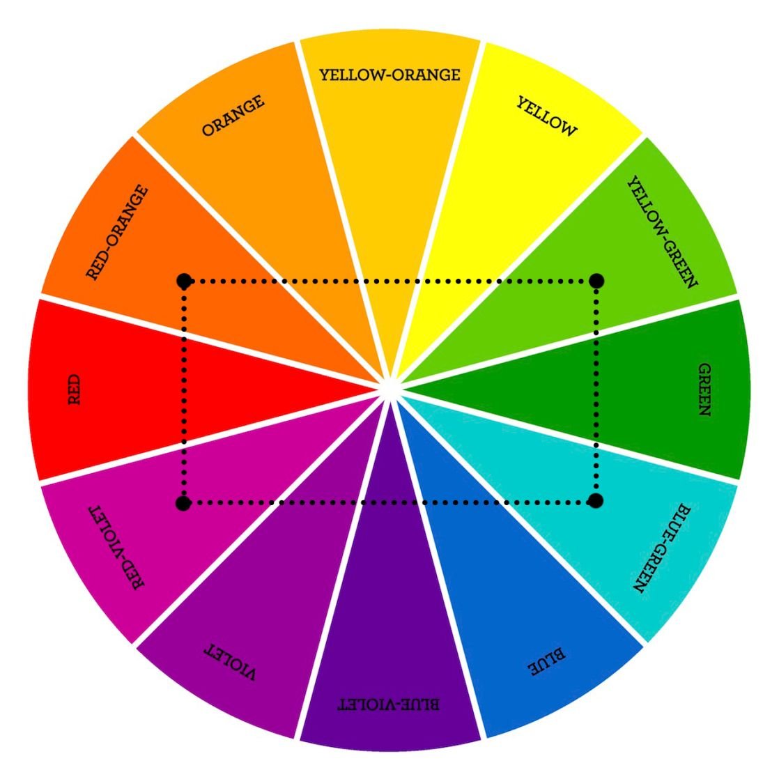
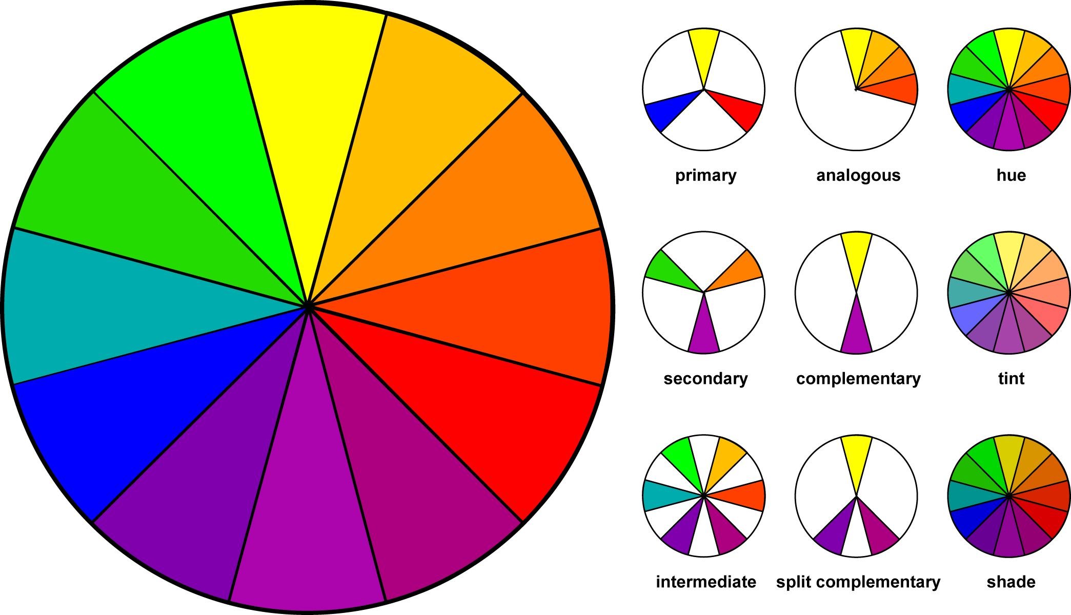
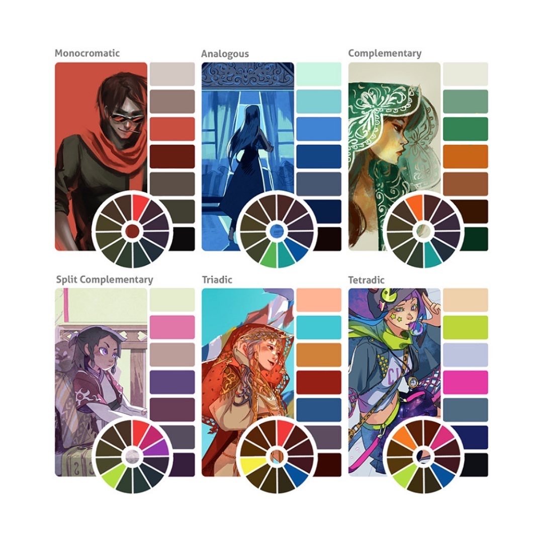
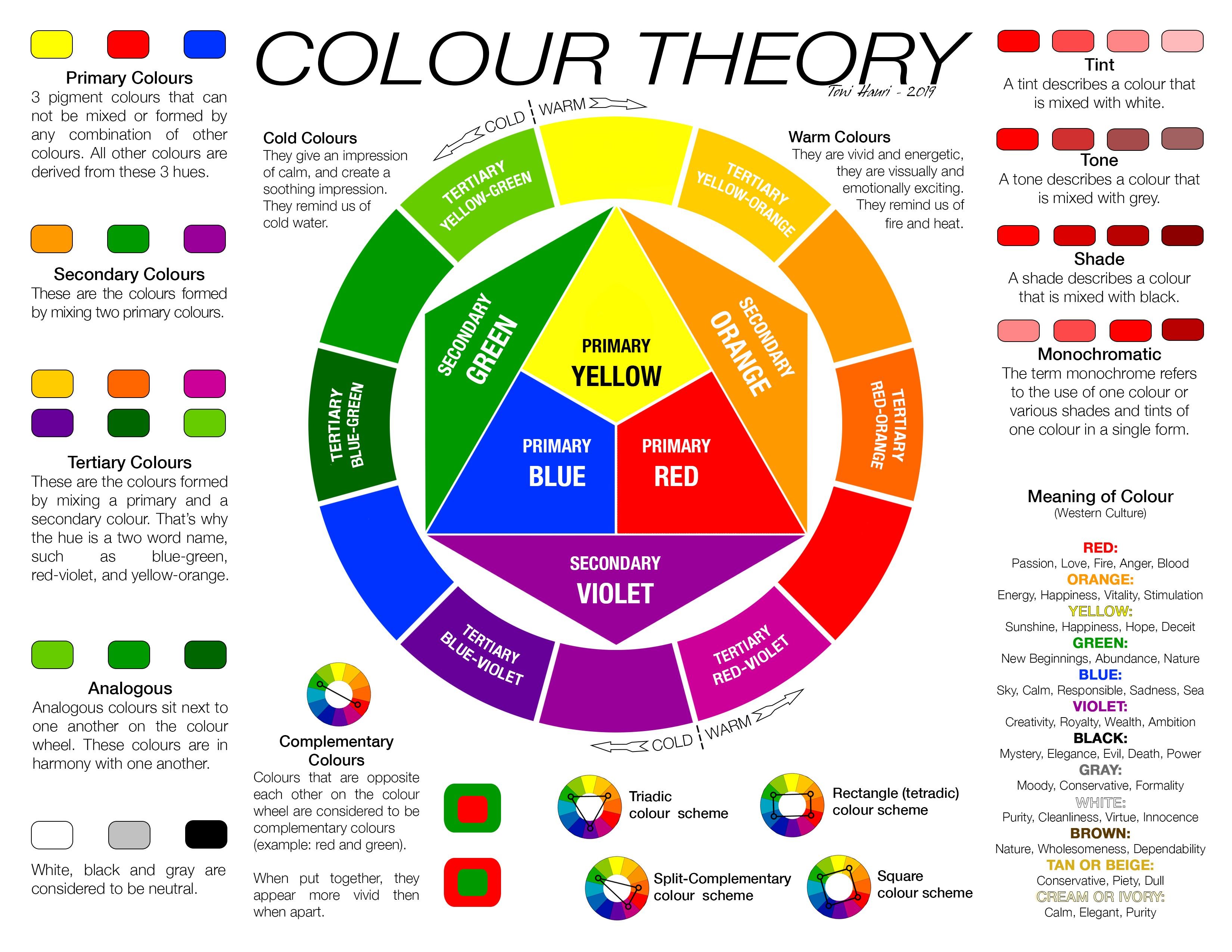
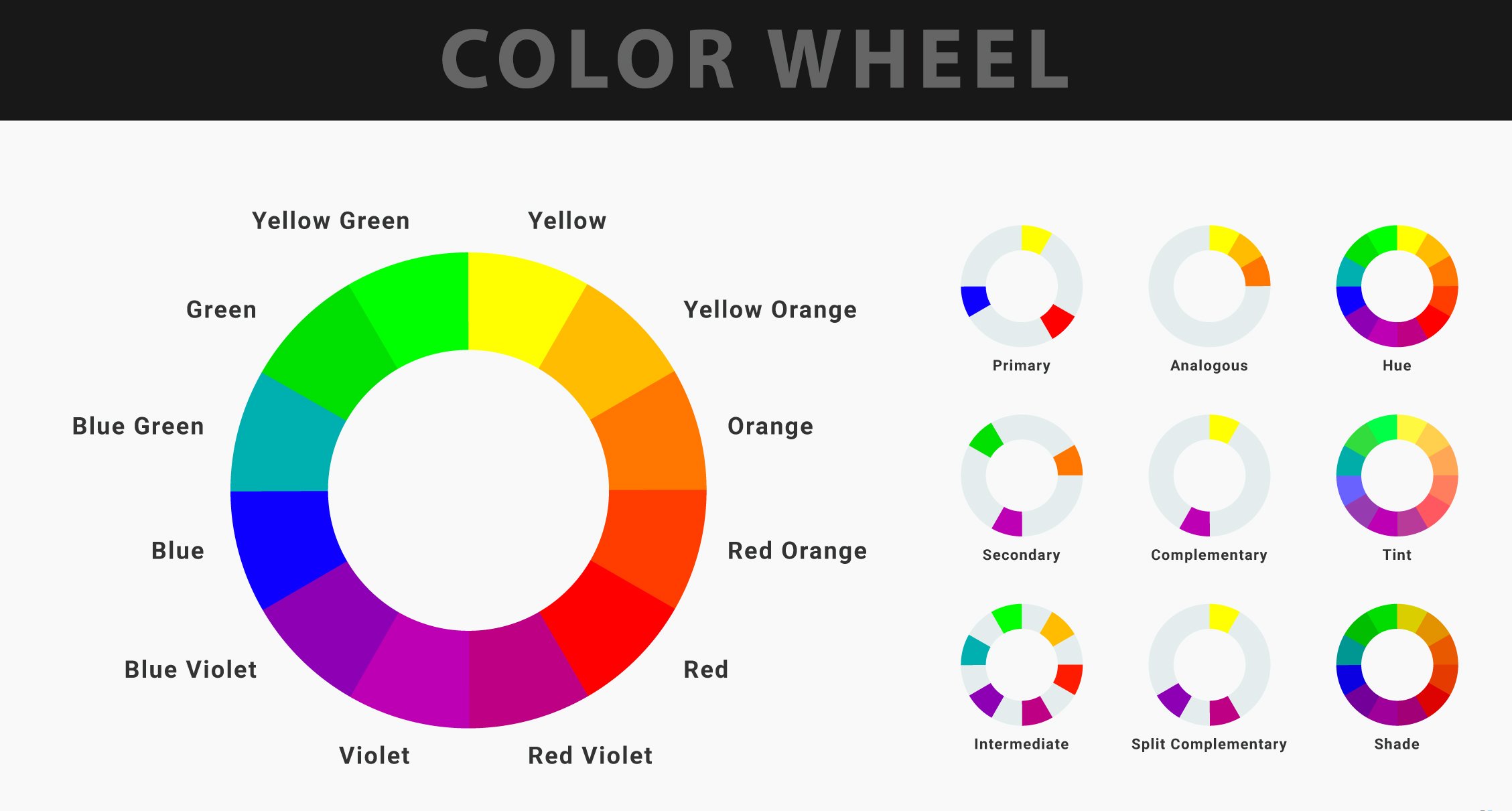
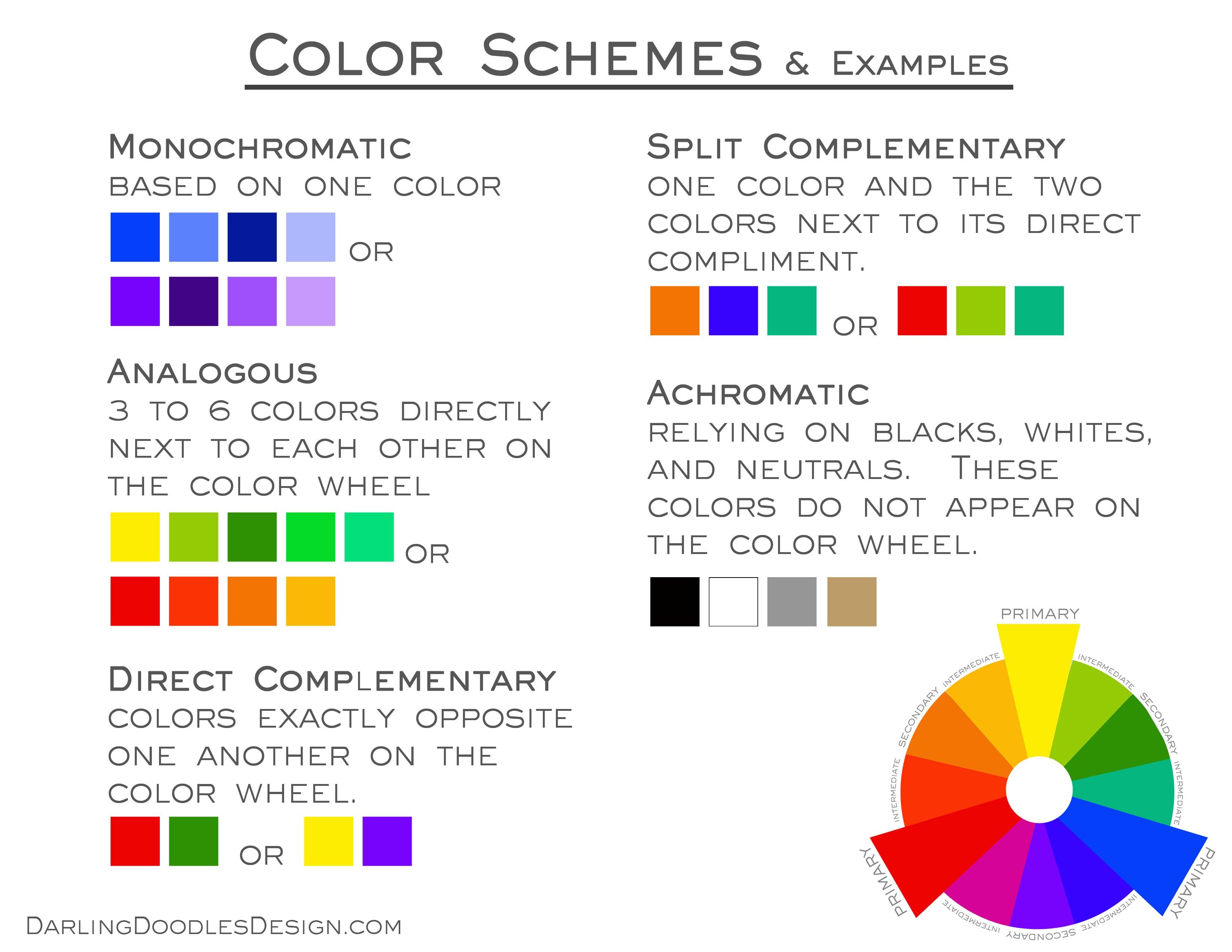
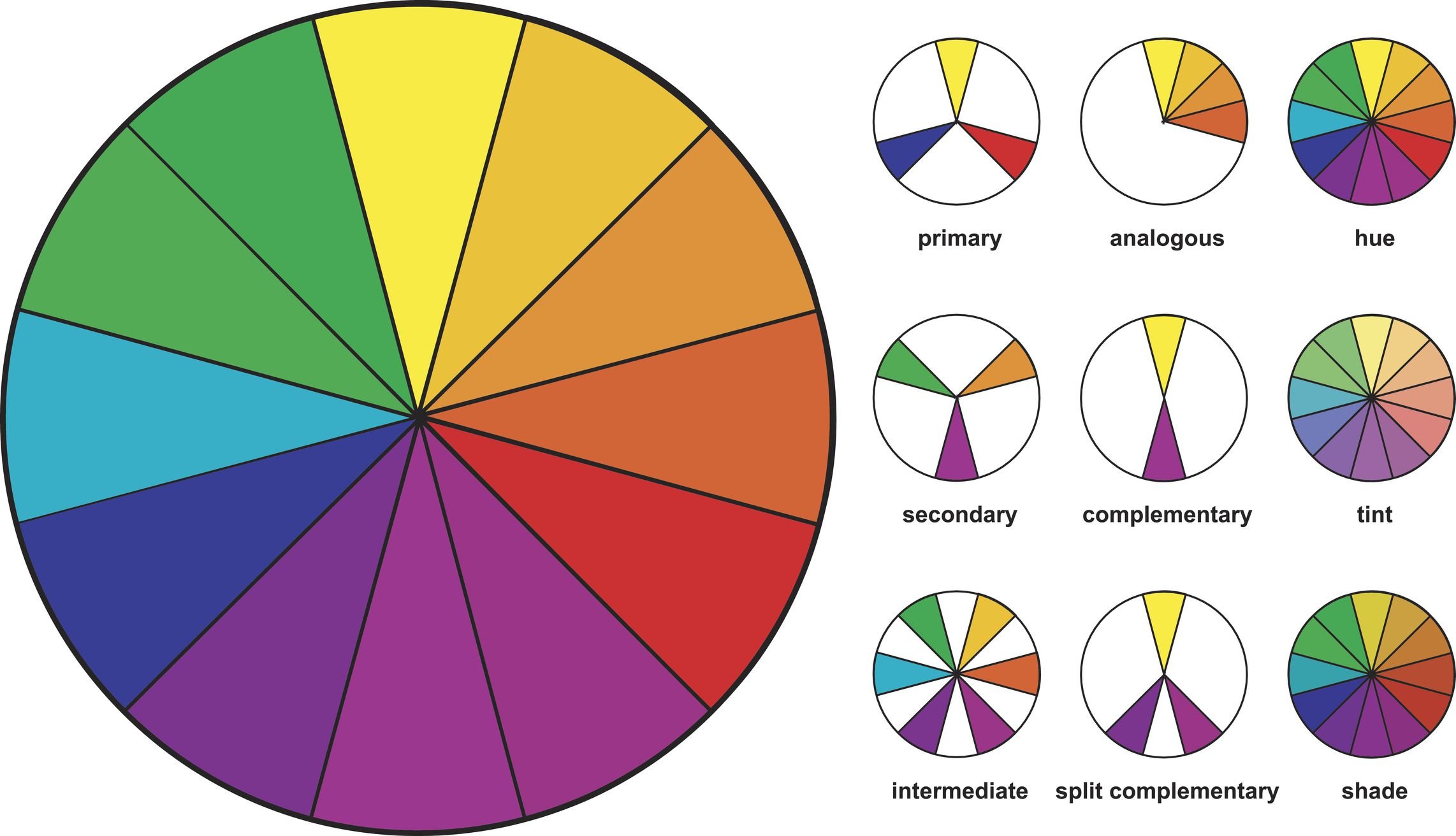
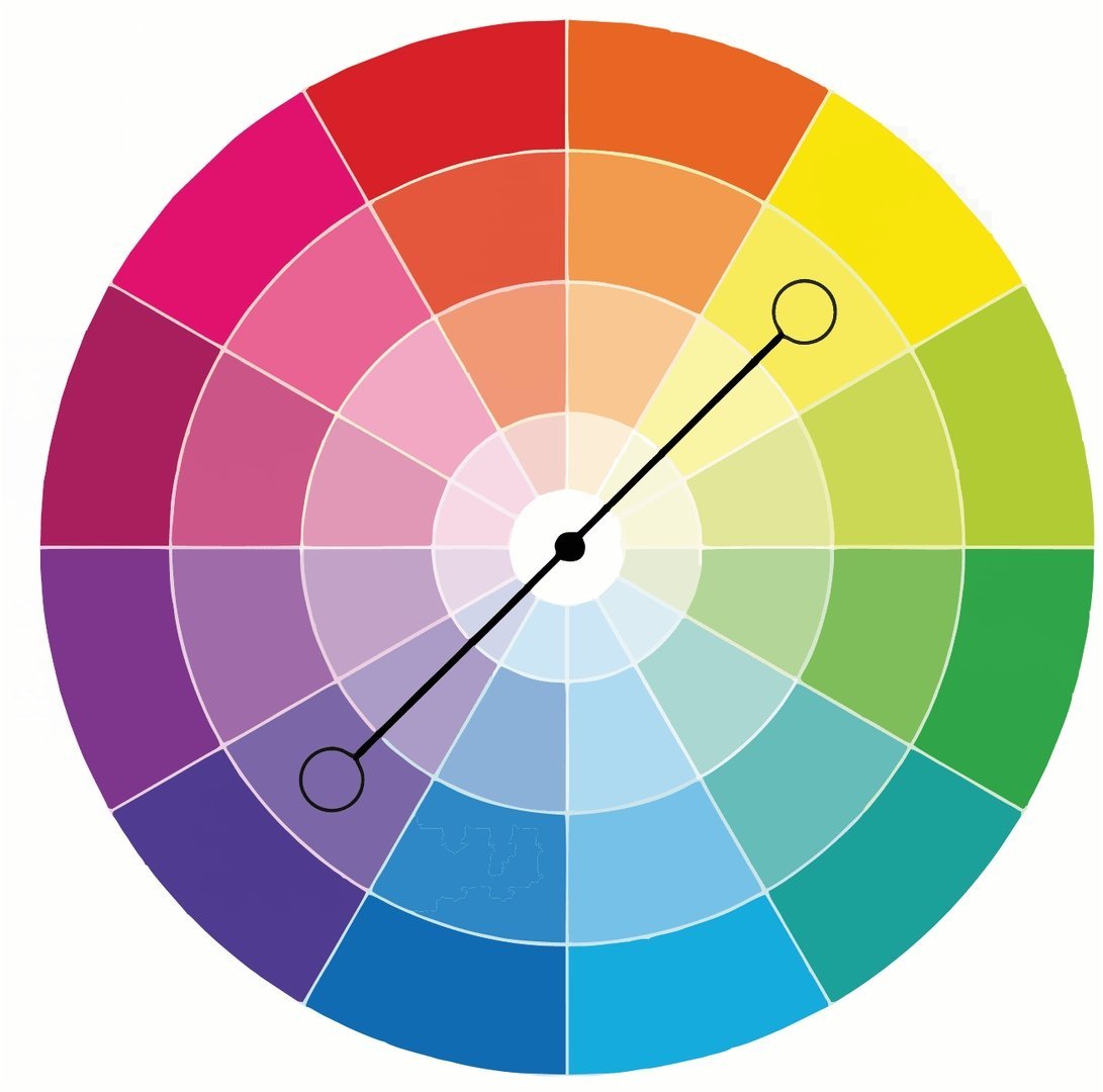
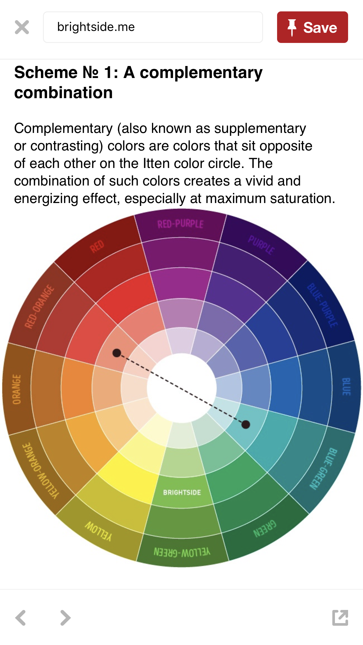
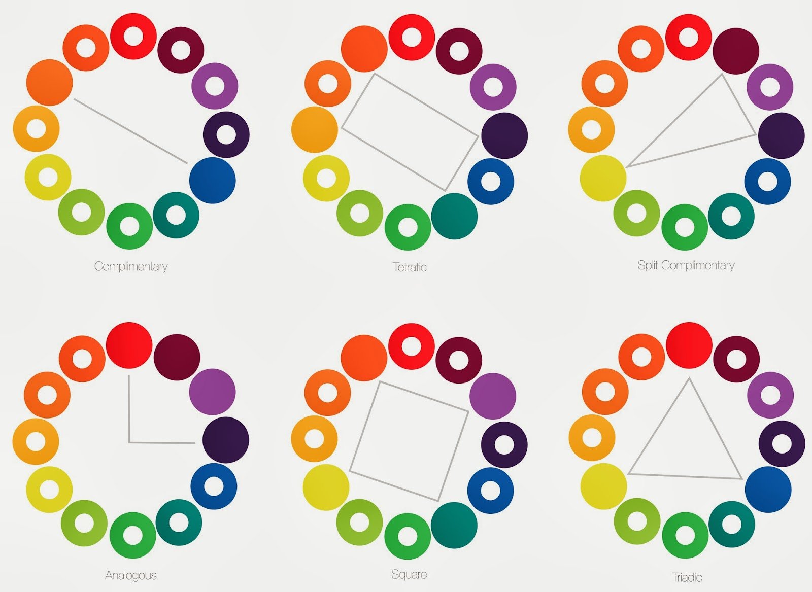
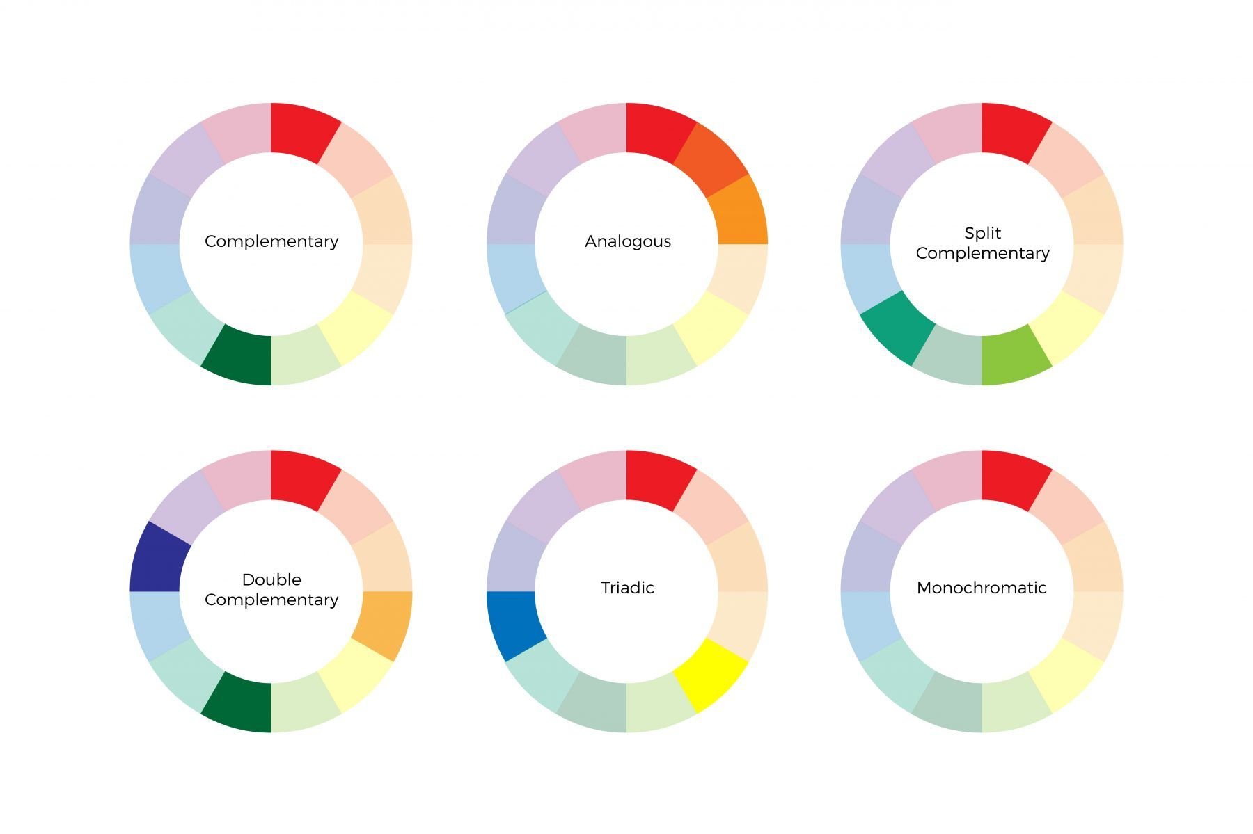
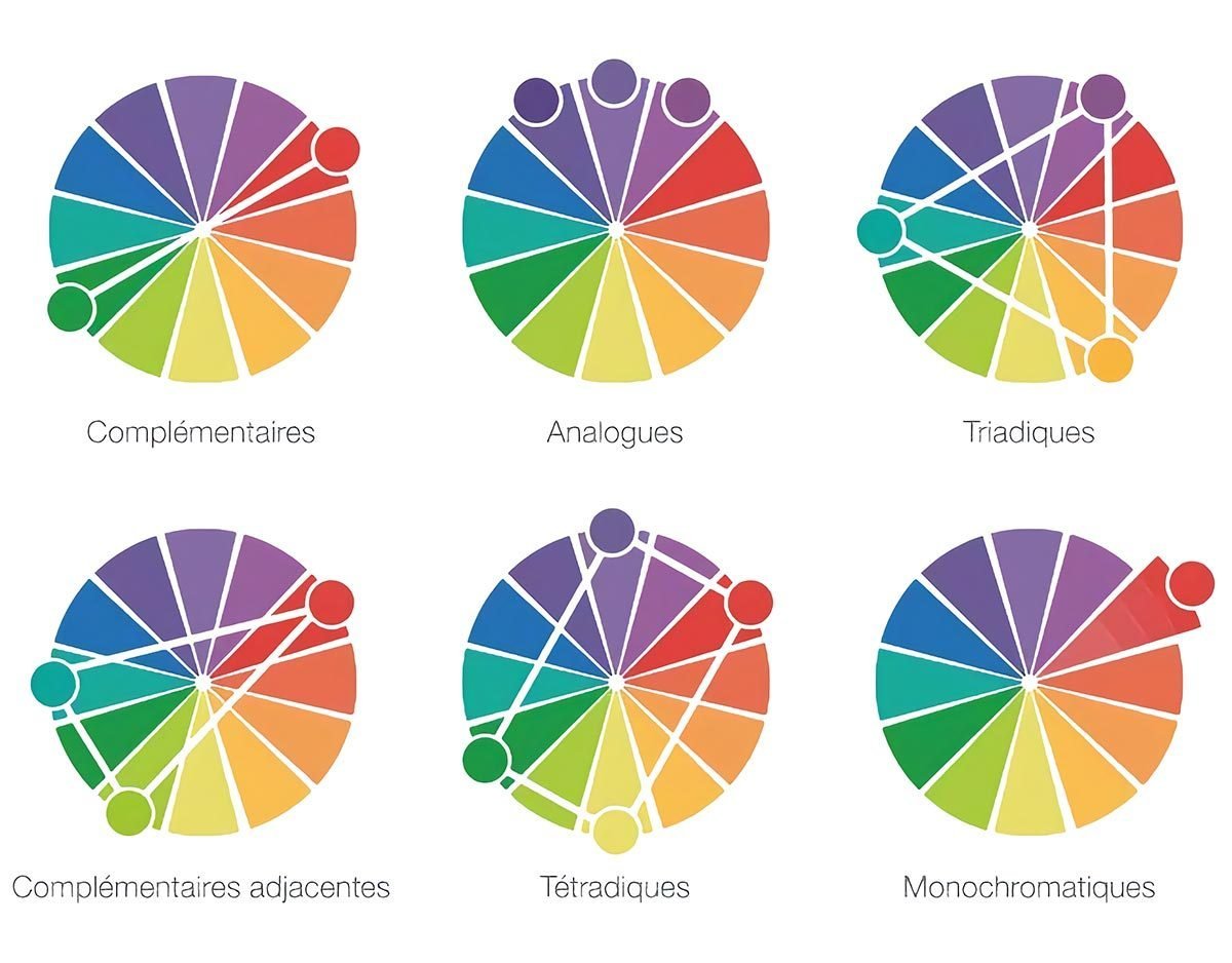
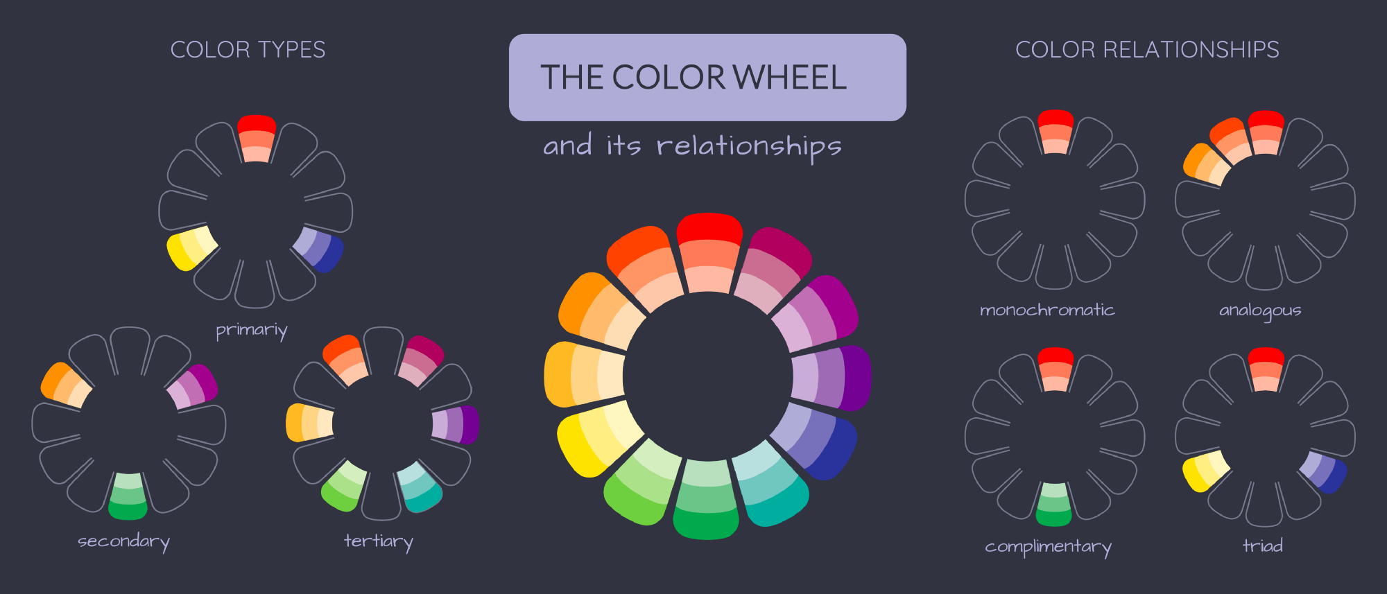
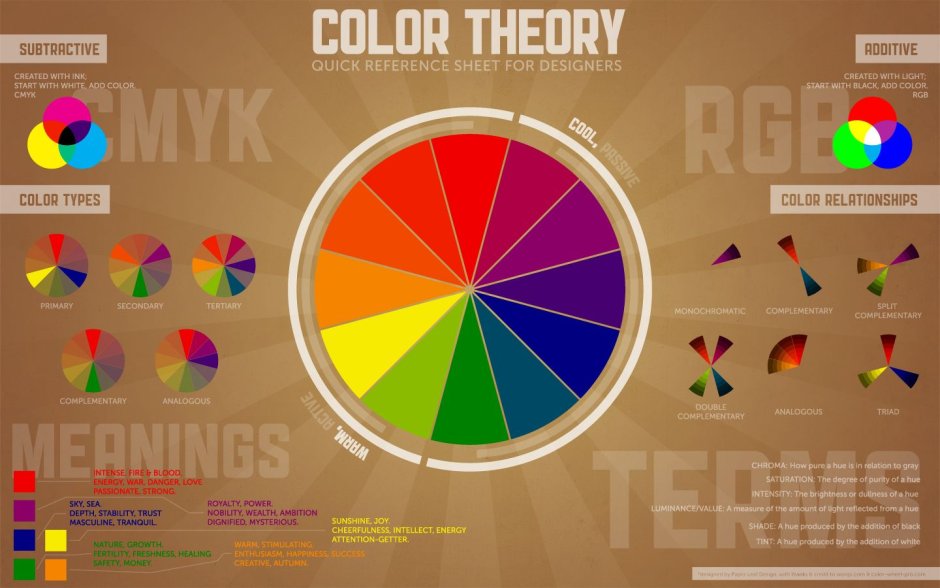
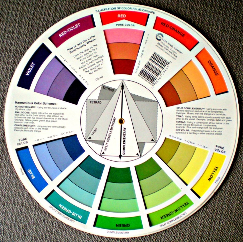
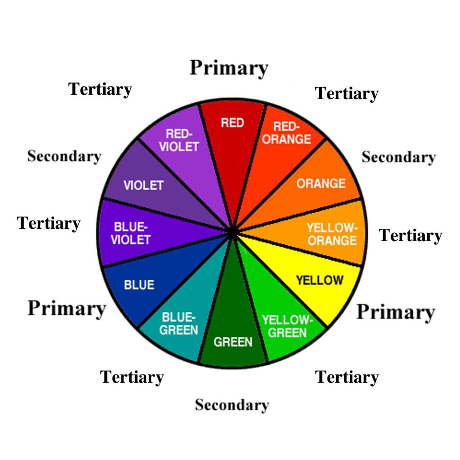
Complementary colors
Complementary colors are a dynamic duo in the world of art and design. These color combinations have an electrifying effect, as they sit opposite each other on the color wheel. When used together, they create a striking contrast that catches the eye and adds depth to any composition.
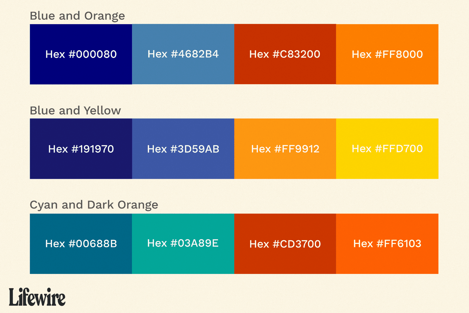
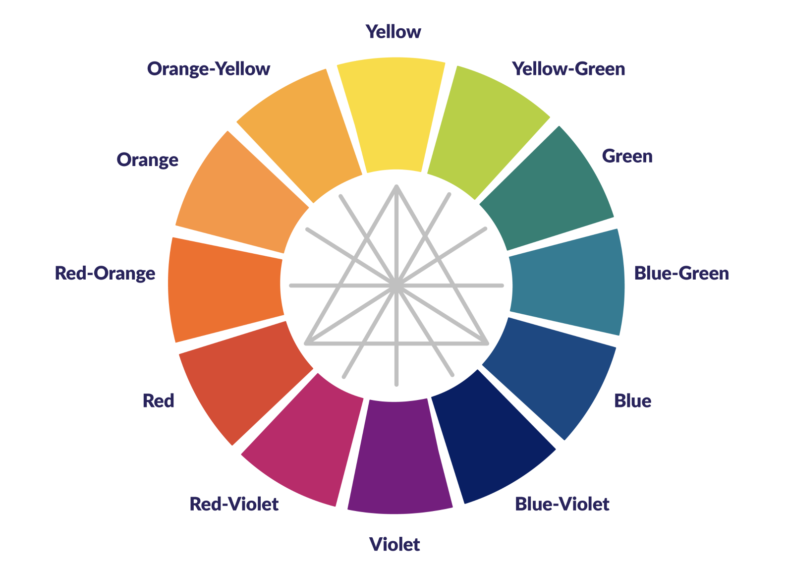
Think of complementary colors as soulmates in the color spectrum. They bring out the best in each other, enhancing their individual qualities. For example, red and green, blue and orange, or yellow and purple are classic examples of complementary color pairs.
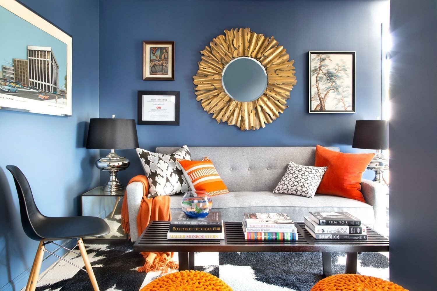
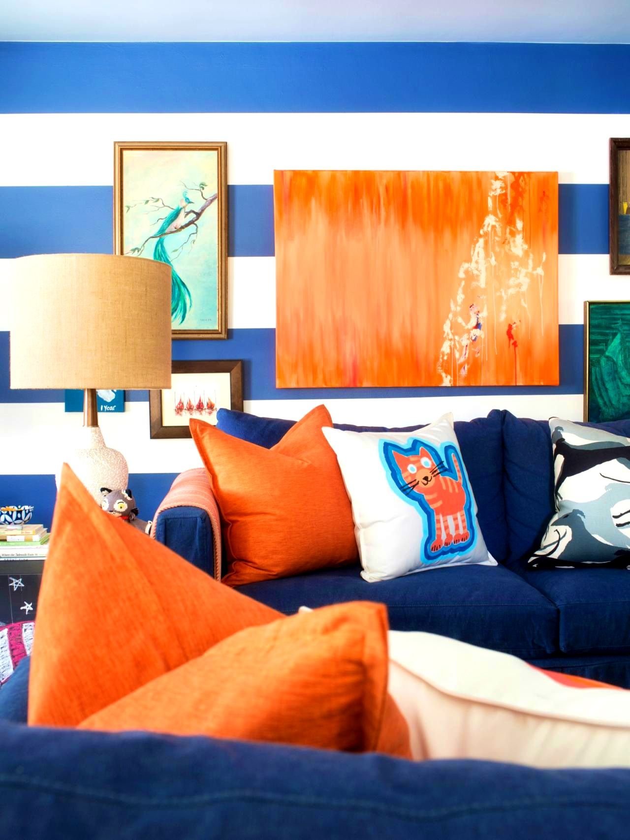
The magic of complementary colors lies in their ability to create visual harmony while still maintaining a sense of excitement. They can be used to create a focal point, draw attention to specific elements, or even evoke certain emotions. The high contrast between these colors adds vibrancy and energy to any design or artwork.
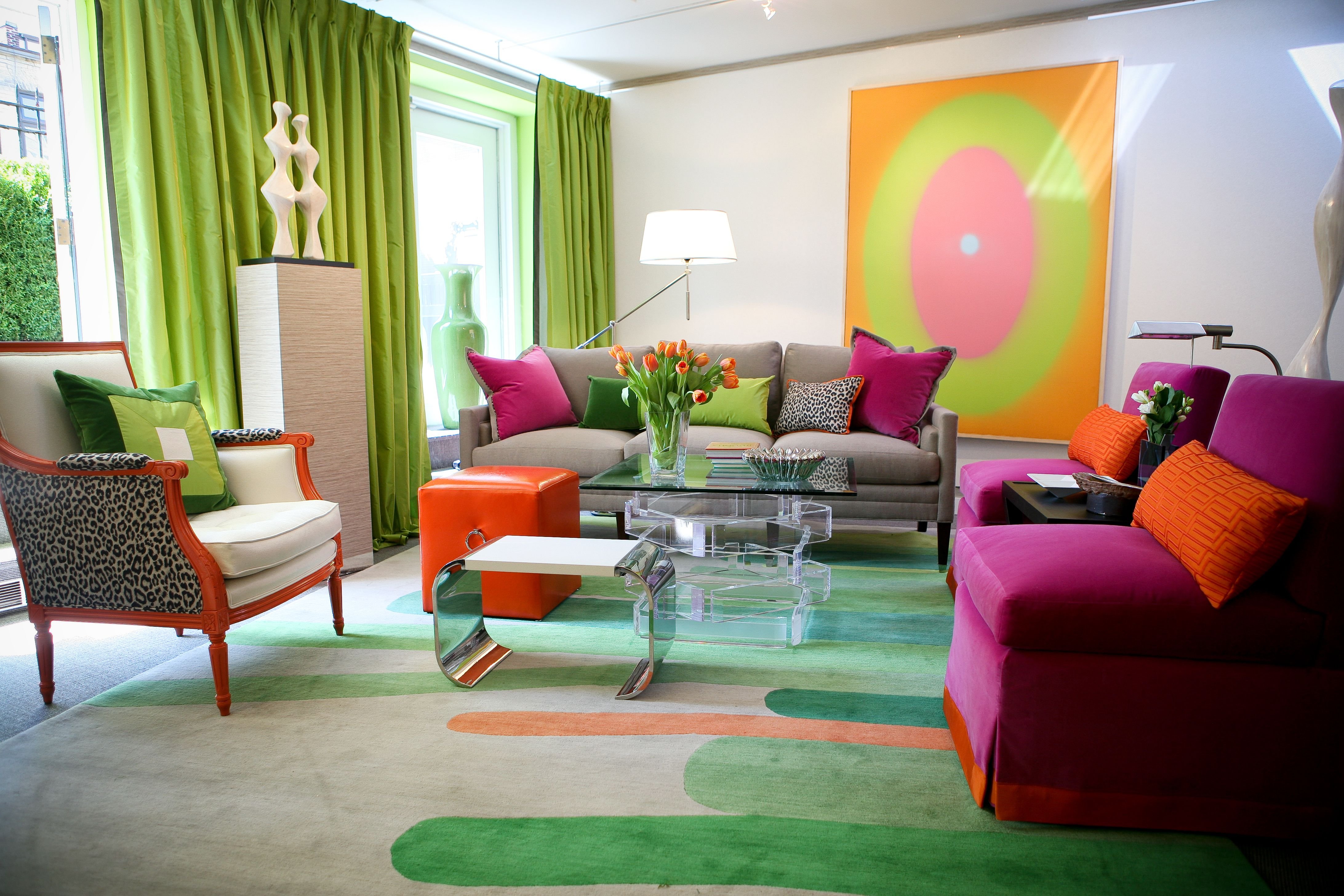
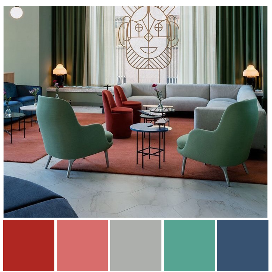
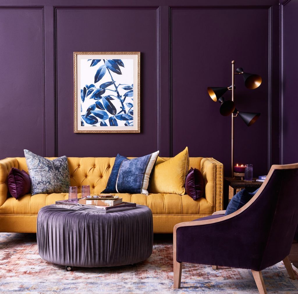
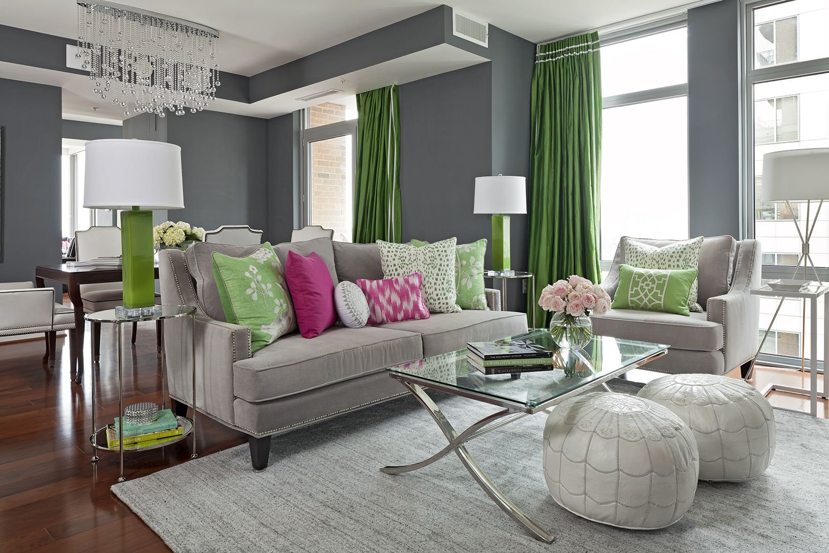
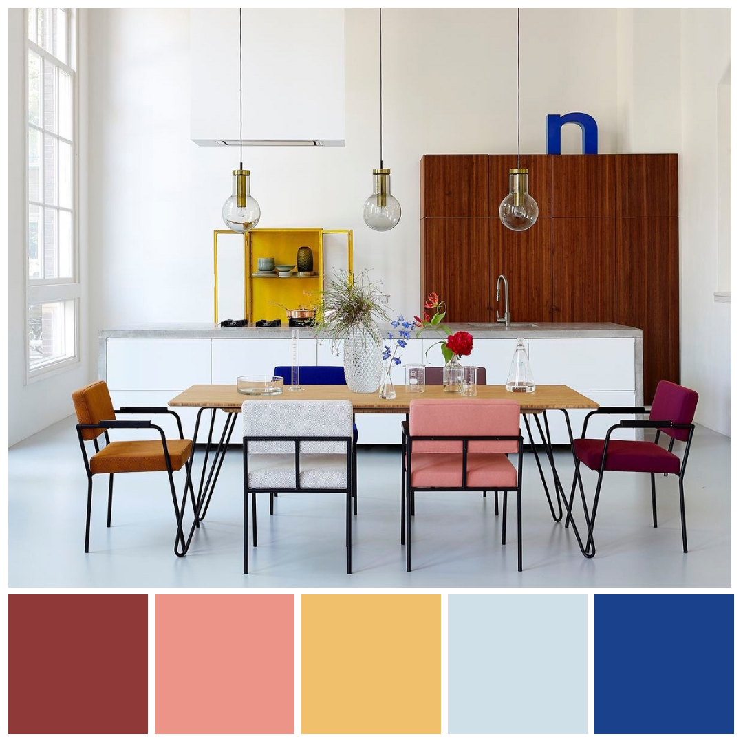
In addition to their visual impact, complementary colors also have practical applications. They can be used in interior design to create balance and harmony within a space. In fashion, they can be used strategically to create bold and eye-catching outfits. Even in photography, complementary colors can be used to enhance the overall composition and create stunning visuals.
When working with complementary colors, it's important to consider the intensity and balance of each hue. By adjusting the saturation and value of the colors, you can create different moods and effects. For example, using a muted shade of one color paired with a vibrant shade of its complement can create a more subtle and sophisticated look.
So, whether you're a designer, artist, or simply someone looking to add a pop of color to your life, embracing the power of complementary colors is a surefire way to make a statement. Experiment with different combinations, play with contrasts, and let these harmonious pairs elevate your creativity to new heights.