Color psychology
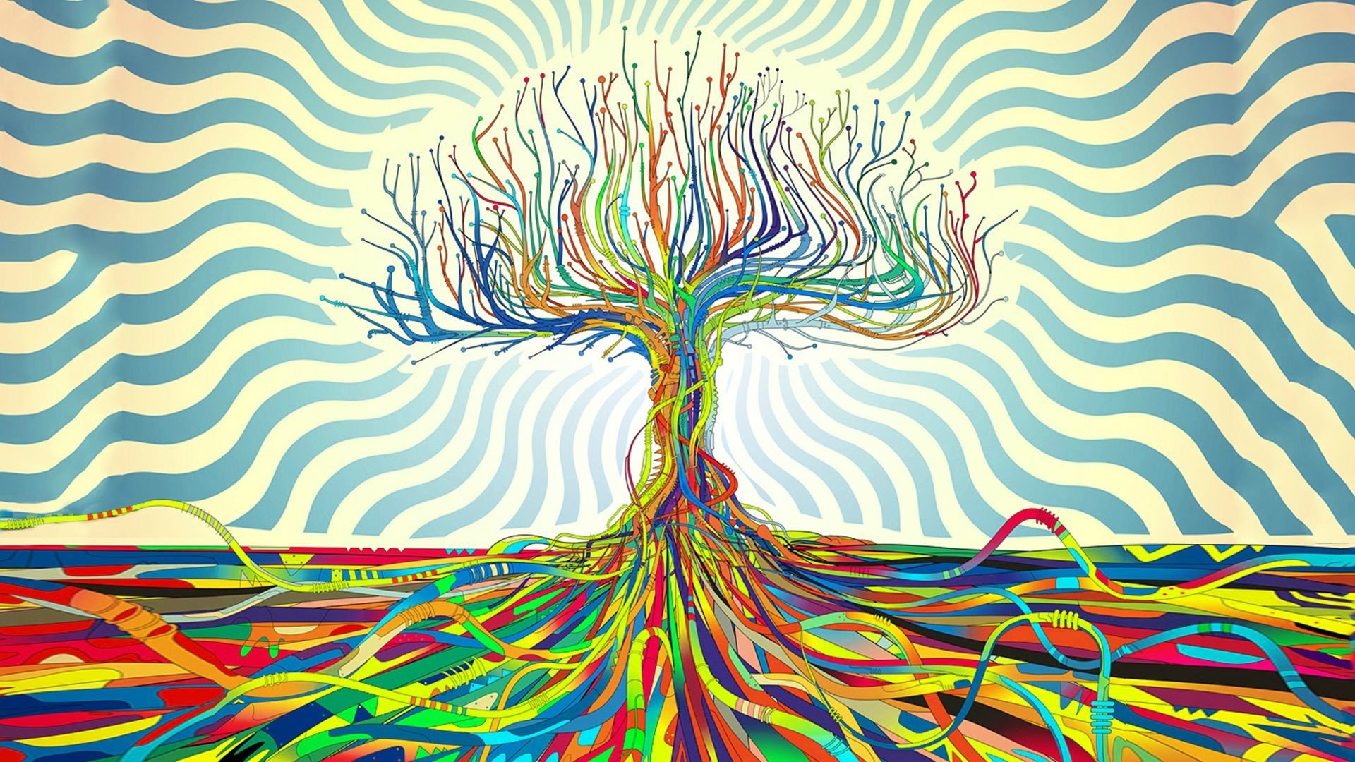
Color psychology is a fascinating field that explores the impact of colors on human emotions, behaviors, and perceptions. It delves into the way different hues can evoke specific feelings and influence our moods. Understanding color psychology can be incredibly valuable for designers, marketers, and anyone seeking to create a certain ambiance or communicate a particular message.
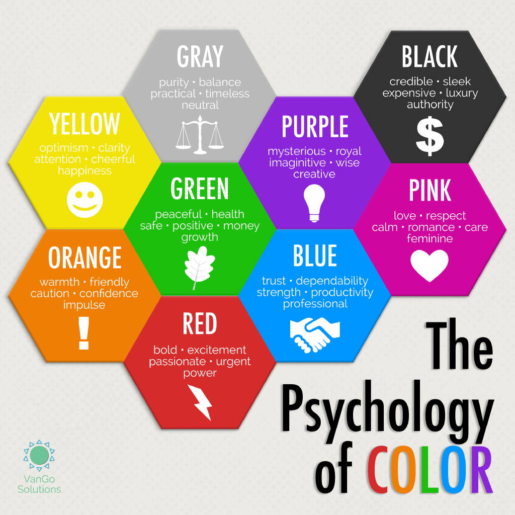
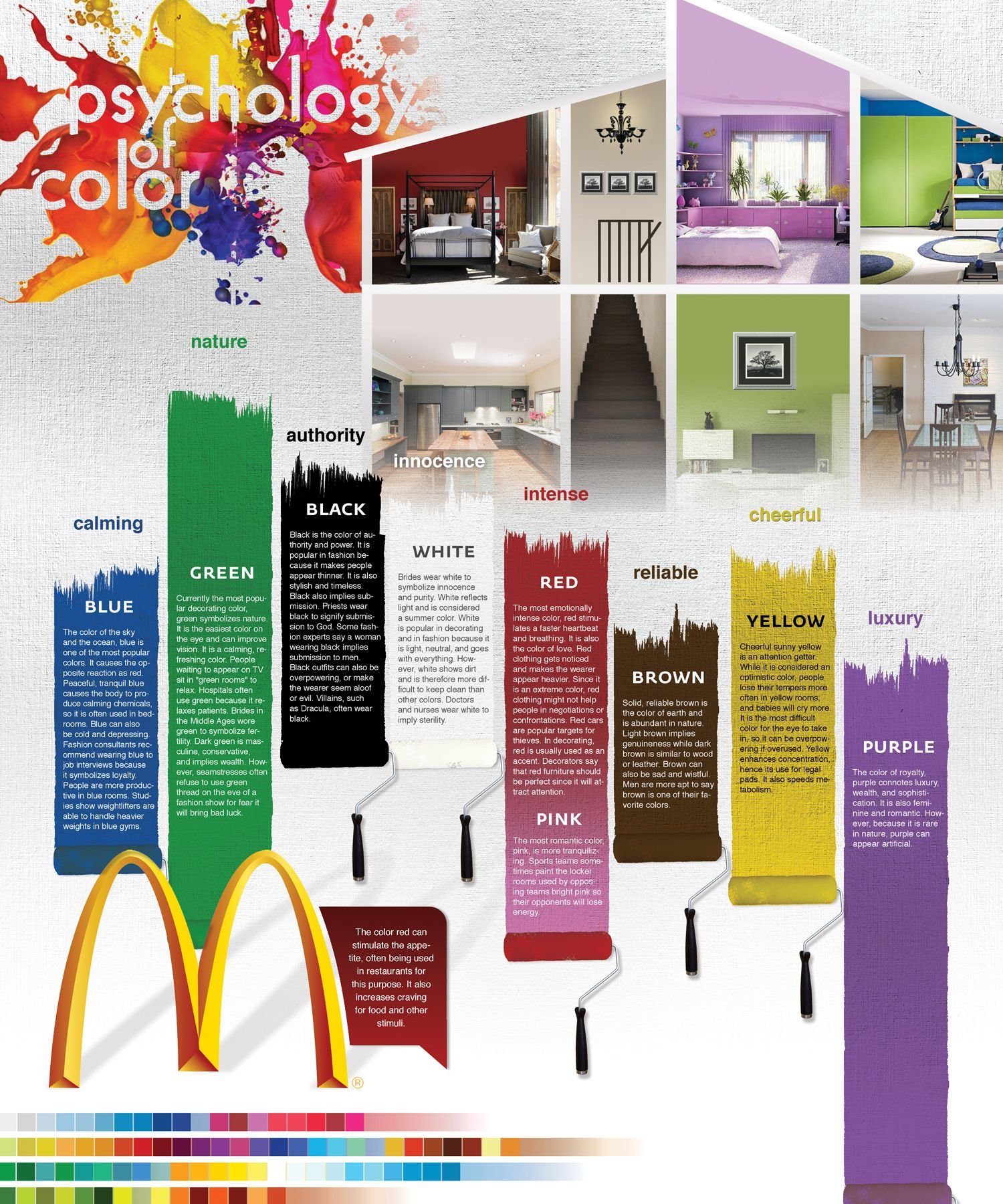
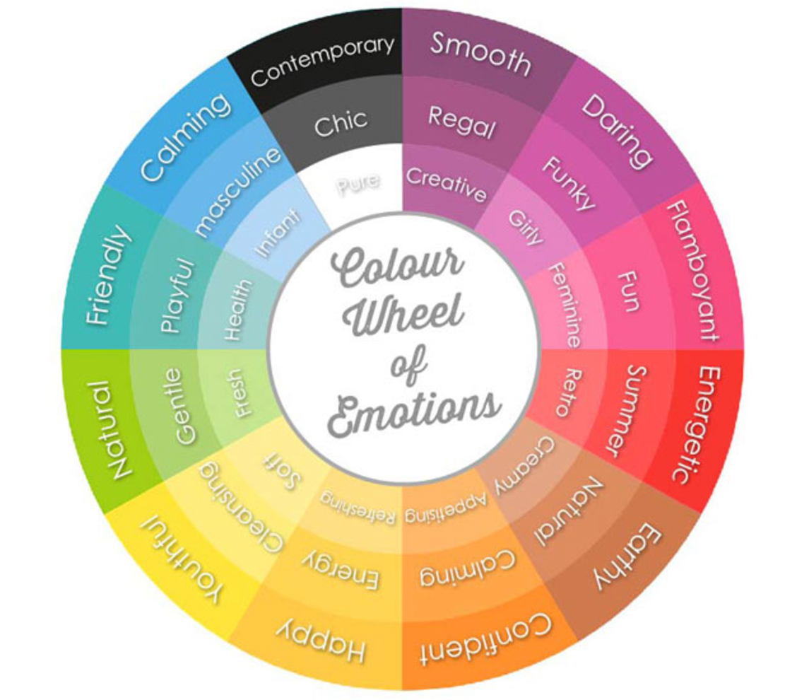
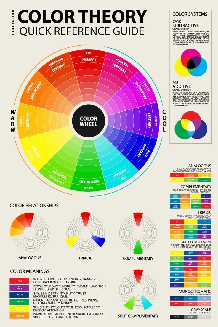
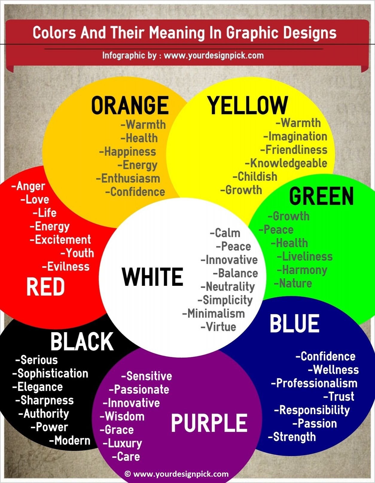
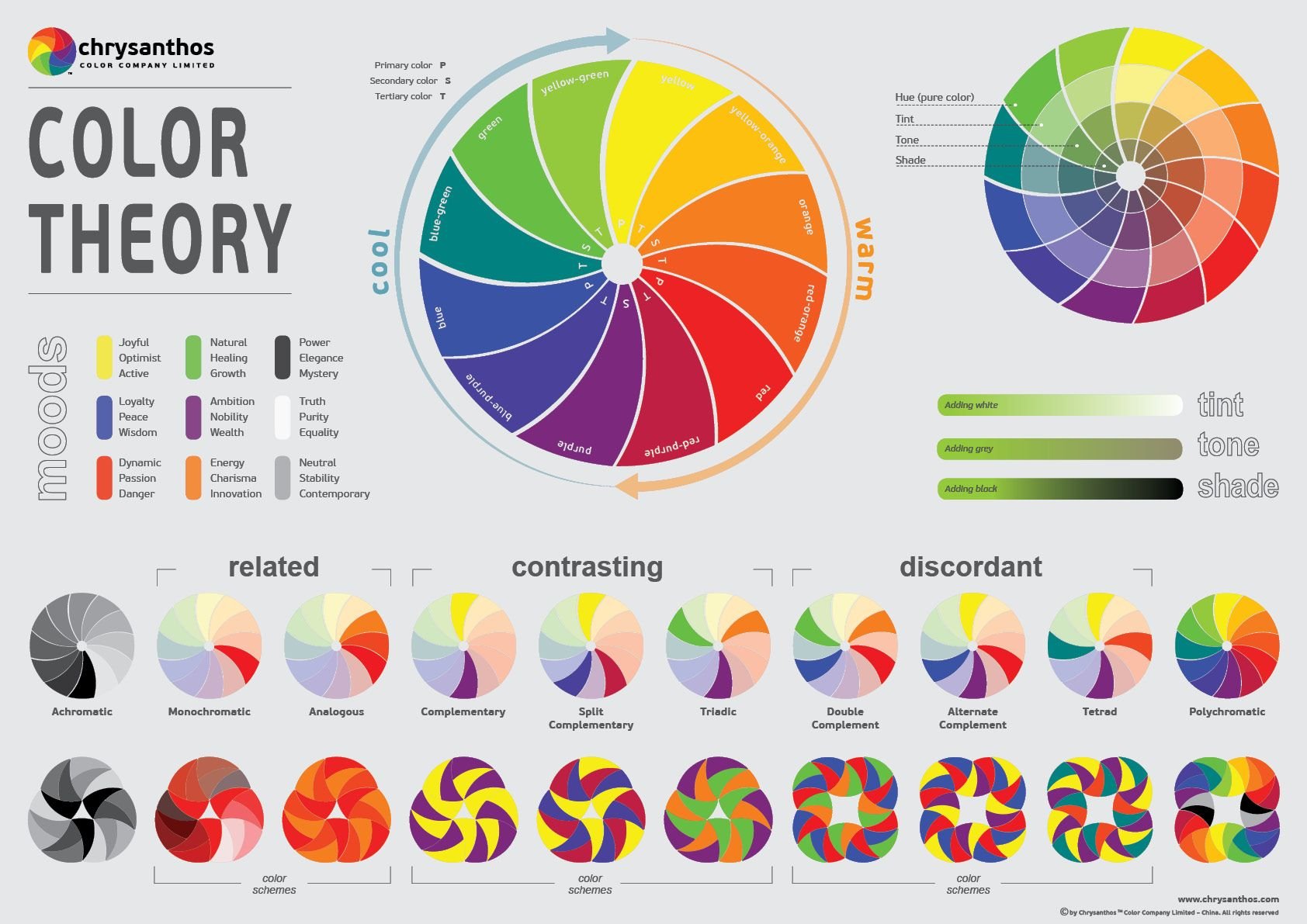
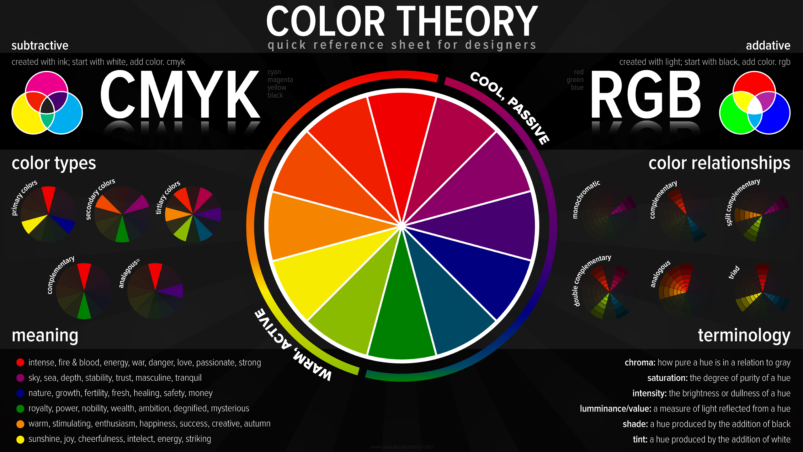
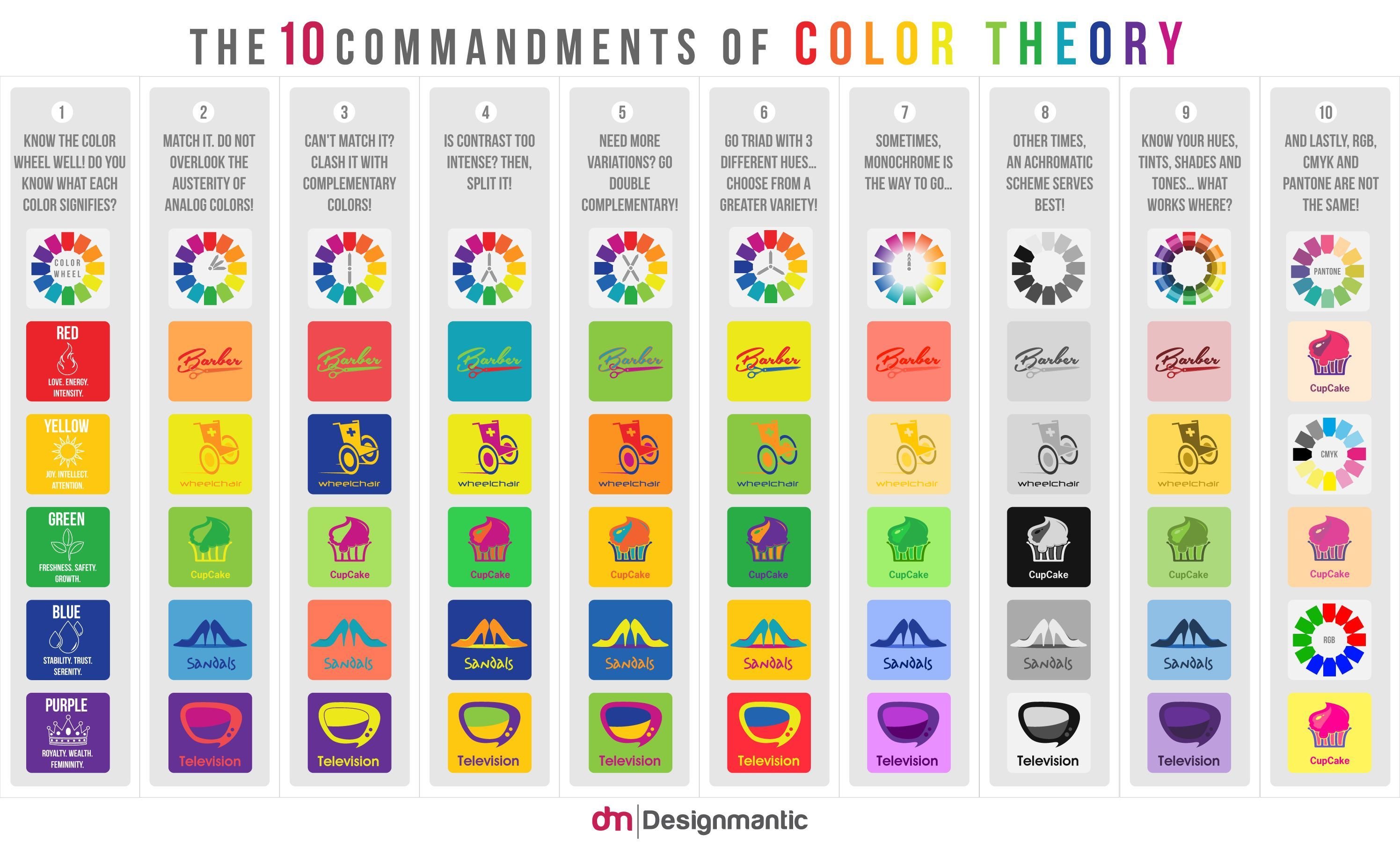
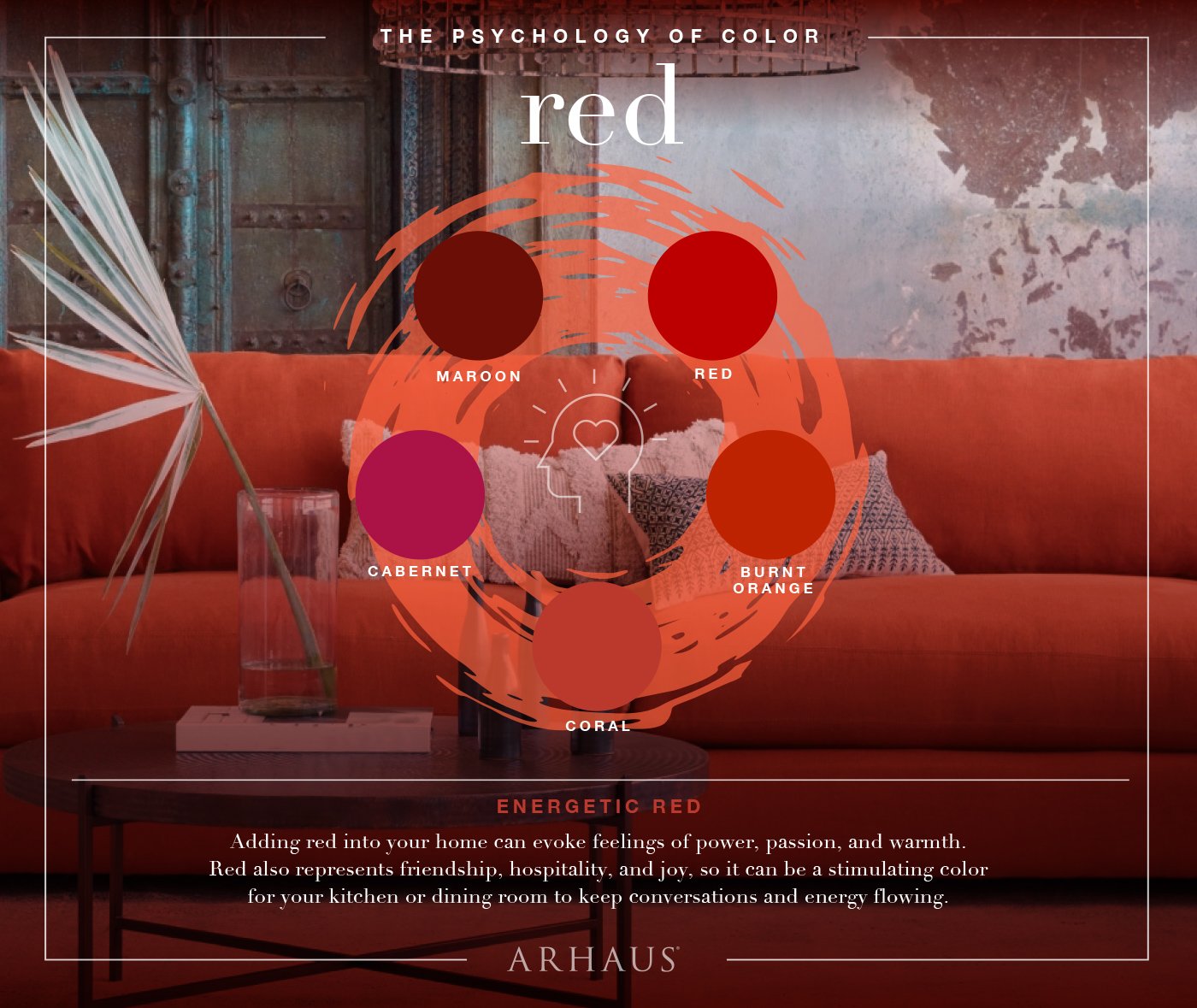
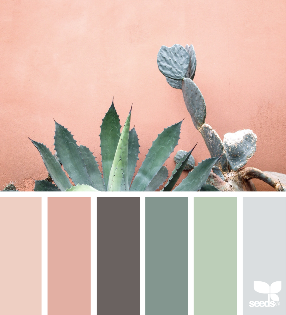
For instance, warm colors like red, orange, and yellow are associated with energy, passion, and excitement. These vibrant shades can stimulate appetite, making them ideal for restaurants and food-related brands. On the other hand, cool colors such as blue, green, and purple are known for their calming and soothing effects. They can promote relaxation, trust, and serenity, making them suitable for healthcare facilities or wellness brands.
Moreover, each color carries its own unique symbolism and cultural significance. For example, red is often associated with love and power in Western cultures, while in Eastern cultures it symbolizes luck and celebration. Blue, on the other hand, is commonly linked to trust and reliability across many societies. These cultural associations make color an essential element in global marketing strategies.
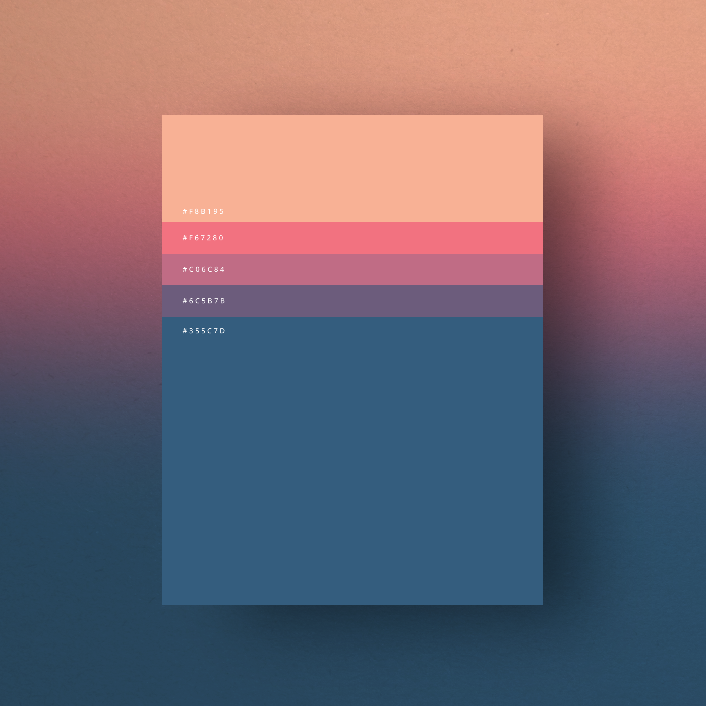
In addition to evoking emotions, colors can also have practical implications. In interior design, lighter colors can make a space feel more spacious and airy, while darker tones can create a sense of intimacy and coziness. Similarly, in graphic design, color choices can affect readability, hierarchy, and overall visual appeal.
By understanding the principles of color psychology, professionals can strategically select colors to elicit desired responses from their audience. Whether it's creating a sense of urgency with red call-to-action buttons or instilling a sense of tranquility with blue backgrounds, color psychology offers endless possibilities for effective communication and design. So next time you embark on a creative project, don't underestimate the power of color!