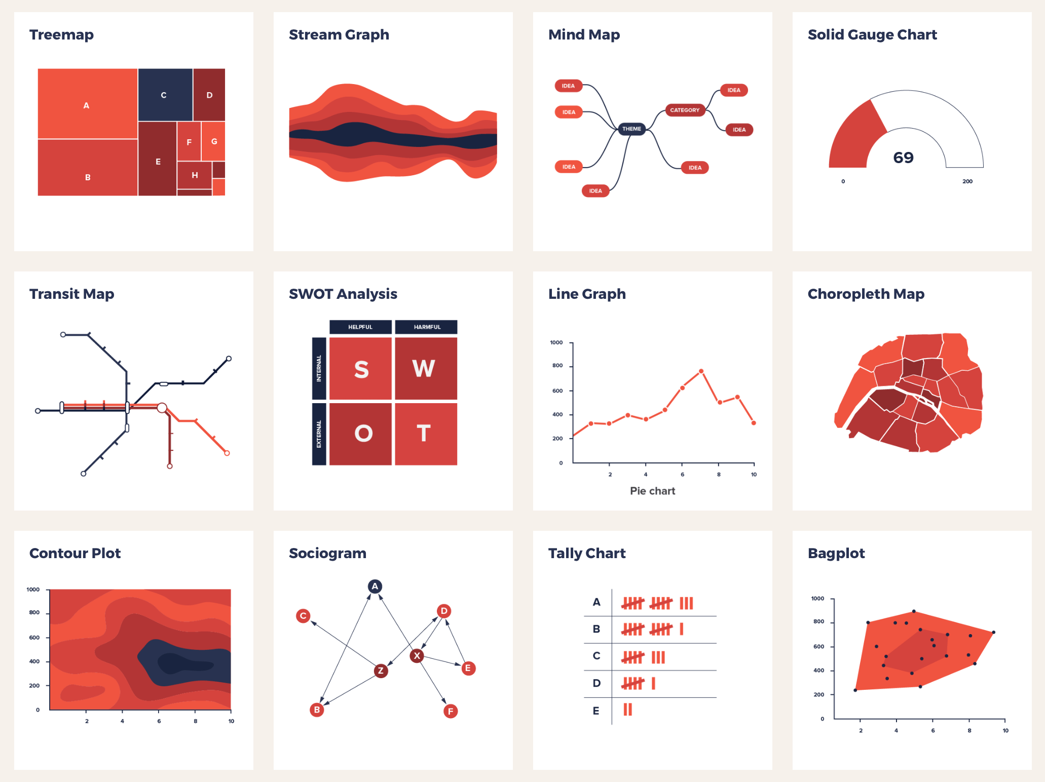
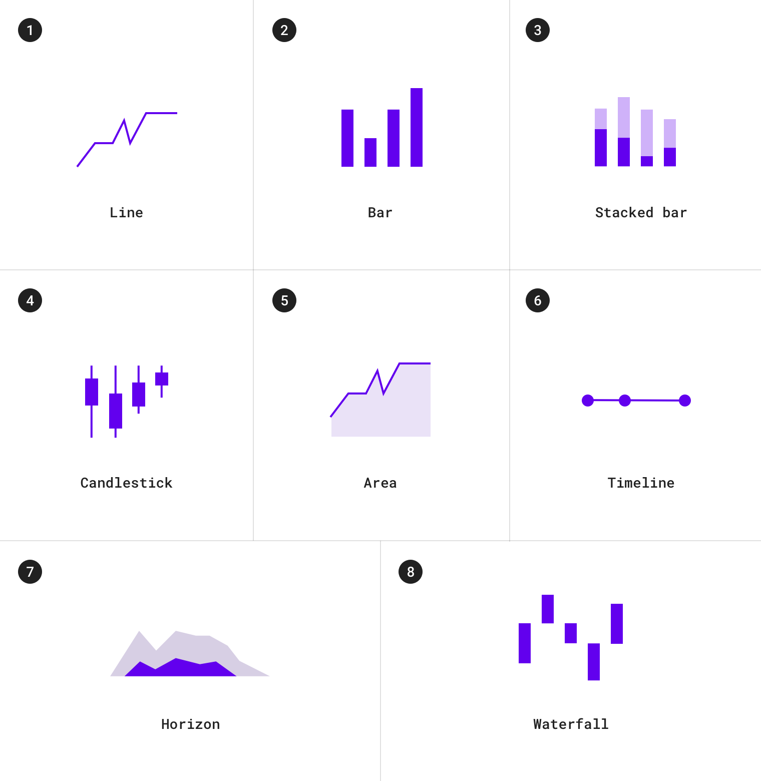
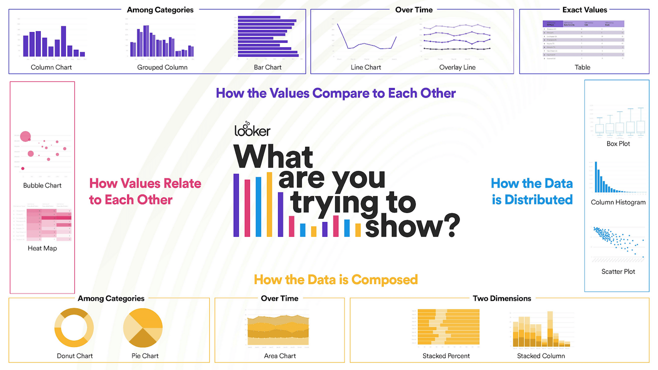
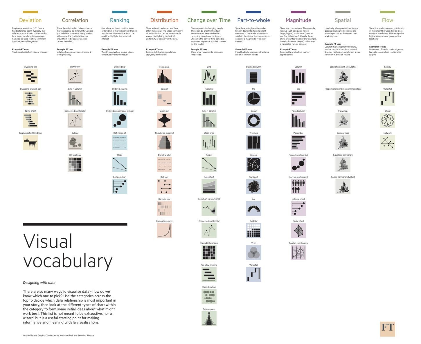
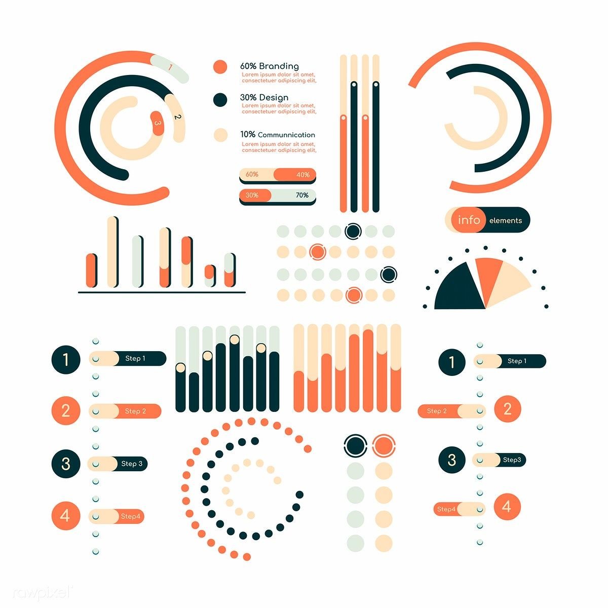
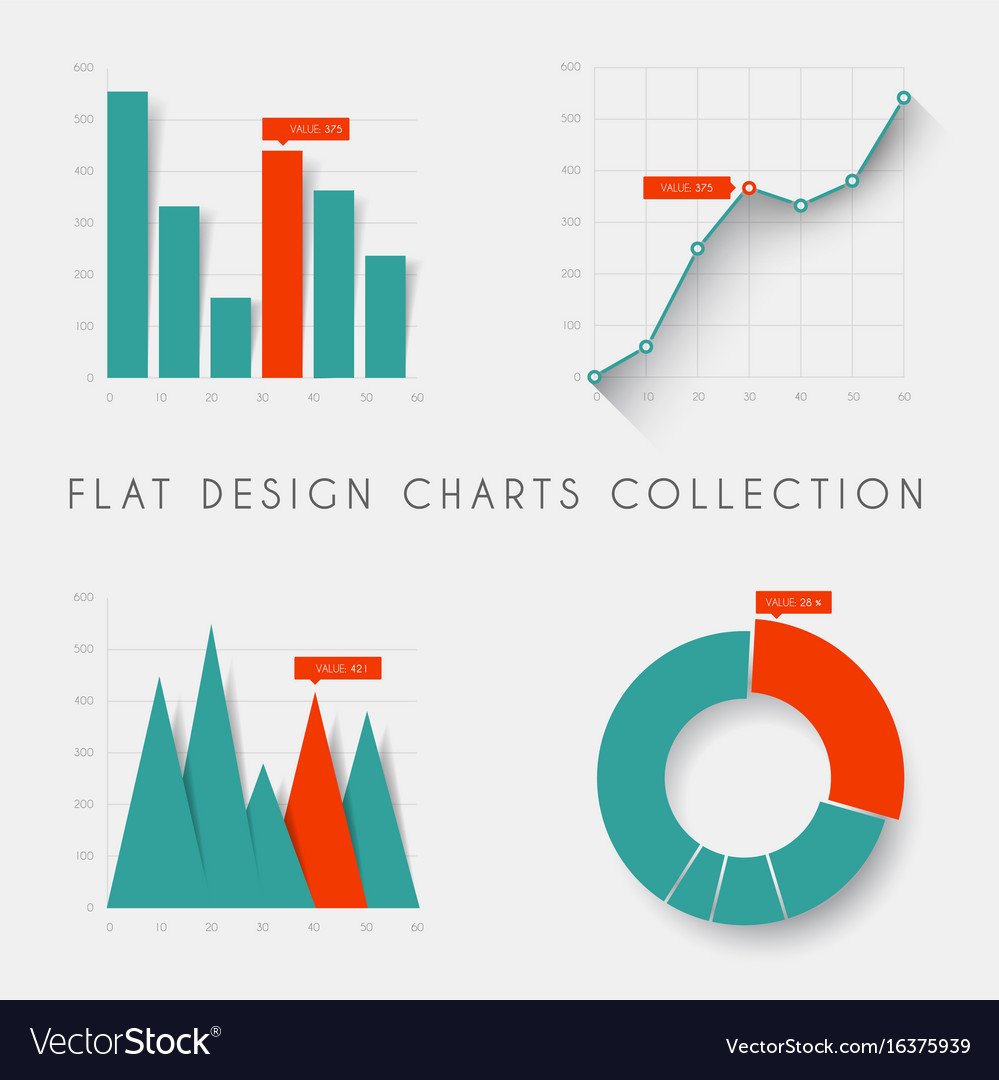
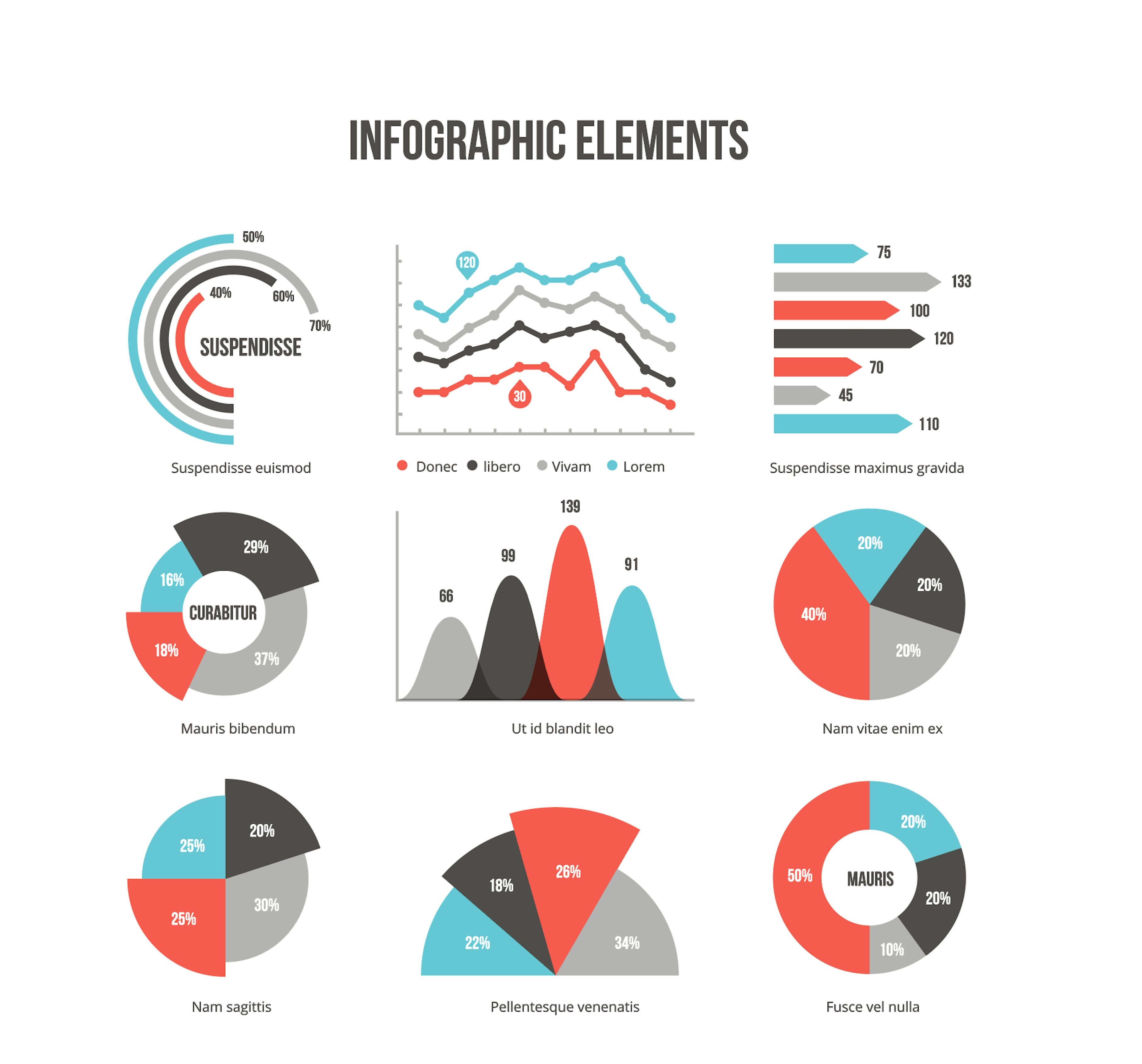
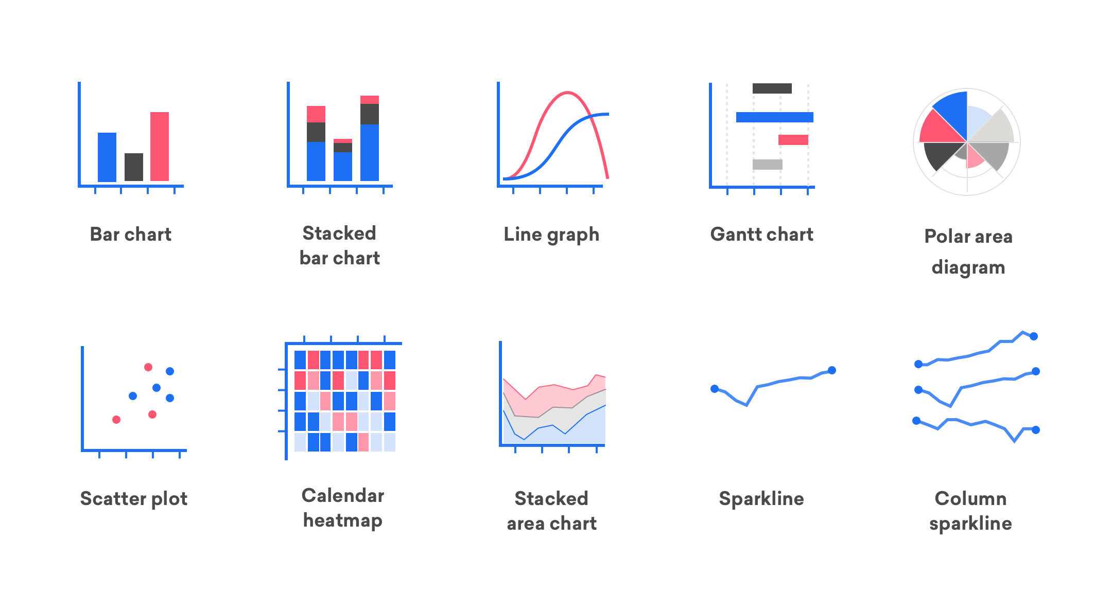
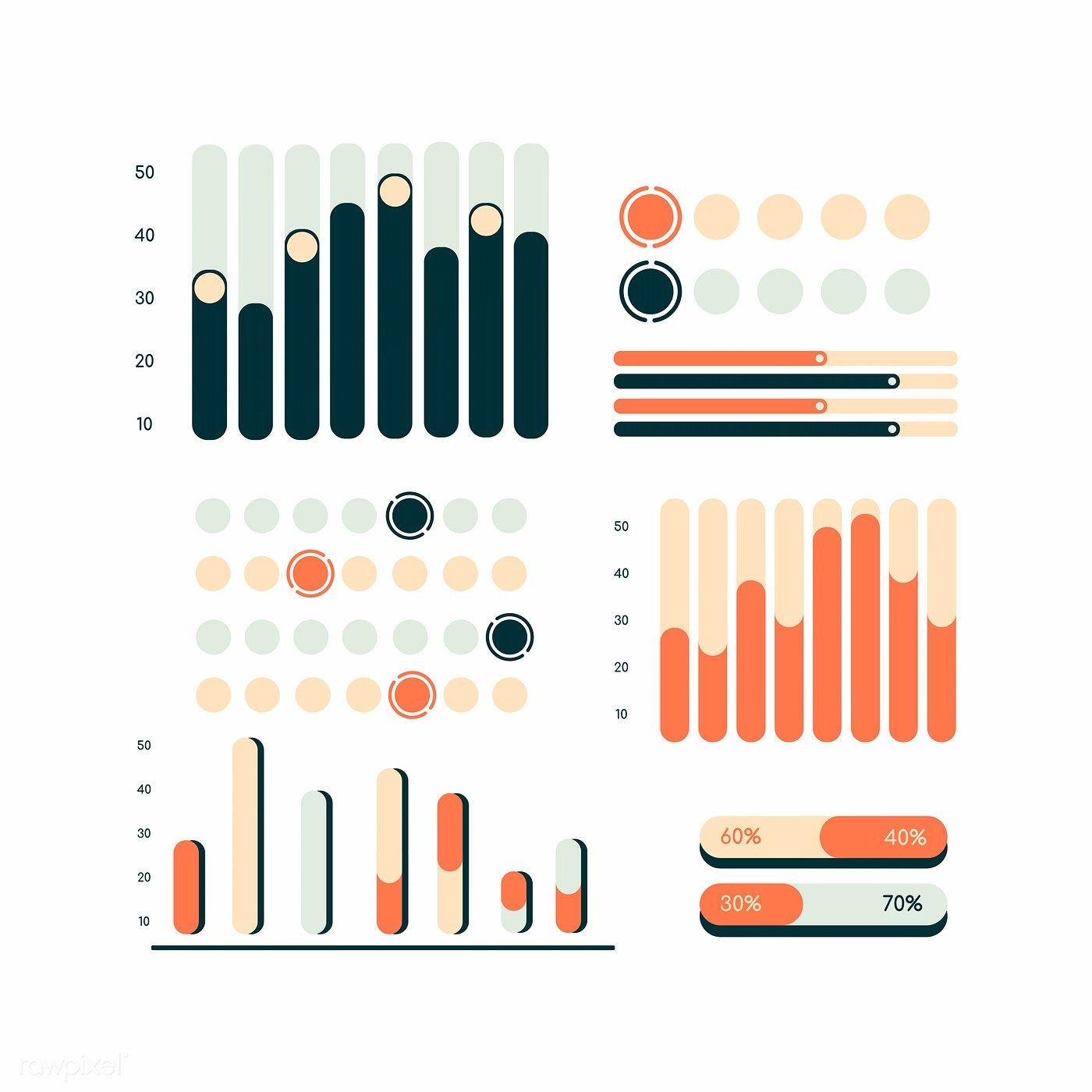
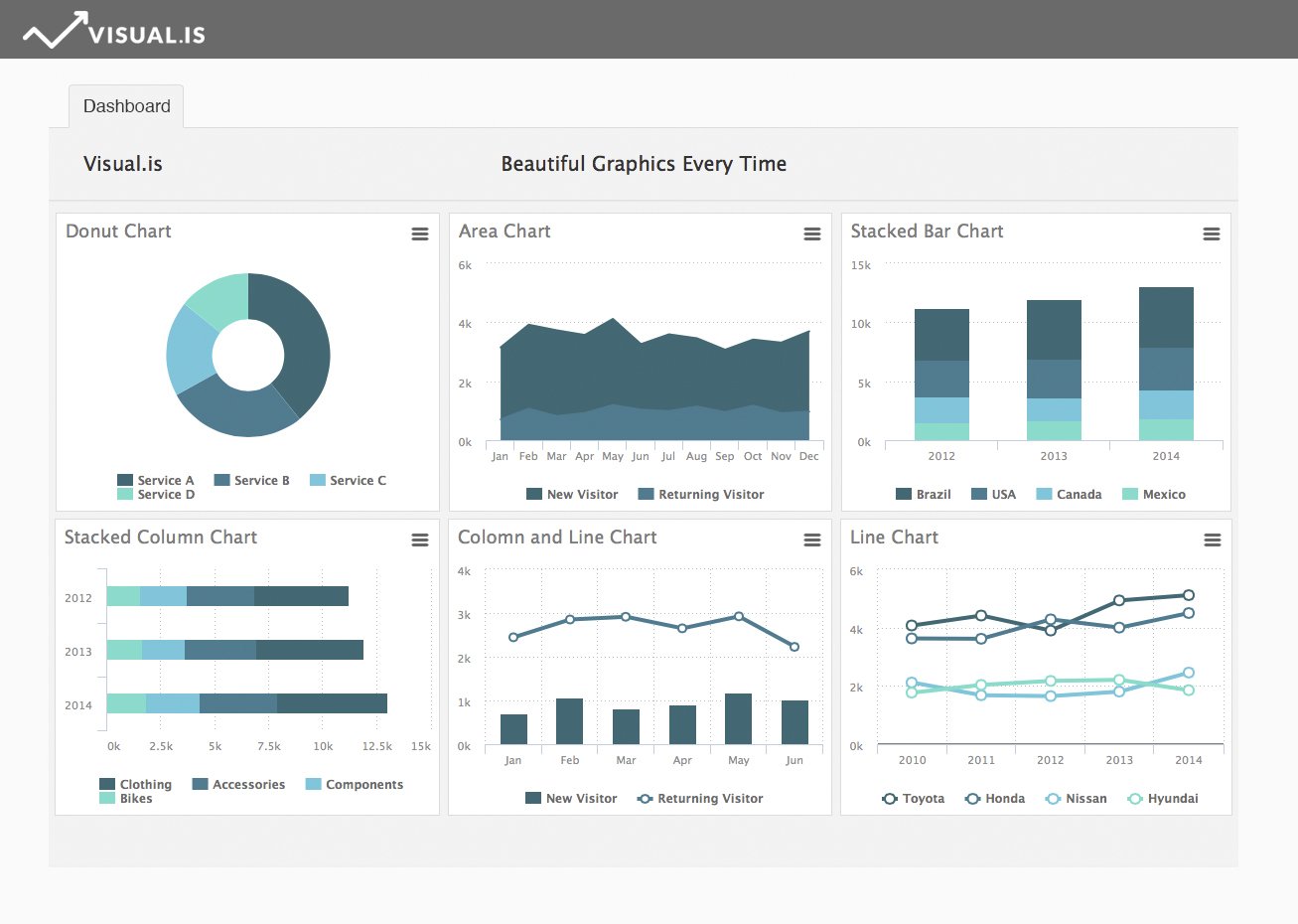
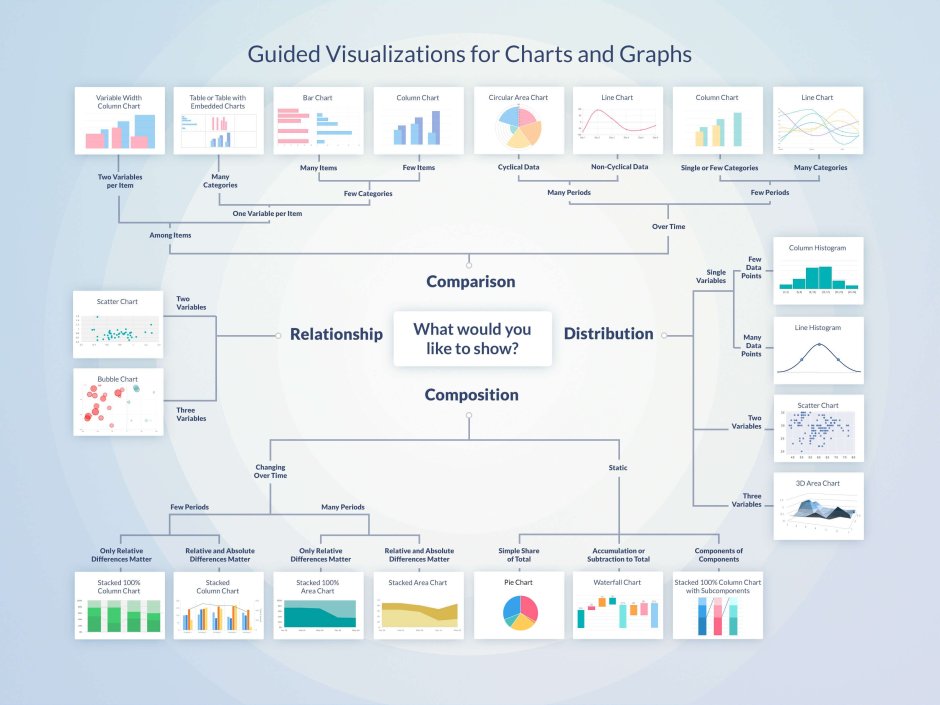
Types of charts
Charts are visual representations of data that allow us to understand information quickly and easily. There are various types of charts, each serving a unique purpose and providing insights into different aspects of data.
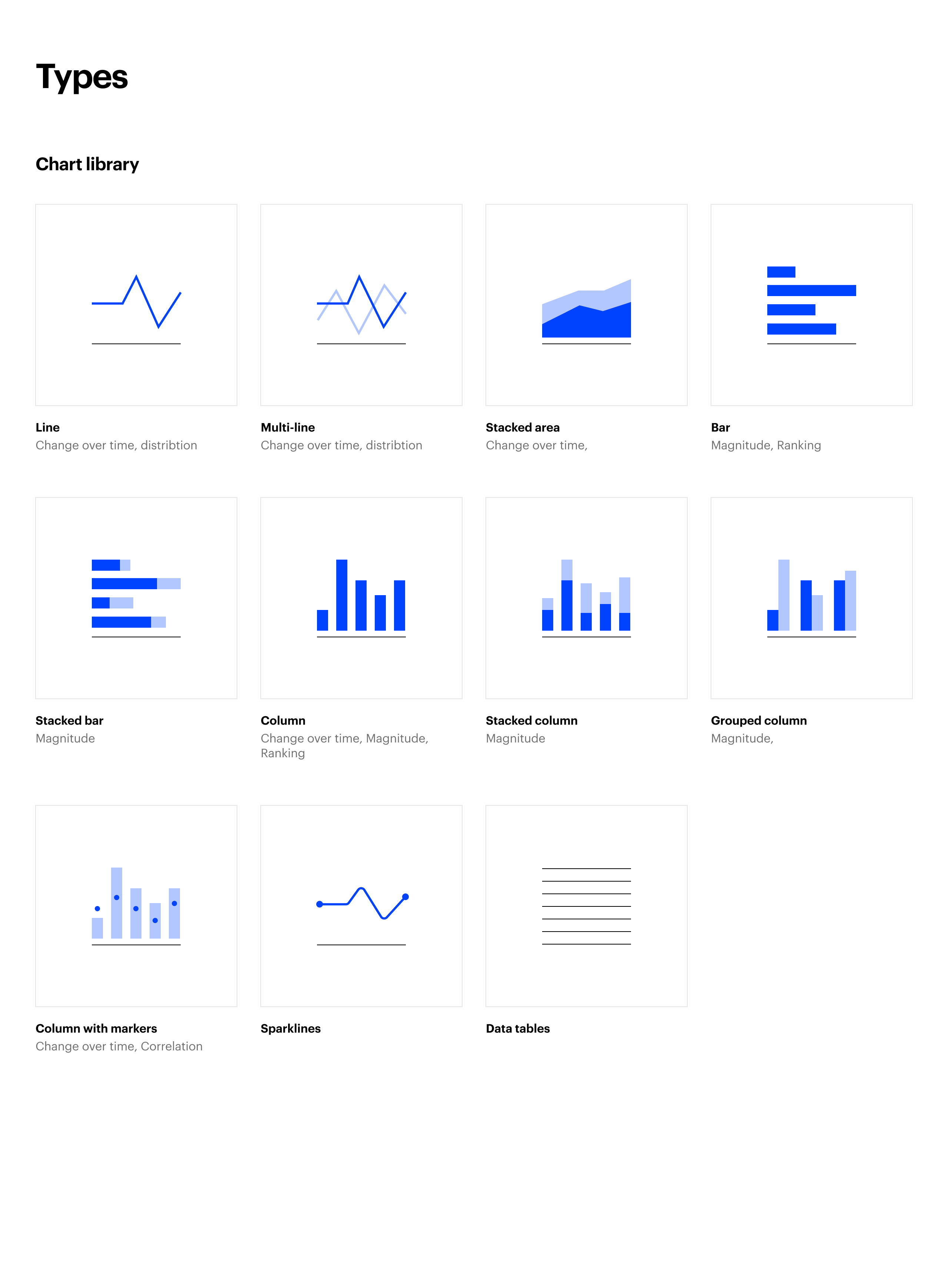
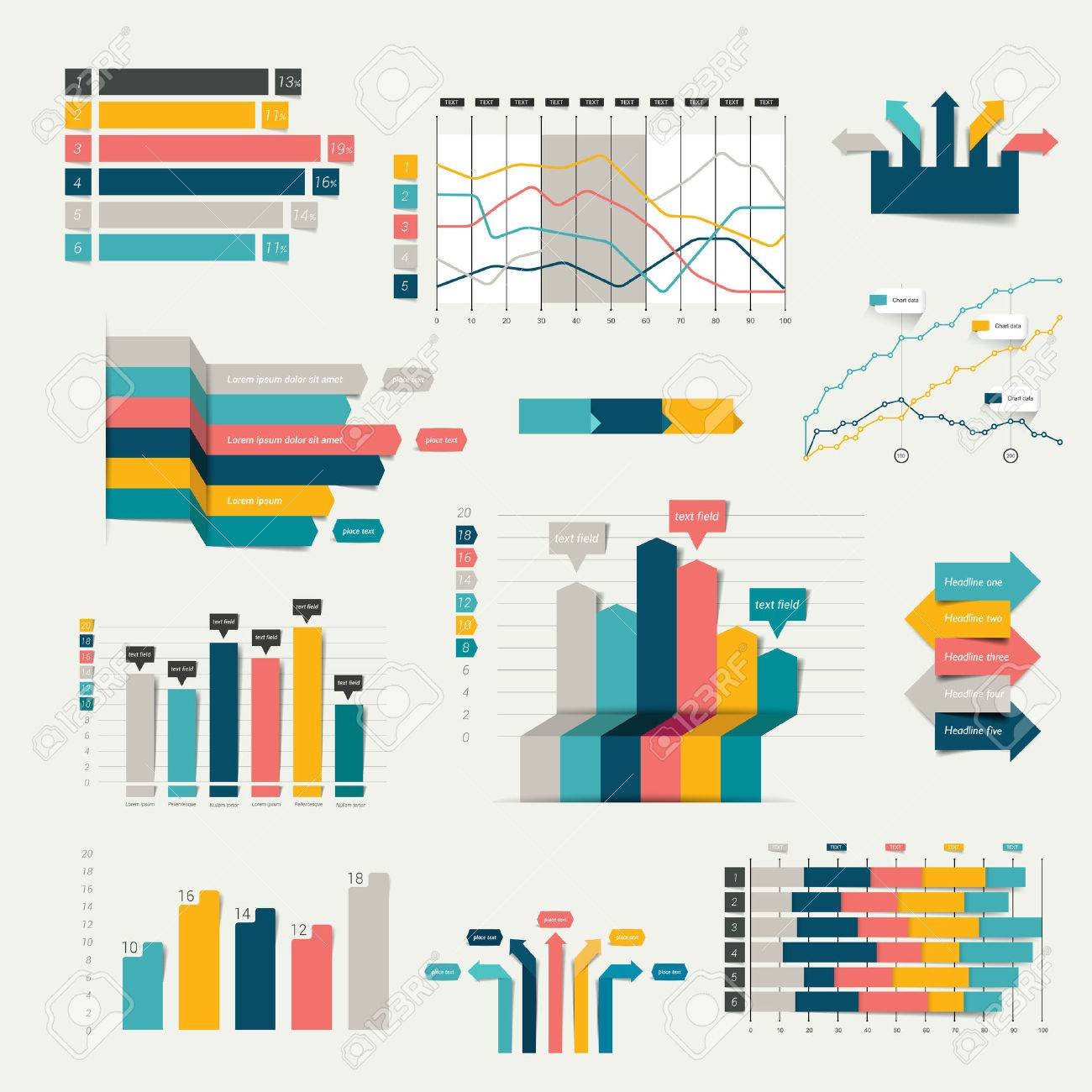
Line charts are perfect for tracking changes over time, showing trends and patterns in data. Bar charts, on the other hand, are ideal for comparing quantities across different categories. They provide a clear visual representation of the differences between data points.
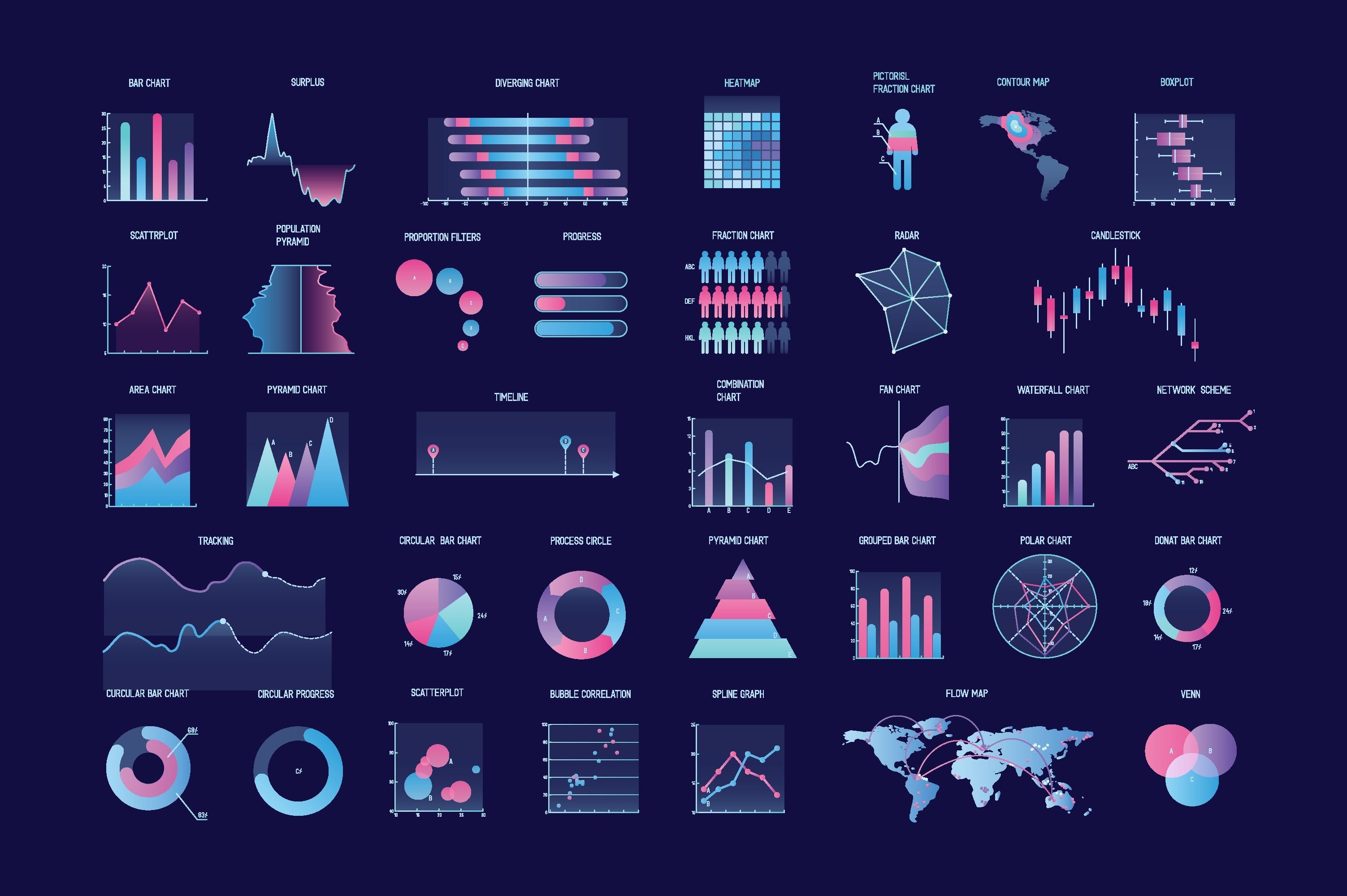
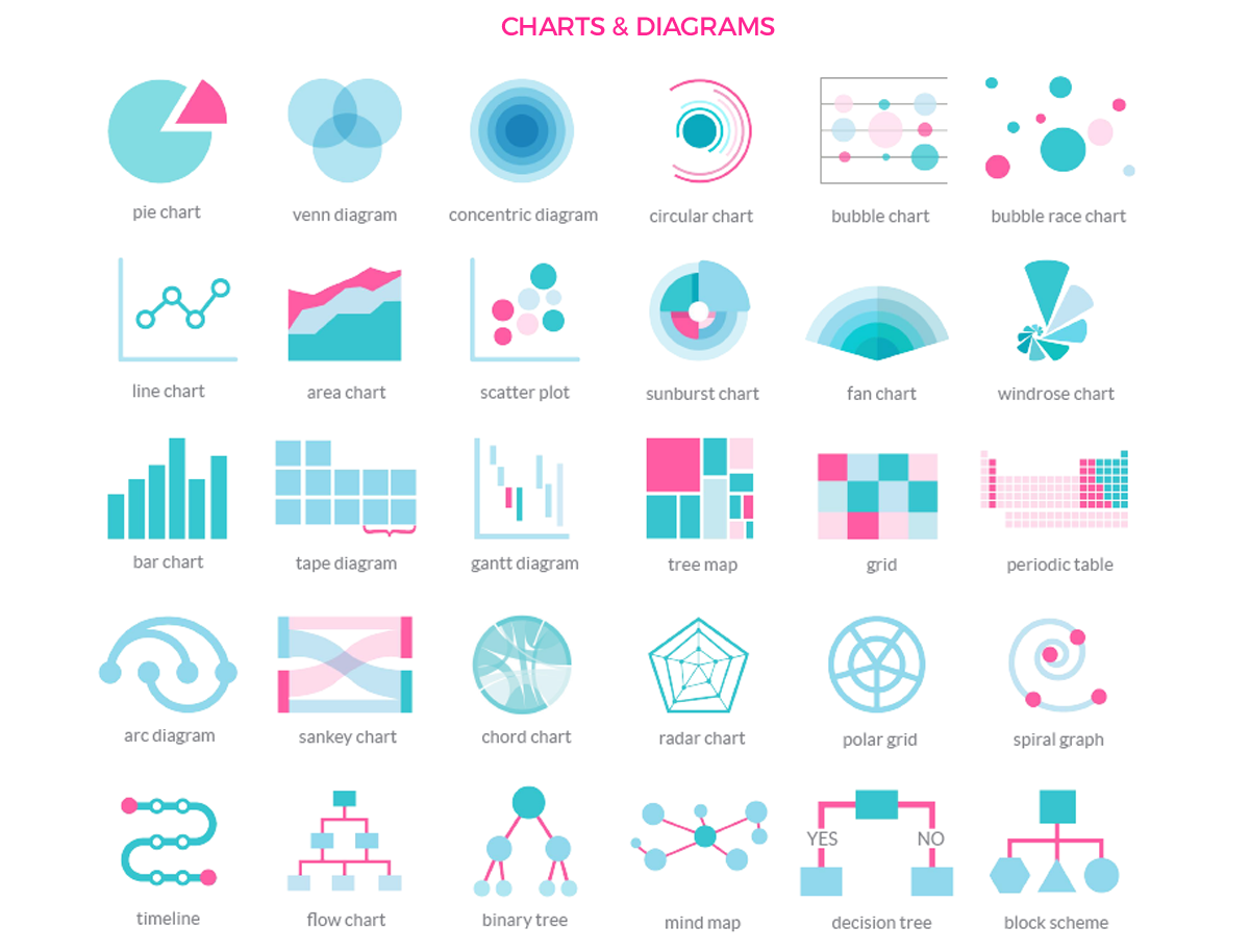
Pie charts are great for representing proportions and percentages. They display data in a circular format, with each section of the pie representing a specific category or value. Scatter plots, on the other hand, are used to observe relationships between two variables, often showing the correlation between them.
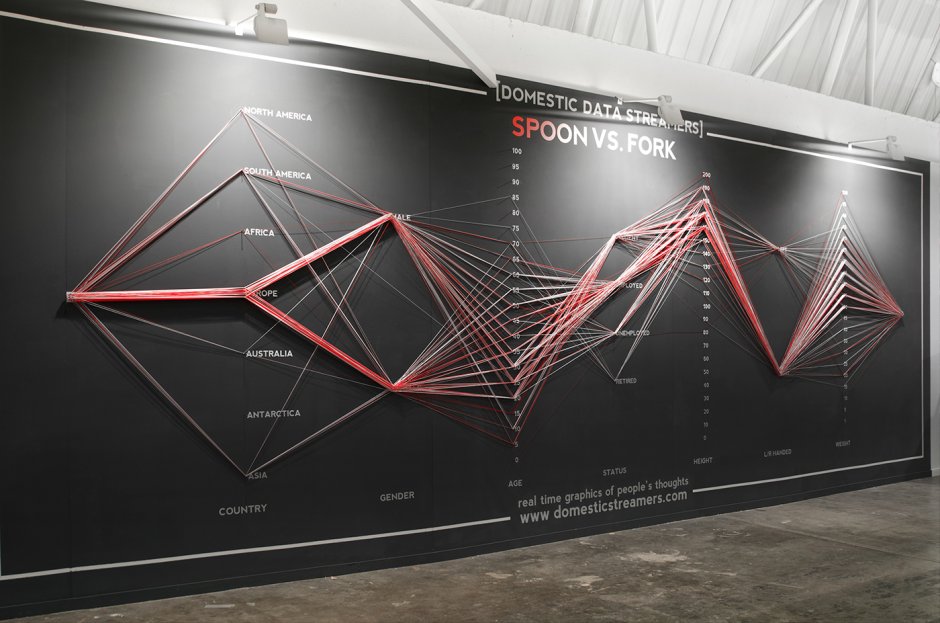
Gantt charts are popular for project management as they visually represent tasks, timelines, and dependencies. They help teams track progress, allocate resources, and meet deadlines effectively. Radar charts, also known as spider charts, display data points on multiple axes, making it easy to compare performance across different dimensions.
Heatmaps, commonly used in data analysis, provide a graphical representation of data using colors to depict values. They reveal patterns and identify areas of interest or concern. Finally, flowcharts are useful for illustrating processes or decision-making workflows, often used in programming and business process mapping.
When choosing a chart type, it is essential to consider the data you have and the story you want to tell. Each chart has its strengths and weaknesses, so selecting the right one will ensure that your data is presented accurately and effectively. So, explore the various chart types, experiment with different visuals, and find the perfect match for your data visualization needs.